How to present a Power BI Dashboard
A practical guide to presenting Power BI dashboards with clear story flow, key insights, and executive ready takeaways.
Presenting a Power BI dashboard is not about showing every chart. It is about leading with a clear story, then using the report to answer questions with confidence.
Before you start, remember that publishing, sharing, and scheduled refresh require Power BI Service and you need a Power BI subscription to use it.
Executive presentation flow
Definition: Executive Summary page
An Executive Summary page is the first page of a report that explains the core question, the headline KPIs, and the top insights in one screen.
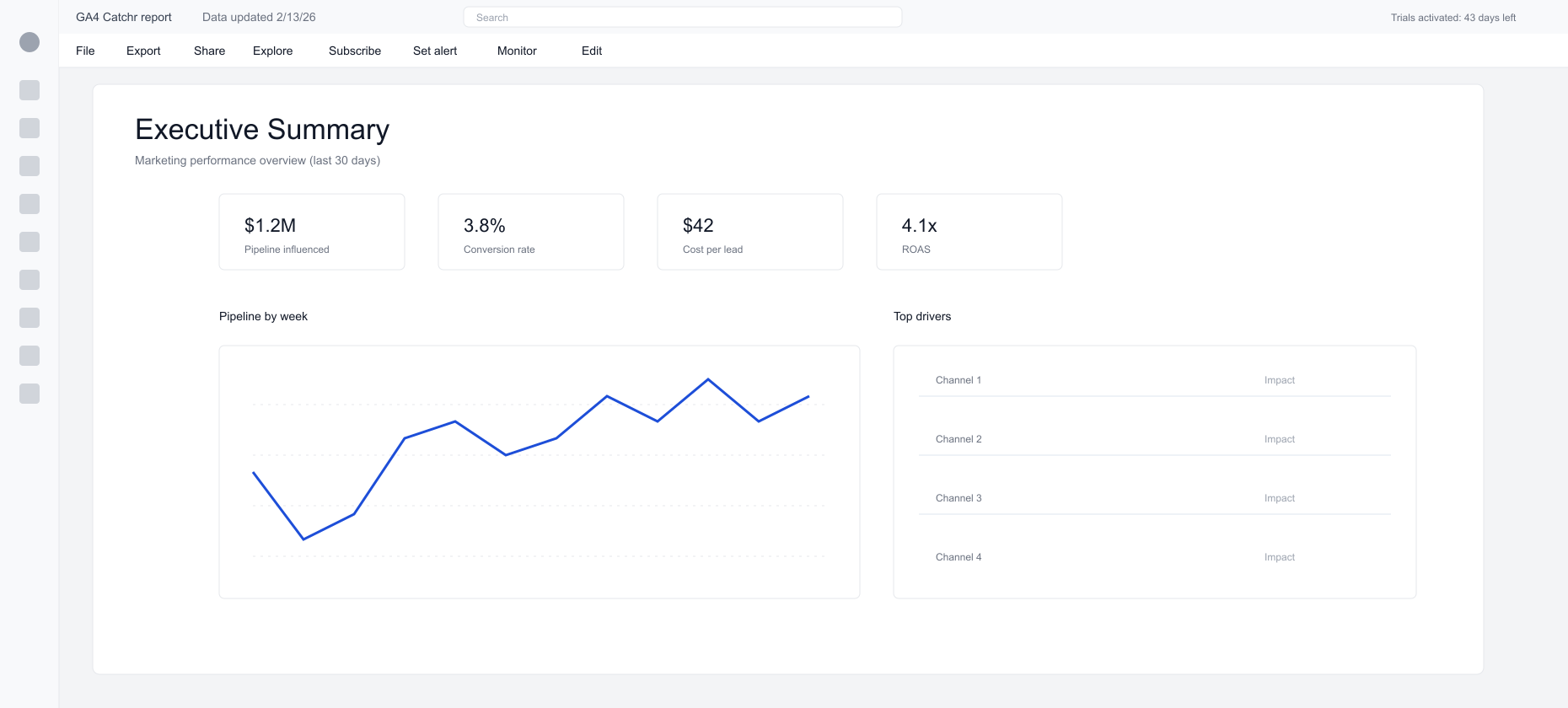
Presenting to executives: the simple flow
Start with the question the dashboard answers.
Open with a single, business‑level question such as “Are we on track for pipeline this month?” or “Which channels are driving efficient growth?” Then use the dashboard to answer it. This keeps the meeting from turning into a tour of charts.
Lead with outcomes, then explain drivers.
Begin with headline KPIs and direction of travel. Then show the drivers: channel mix, spend shifts, conversion rate changes, and funnel drop‑offs. Close with the actions you recommend and the owners.
A simple structure that works every time
- Frame the question and time range.
- Show the headline KPIs and trends.
- Explain drivers by channel, campaign, or segment.
- Connect outcomes to pipeline or revenue.
- Close with actions and owners.
Prepare the report before presenting
Lock the starting view
Set a clear default page and filter state so everyone sees the same story when the report opens. For navigation patterns, see Advanced UX in Power BI.
Keep the data fresh
Live questions require current data. The basics are covered in Refresh data in Power BI, and the production approach is in Power BI refresh strategy for marketing reporting.
Reduce friction during the meeting
Fewer pages and fewer slicers load faster. A lean report is easier to explain and easier to trust.
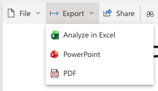
Presentation options for Power BI reports
- View in Power BI Service: best for live, interactive review.
- Export to PowerPoint: useful for executive decks with live visuals.
- Embed on a website or portal: ideal for sharing with internal teams or clients. See Embed Power BI reports in websites and tools.
- Export to PDF: useful for static sharing, but not interactive.
Marketing use cases for presenting dashboards
- Weekly growth reviews with performance and next actions
- Monthly executive updates that connect spend to pipeline
- Client reporting where definitions need to be consistent
- Launch retrospectives that need fast drilldowns
Where Catchr fits for marketing teams
Catchr can send marketing data directly into Power BI as a destination so reports stay current without manual exports.
Catchr supports 80+ marketing sources and automatic data refresh for most connectors, which keeps reports reliable and on schedule. It also supports multiple destinations beyond Power BI, including reporting tools, data warehouses, storage, databases, and API. A marketing platform connection in Catchr is created once and can be reused across multiple reports and destinations.
A faster starting point is the Power BI templates collection.
⭐️ Start your free trial ⭐️
Conclusion
A great Power BI presentation starts with a clear question, shows only the KPIs that answer it, and explains the drivers behind the change. Keep the report focused, keep the data fresh, and use the presentation option that fits the audience.
FAQs
Is it safe to present a Power BI dashboard live?
Yes, as long as the report is published in Power BI Service and refresh is stable.
How many KPIs should be on an Executive Summary page?
Three to five is usually enough for clarity and focus.
Should every stakeholder get the full report?
Not always. Present the Executive Summary first and drill into detail only when questions come up.
Do I need Power BI Service to present a report?
Yes. Sharing and scheduled refresh are managed in Power BI Service.
.svg)