Slicers in Power BI explained (for marketers)
Learn how Power BI slicers work, which slicer types to use (date, dropdown, list, hierarchy), and best practices like syncing slicers and enabling search.
Slicers are the fastest way to make a marketing dashboard feel self-serve. Instead of duplicating pages for every market or channel, you let viewers select a date range, market, or channel and instantly see the report update.
For performance and trust, slicers should feel like a simple control panel. When they are scattered, inconsistent, or too granular, they slow people down and increase misinterpretation.

What slicers are in Power BI: definition & types
What a slicer is
A slicer is a visual placed on the canvas that filters other visuals. It is designed for the viewer, so the current selection is visible and easy to change. Marketing teams rely on slicers because reporting questions change constantly. A VP might want month to date, a growth lead might want last 7 days, and a channel owner might want Paid Search only.
Fields you typically use in slicers include Date, Market, Channel group, Platform, Campaign, Device, and Landing page.
Power BI slicer types (quick guide)
Slicers vs filters: quick difference
Slicers are the interaction layer you design for. They sit on the page, show their selection clearly, and encourage exploration.
Filters are often used as definitions and guardrails set by the report builder. They can be less visible to viewers and are better suited to rules the report should consistently respect, like excluding test campaigns or internal traffic.
How to add a slicer in Power BI (step by step)
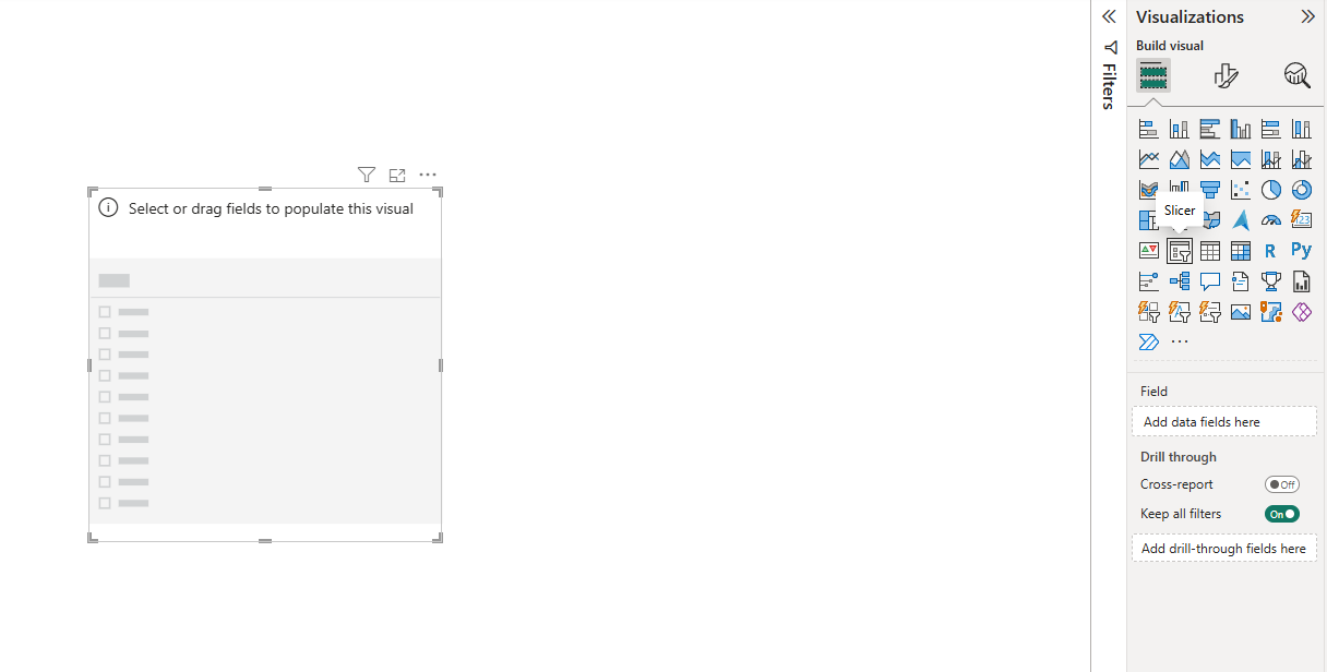
1) Add the slicer visual
In Power BI Desktop, select the Slicer visual from the Visualizations pane.
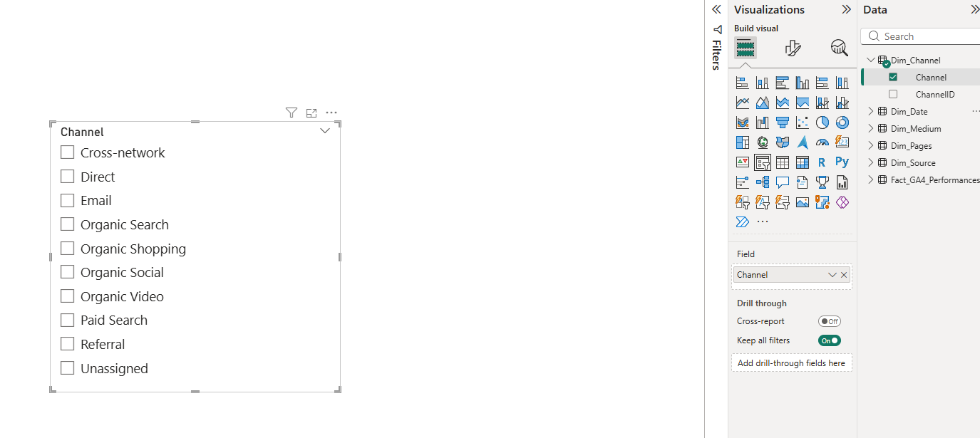
2) Choose the right field
Drag a field into the slicer, such as Date, Market, Channel group, or Campaign.
For marketing dashboards, start with slicers that match how teams work week to week:
- Date range
- Market or brand
- Channel group or platform
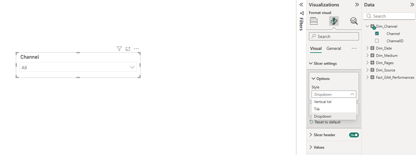
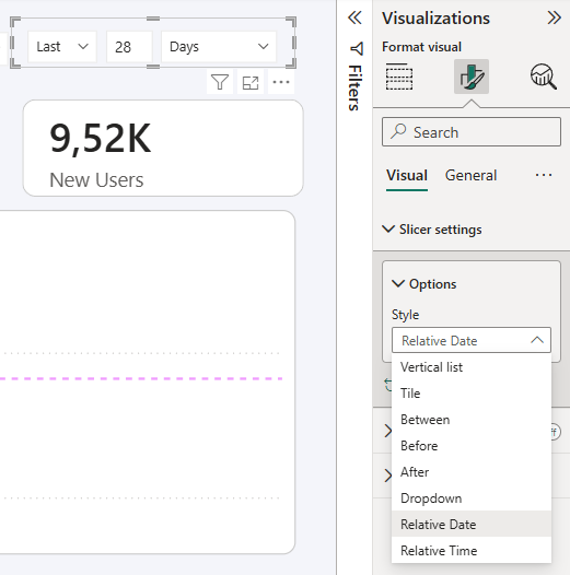
3) Pick the slicer style (list, dropdown, between, relative)
Slicer style is not cosmetic. It changes how quickly people can select values and how often they make mistakes.
Date slicers in Power BI
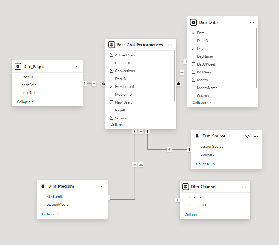
Use a common Date table: your single source of truth
Marketing models often have multiple dates: click date, session date, lead created date, opportunity created date. Pick one as the primary reporting date for the dashboard and use it consistently, ideally via a dedicated Date table.
This avoids stakeholder confusion when the same dashboard shows different “truths” depending on which visual they are looking at.
Relative date slicers for operating rhythms
Relative date slicers reduce manual work and keep weekly reporting consistent. They are a strong default for always-on dashboards.
Good patterns for marketers include:
- Last 7 days
- Last complete week
- Last 28 days
“Between” slicers for analysis, with a guardrail
Between slicers are great for ad-hoc analysis, but they increase the chance of partial-period comparisons. If people often select mid-month ranges, add a small note near the slicer explaining how to compare fairly, or provide a second option like “Last complete week”.
Sync slicers across pages
When syncing slicers makes sense
Sync slicers are best for selections that should stay consistent everywhere. For marketing reports, Date and Market are usually the top candidates. This creates a smoother experience. People move across pages without needing to re-select the basics.
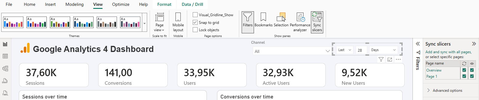
When not to sync
Do not sync slicers that are page-specific or platform-specific, like Campaign. Each platform page usually has different naming conventions and different levels of granularity.
A clean pattern is to sync:
- Date
- Market (or brand)
Then keep local to a page:
- Platform-specific breakdowns (Campaign, Ad group, Keyword, Landing page)
Slicer best practices (layout, naming, and trust)
- Make slicers predictable across pages: keep them in the same position on every page (ideally a header row) and use consistent sizing so the report feels designed, not assembled.
- Use clear titles (avoid internal field names): prefer “Market” over “Dim_Market_Name” and “Channel group” over “DefaultChannelGrouping” to reduce confusion and support questions.
- Avoid overlapping slicers without explanation: if you include both Source/Medium and Channel group, explain the difference; most marketer audiences do better with one primary channel taxonomy.
- Keep refresh reliable: slicers work best when the underlying data refreshes consistently; publishing, sharing, and scheduled refresh require Power BI Service.
- Mention connectors only when relevant: if you want to connect marketing platforms without manual exports and keep refresh reliable, tools like Catchr can help (14-day free trial); a marketing platform connection in Catchr is created once and can be reused across multiple reports and destinations.
- Always enable search for long lists: if a slicer can contain dozens or hundreds of values, search makes it usable, especially for Campaign, Landing page, and Keyword.
- Keep slicers intentional: avoid “control panel overload”; a practical default is 2 to 4 slicers per page, then use drillthrough pages for deeper segmentation when needed.
Conclusion
Slicers make a Power BI report feel interactive and marketer-friendly. Prioritize a small set of high-impact slicers, make date selection hard to misuse, and sync only the slicers that should truly be global. When slicers are consistent and intentional, stakeholders move faster, trust the numbers more, and ask better questions instead of debating definitions.
.svg)