Advanced UX in Power BI: tooltips, drillthrough, and navigation
Learn how tooltips, drillthrough, bookmarks, and buttons work in Power BI to build dashboards easier to navigate and explore.
Once you’re comfortable building clear dashboards with the right visuals and layout, the next step is to improve how users interact with them. At this stage, adding more charts or more pages is not always the best solution.
Power BI includes a few features that help dashboards feel more fluid, easier to explore, and more pleasant to use, without making them harder to understand. In this article, we’ll look at the most useful ones: tooltips, drillthrough, bookmarks, and buttons.
Improve Power BI dashboards with contextual details
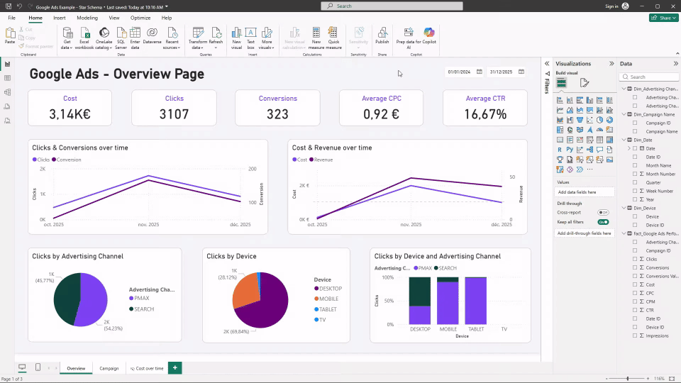
Tooltips in Power BI
Tooltips allow you to display additional information when a user hovers over a visual. They are one of the simplest ways to enrich a dashboard without adding permanent elements to the page.
In practice, tooltips are useful to:
- explain a KPI or metric definition
- show complementary values or benchmarks
- add a small breakdown without creating another visual
Power BI supports both simple tooltips and tooltip pages. Tooltip pages are especially useful because they let you design a small, dedicated layout that appears only on hover.
Used well, tooltips add clarity without increasing visual noise.
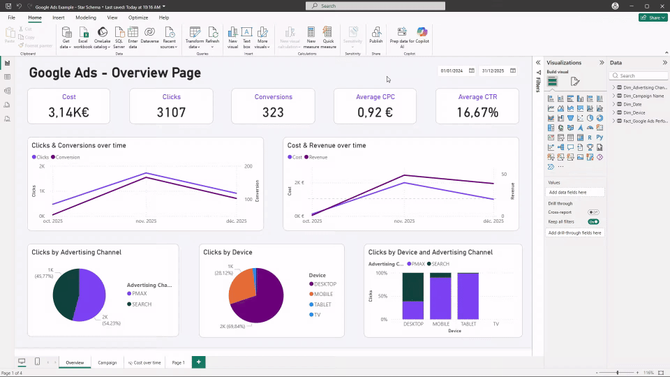
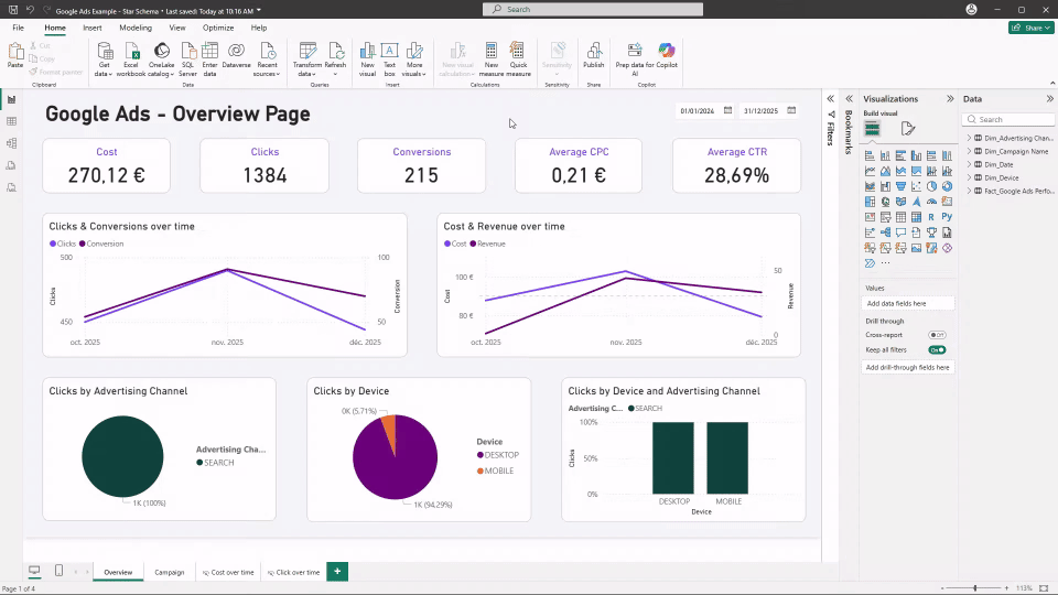
Drillthrough in Power BI
Drillthrough lets users move from a high-level view to a more detailed page while keeping context, such as the selected campaign or channel.
For example a user can click on a campaign in an overview page, open a detailed page focused on that campaign, and keep the same date range and filters.
In practice, drillthrough is mainly designed for published, shared reports. You can set it up in Power BI Desktop, but it works fully once the report is published to Power BI Service, since users need to be connected and have access to the drillthrough pages for the navigation to work properly and consistently.
Make dashboards easier to navigate
Bookmarks in Power BI
Bookmarks allow you to save a specific state of a page, including visibility of visuals and filters. They are often used to switch between different views without duplicating pages.
Common uses of bookmarks include:
- toggling between two perspectives (for example volume vs efficiency)
- showing or hiding a detail section
- returning to a default view
Bookmarks help structure interaction while keeping the dashboard tidy.
Buttons in Power BI
Buttons work together with bookmarks and navigation features. They give users clear actions instead of relying on right-clicks or hidden menus.
Typical button use cases include:
- navigating between pages
- going back to a previous view
- resetting filters to a default state
Buttons make dashboards more intuitive, especially for non-technical users.
Building a more app-like dashboard experience
When dashboards are widely shared or used frequently, navigation and interaction become more important. By combining tooltips, bookmarks, and buttons, you can create a more guided experience that feels closer to an application than a static report.
This approach works well when:
- dashboards are used by many stakeholders
- the same report is reviewed regularly
- you want to guide users through a clear analysis path
Common mistakes to avoid
Advanced UX features are powerful, but they should be used with moderation.
Some common pitfalls include:
- adding too many interactions on a single page
- hiding important logic behind clicks or buttons
- using tooltips or drillthrough where a simple visual would be clearer
Conclusion
Tooltips, drillthrough, bookmarks, and buttons help dashboards become more interactive and easier to use. They allow you to add detail, guide users, and structure navigation without overloading the main pages.
Once the basics of visuals and layout are in place, these features are a natural next step to build more polished and effective Power BI dashboards.

.svg)