Choose the right visual in Power BI
Learn how to choose the right Power BI visuals based on your reporting needs. Discover when to use line charts, bar charts, tables, matrices, and KPI visuals to build clear and effective dashboards.
Power BI offers many types of visuals, but effective dashboards are not built by using as many visuals as possible. They are built by choosing the right visual for the right question. A good visual helps users understand performance quickly and confidently, while a poor choice can hide trends or lead to misinterpretation.
This article explains how to choose Power BI visuals based on common reporting needs, and shows when each type is useful, why it works, and how it supports decision-making.
Visuals for tracking and understanding performance
Line chart in Power BI
A line chart is designed to show how a metric evolves over time and is the most reliable way to analyze trends, seasonality, and changes in performance.
- Ideal for continuous time analysis (daily, weekly, monthly data)
- Makes trends, peaks, and drops immediately visible
- Works well with comparisons (current vs previous period, YoY)
A line chart is built around a time dimension. It typically uses a date or time field on the X-axis and one or several numeric measures on the Y-axis. The date field should come from a proper date column (or a date table) to ensure correct sorting and filtering.
You can add:
- one date field on the axis (day, week, month)
- one or more numeric fields as values (spend, leads, conversions)
- an optional categorical field in the legend to compare multiple lines (channel, campaign)
Bar chart and column chart in Power BI
Bar and column charts are used to compare values across categories and quickly identify top and underperformers.
- Easy to read and compare multiple categories at a glance
- Perfect for rankings when sorted by value
Bar and column charts are designed to compare values across categories. They typically use a categorical field on one axis and a numeric measure on the other.
Common field combinations include:
- one category (channel, campaign, country)
- one main measure (spend, leads, ROAS)
- an optional legend to split the bars by a second category
Because categories are discrete, these charts work best when the number of items is limited and clearly defined.
Stacked bar chart and 100% stacked bar chart in Power BI
Stacked charts show how a total value is composed and how each category contributes to the whole.
- Displays both total volume and distribution
- Useful for understanding mix rather than precise values
Stacked charts combine two categorical dimensions with one numeric measure. One category defines the main axis, while the second category splits the total into segments.
Typical field setup:
- a main category (channel, campaign)
- a secondary category in the legend (source, device, product)
- a numeric measure as value (spend, leads)
The 100% stacked version normalizes values, making it easier to compare proportions rather than absolute volumes.
Visuals for detailed and operational reporting
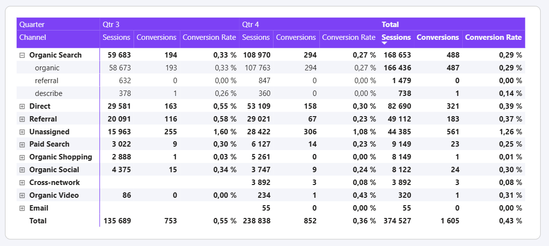
Table visual in Power BI
Tables are built for precision and operational reporting when exact values matter more than visual trends.
- Shows detailed, exact numbers without aggregation ambiguity
- Allows sorting, scanning, and filtering large lists
- Ideal for campaign or keyword-level reporting
Tables are the most flexible visual in Power BI. They can combine multiple dimensions and multiple measures without restrictions on structure.
You typically use:
- several categorical fields as columns (campaign, channel, country)
- multiple numeric measures (spend, clicks, conversions, CAC)
- optional sorting and conditional formatting
Matrix visual in Power BI
A matrix allows you to analyze data across rows and columns, combining multiple dimensions in a structured view.
- Handles complex breakdowns without clutter
- Supports hierarchies and time-based columns
- Makes patterns visible across dimensions
A matrix extends the table concept by introducing a clear separation between rows and columns. It is designed to analyze data across two dimensions simultaneously.
Typical field usage includes:
- one or more fields in rows (campaign, channel)
- one field in columns (month, week, device)
- one or more numeric measures as values
Visuals for highlighting key metrics
Card visual and KPI visual in Power BI
Cards and KPI visuals are used to highlight a single metric that should be read instantly.
- Focuses attention on one key number
- Very readable and suitable for executive views
- KPI visuals add context with targets or trends
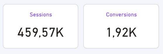
Cards and KPI visuals are built around a single numeric measure. They are meant to display one value clearly and without distraction.
They usually contain:
- one aggregated measure (total spend, total leads, average CAC)
- optionally, a target or trend (for KPI visuals)
Because they rely on aggregation and filters, these visuals work best when the underlying model and measures are well defined.
How aggregation works inside visuals
All Power BI visuals aggregate data. This aggregation happens dynamically based on the visual type, the fields used, and the filters applied.
It’s important to understand that aggregation in a visual only affects how values are displayed. It does not change the underlying data model. Visual aggregation is flexible and useful, but it does not replace proper data preparation or modeling.
You can work on aggregation before adding visuals, at the data model level by using the Group by tool in Power Query.
All visuals in Power BI aggregate data automatically. The type of aggregation depends on the measure used and the visual configuration.
Most visuals expect:
- numeric fields for values (summed, averaged, counted)
- categorical or date fields for grouping
Understanding this helps explain why the same measure can display different results depending on filters or visual context.
Common visual mistakes to avoid
Some mistakes frequently reduce the clarity and usefulness of dashboards:
- using the wrong visual for the question being asked
- placing too many metrics in a single chart
- mixing different units on the same axis
- choosing decorative visuals that reduce readability
Avoiding these pitfalls helps keep dashboards clear, reliable, and easy to interpret.
Conclusion
Choosing the right visual in Power BI is about answering the right question in the simplest possible way. By aligning visuals with real reporting needs (trends, comparisons, composition, detail, or focus) you create dashboards that communicate insights clearly and support better decision-making.

.svg)