Power BI Interface Explained
Learn how the Power BI interface works: Report, Data (Table), and Model views, key panes, and ribbon essentials explained for marketing teams.
When opening Power BI for the first time, the interface can feel overwhelming. With multiple views, panes, and menus, it’s not always obvious where to start. The good news is that it’s highly structured. Once you understand how the main views and panes work together, navigating Power BI becomes much easier.
In this article, we’ll walk through the interface step by step, focusing on how marketing teams actually use it.
Understanding the Power BI interface
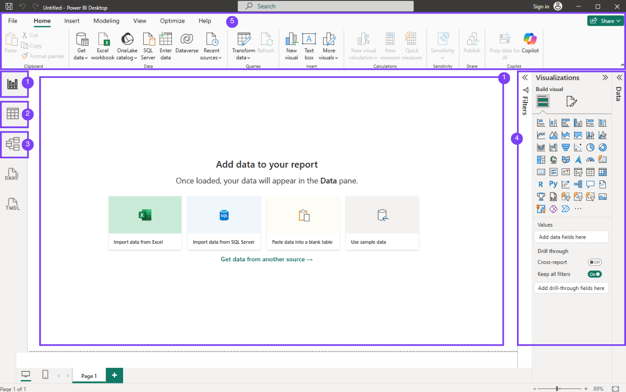
Power BI Desktop is organized around three main views, several side panes, and a top ribbon. Each part of the interface serves a specific purpose, and you don’t need to use everything at once. Most marketing tasks happen in the Report view (1), while the Data view (2) and Model view (3) are used occasionally to understand or adjust the structure of the data. The side panes (4) help you build visuals and apply filters, and the ribbon (5) gives access to key actions such as connecting data or publishing reports.
Power BI views explained
The three Power BI views determine what you are working on at any given moment. Knowing when to use each one is essential to avoid confusion and work more efficiently.
Report view in Power BI (building dashboards)
The Report view is where marketing teams spend most of their time. This is the workspace used to build dashboards and reports by adding visuals to report pages.
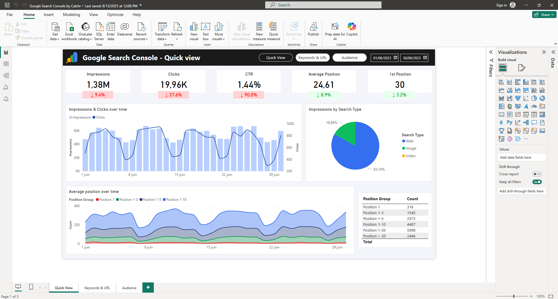
In Report view, you can create charts and tables, add slicers and filters, arrange visuals on the canvas, and format them for readability. This is also where you create multiple pages within a report to cover different marketing perspectives, such as acquisition, channel performance, or funnel analysis. Page tabs appear at the bottom of the Report view, letting you add new pages and quickly switch between them.
Data view in Power BI (understanding your data)
The Data view, represented by the table icon in the interface and sometimes called the Table view, displays the data loaded into Power BI in a tabular format.
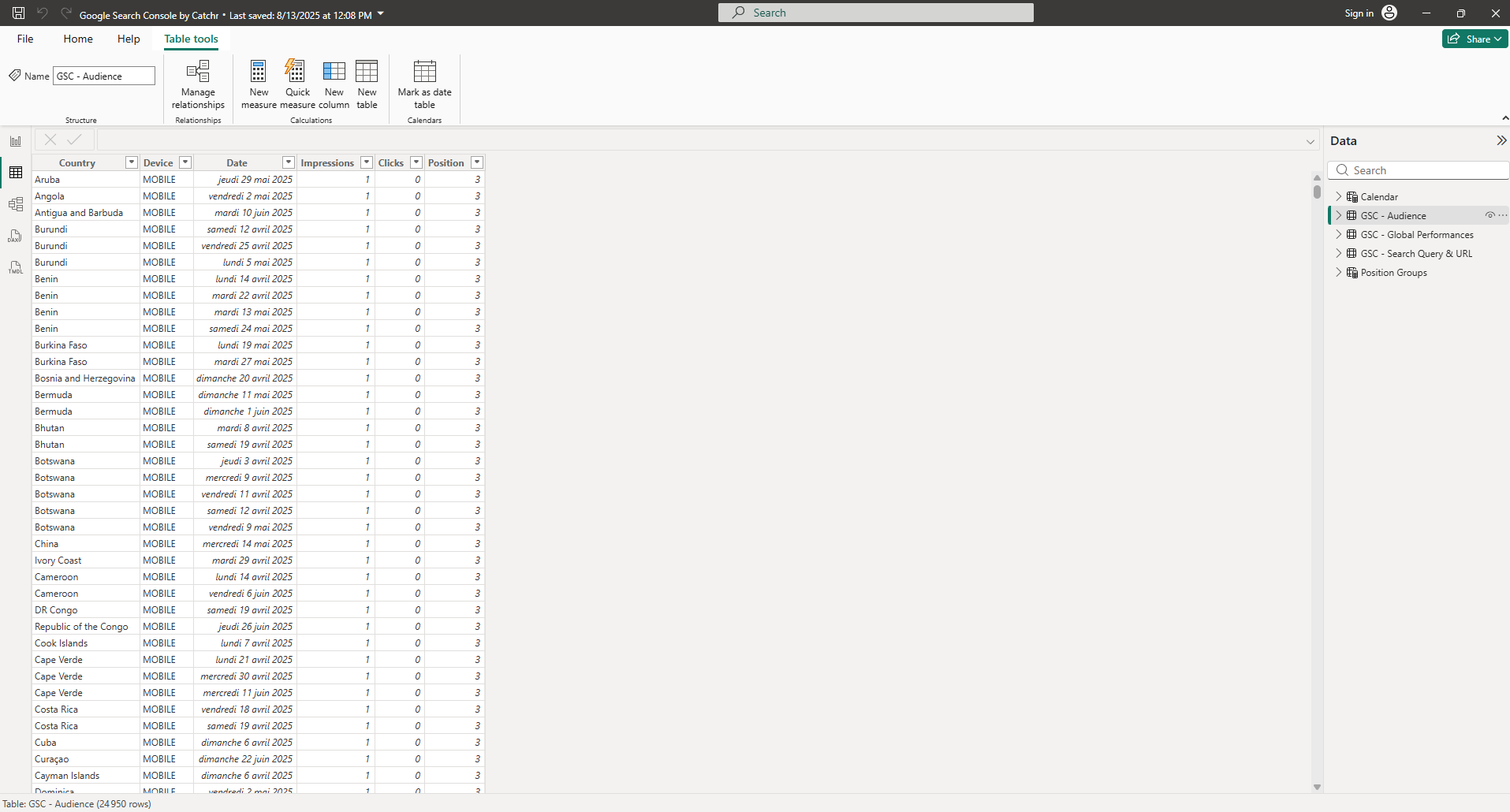
Marketing teams typically use it to quickly check values, understand which columns and fields are available, verify data types, or troubleshoot unexpected results in a report. Keep in mind that this view is read-only: it looks like a spreadsheet, but it isn’t meant for editing data like Excel.
Model view in Power BI (relationships and structure)
The Model view shows how tables are connected to each other through relationships. It provides a visual representation of how data flows across the model.
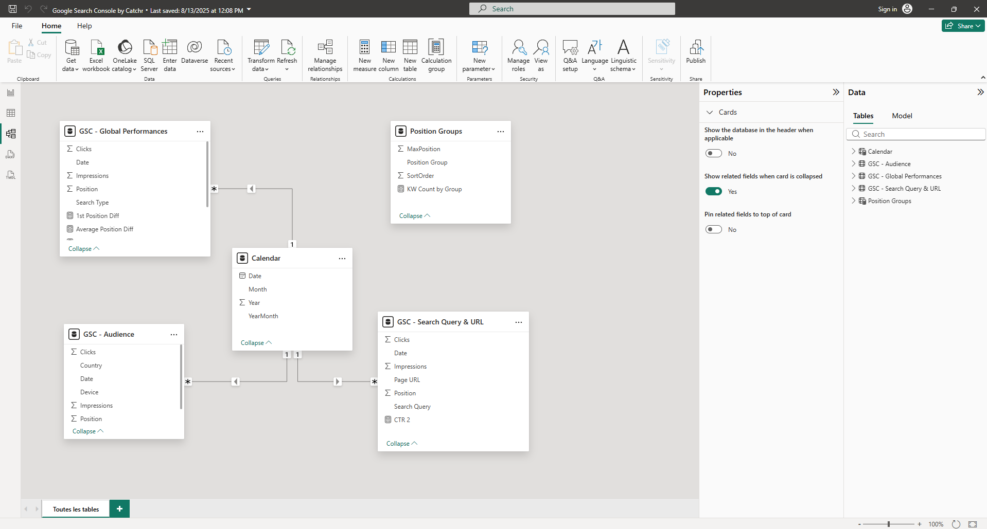
This view is especially useful when filters or KPIs don’t behave as expected. For example, if a date filter does not affect all visuals, the issue is often visible in the relationships shown in the Model view.
Marketers don’t need to work in this view constantly, but understanding its role is essential because changes made here affect the entire report.
Power BI panes explained
The right-hand panes in Power BI are core to how you build and manage reports. In this section, we’ll focus specifically on the panes in Report view, which you use to add visuals, control how data is displayed, and apply filters.
Data pane in Power BI
The Fields pane lists all tables, columns, and measures available in your report. This is where you choose which data appears in your visuals.
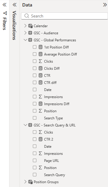
For example, with a Google Search Console dataset, the Fields pane typically includes metrics like Clicks, Impressions, CTR, and Average position, plus dimensions such as Query, Page, Country, Device, and Date. To build a visual, drag a metric into Values and a dimension into the Axis, Legend, or Filters.
Visualizations pane in Power BI
The Visualizations pane controls how your data is displayed. It lets you select chart types and define how fields from the Fields pane are used inside a visual.
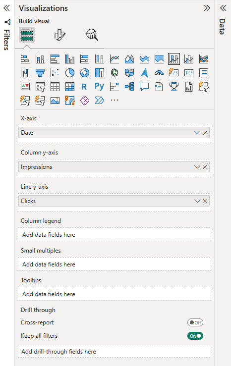
With Search Console data, this pane lets you build common SEO visuals such as tables for top queries or pages, line charts to track performance over time, or comparisons by country or device. For example, you can create a line chart with Date on the axis and Clicks and Impressions as values to analyze trends.
Filters pane in Power BI
The Filters pane controls which data is included in a visual, a page, or the entire report. Filters can be applied at different levels, which is why they are often a source of confusion for beginners.
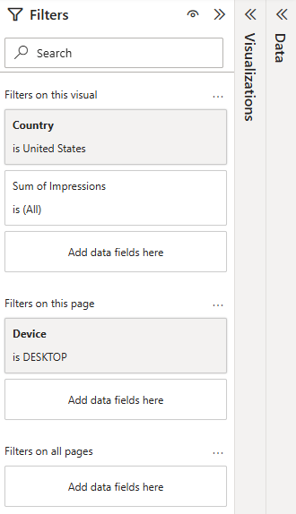
For example, you might filter a page to only show data for desktop traffic, or apply a visual-level filter to display only performances for a specific country.
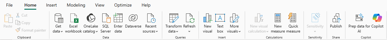
Power BI ribbon essentials for marketers
The ribbon at the top of Power BI Desktop includes many options, but most marketers rely on a small set of actions on a daily basis. The good news is that the essentials are all available in the Home tab, and you can then explore other tabs when you need more specific features.
The most commonly used actions are:
- Get data (connect to a data source)
- Transform data (open Power Query to clean and reshape data)
- Refresh (update the dataset)
- New measure (create KPIs such as ROAS, CAC, or conversion rate)
- Publish (send your report to Power BI Service)
While the Home tab covers most day-to-day needs, the other ribbon tabs help you go further depending on what you’re working on:
- Home: core actions for connecting, transforming, refreshing, and publishing
- Insert: add visuals, buttons, shapes, and other report elements
- Modeling: build measures, manage relationships, and work with your model logic
- View: control layout, panes, themes, and on-screen guidance
- Optimize: performance-related tools (mostly useful for advanced use cases)
- Help: documentation, support, and learning resources
How marketers should navigate the Power BI interface
A simple way to navigate Power BI is to think in terms of intent. When you want to build or adjust visuals, stay in the Report view. When you need to check which columns are available or validate specific values, use the Data (Table) view. If filters or relationships don’t behave as expected, the Model view is usually the right place to look. And when your data needs cleaning or reshaping before it can be reported correctly (such as removing duplicates, changing data types, splitting columns, or preparing a date field) use Transform data to open Power Query.
This mental model helps marketers move through the interface with confidence and know where to act depending on the issue.
What's next?
Now that you understand how Power BI Desktop is structured, views on the left, panes on the right, and key actions in the ribbon, you can navigate the interface with confidence. Next, you’ll start working with real marketing data by connecting a source, preparing it in Power Query, and building your first report.

.svg)