Build your first Marketing Report in Power BI
Learn how to build your first marketing report in Power BI step by step: connect data, create KPIs, add charts, filters, and structure your dashboard properly.
Power BI really starts to make sense once you build something concrete. Instead of exploring features one by one, the best way to learn is to create a simple but real marketing report from start to finish.
In this quick start guide, you’ll build your first Power BI dashboard using a basic CSV or Excel export. The goal is not to create a perfect report, but to understand the workflow and end up with something usable.
By the end of this article, you’ll have a clean marketing dashboard with KPIs, a trend, a table, and a date filter.
Build your first marketing dashboard step by step
In this section, we’ll build a simple marketing dashboard step by step:
- Connect a CSV or Excel marketing export
- Create 3 key marketing KPIs
- Add a trend over time
- Build a detailed table
- Add a date slicer
- Save and structure the report properly
Step 1: Connect to a CSV or Excel marketing export
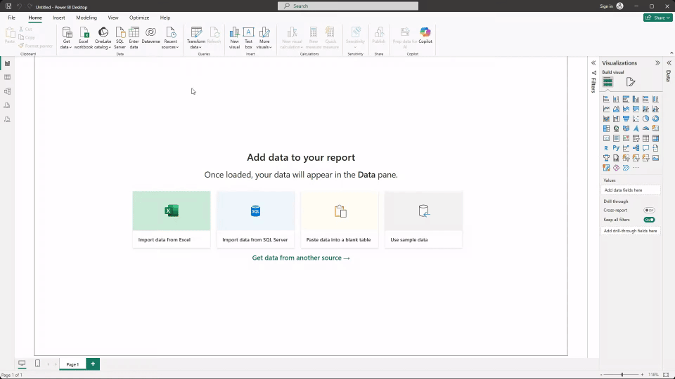
Start with a simple marketing export, such as data from Google Search Console, Google Analytics, an advertising platform, or a CRM. CSV or Excel files are perfect for learning because they’re easy to work with and don’t require any setup. In this example, we'll connect data to Power BI using a CSV export from Google Search Console.
In Power BI Desktop:
- Click Get data from the Home tab
- Select CSV or Excel, then choose your file
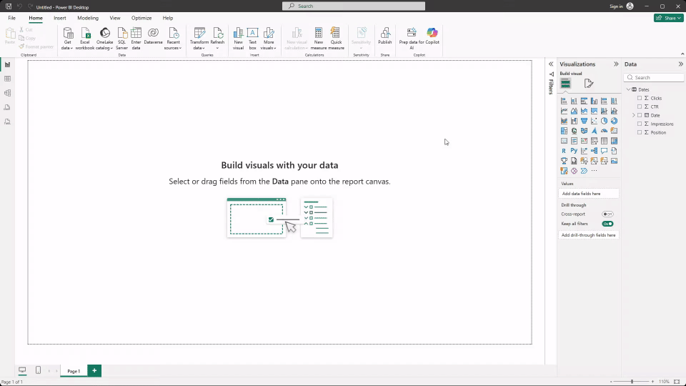
Power BI will preview the data before loading it into the report. This preview lets you quickly check the file structure, column names, and confirm that your metrics are correctly recognized as numeric values. You don’t need to clean or transform the data extensively yet. This step is simply about validating that the dataset makes sense before building visuals.
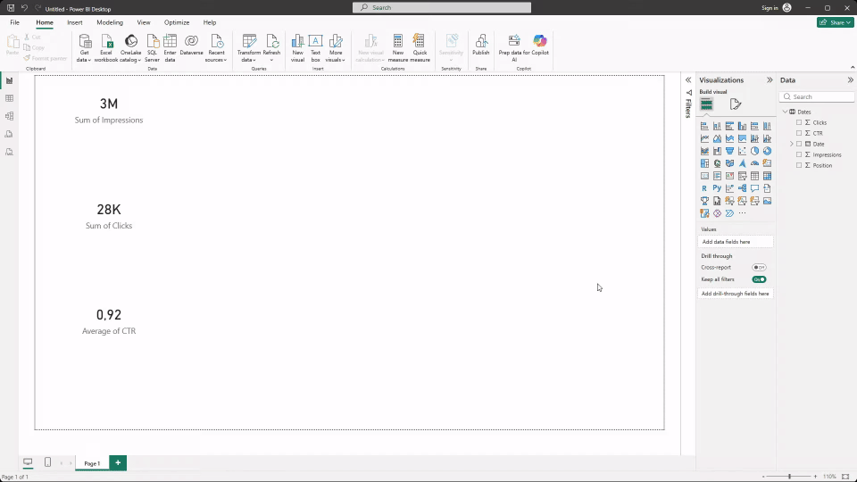
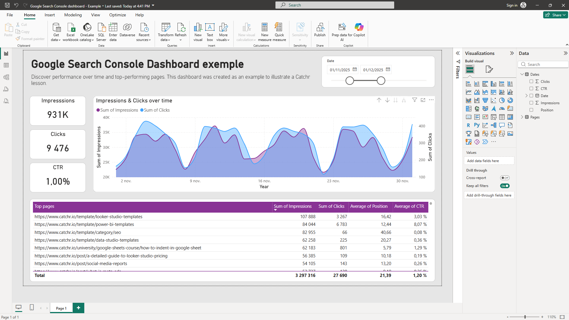
Step 2: Create 3 key marketing KPIs
Next, create three simple KPIs using Card visuals. These KPIs should give a quick overview of performance.
- Open the Visualizations pane.
- Select the Card visual.
- Drag and drop (or check) the metric you want to display.
- If needed, adjust the aggregation by clicking the arrow next to the metric in the Values section.
Typical examples include total clicks or sessions, total impressions, and conversions or revenue, depending on your dataset. Drag each metric into a separate card and place them at the top of the report.
At this stage, basic aggregations are enough. There’s no need for advanced calculations or custom measures yet.
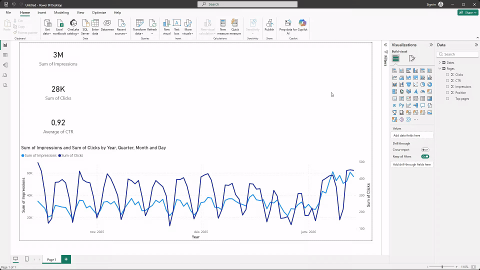
Step 3: Add one trend over time
Now that you have a high-level view of performance, you can go deeper by adding a line chart to show how metrics evolve over time.
- Select the Line chart visual
- Add Date in x-axis
- Add your metrics in y-axis and secondary y-axis to avoid overwhelming you chart
This visual helps identify growth, seasonality, or sudden changes in performance. Keep the chart simple and easy to read.
Step 4: Build one table for detailed analysis
To make the report actionable, add a Table visual. Choose one main dimension, such as query, page, campaign, or channel, and add two or three relevant metrics.
- Select the Table visual.
- Choose the dimensions and metrics you want to display.
- Adjust the size of the table and resize columns as needed for better readability.
Step 5: Add a date slicer
Add a Slicer using your date field so users can control the time period displayed in the report. Place the slicer at the top or side of the page.
- Select the Slicer visual.
- Add the Date field to the slicer.
You can now easily select a time range to filter the entire report.

Step 6: Save and structure your report properly
Before moving on, take a moment to organize and refine your report.
- Rename the page with a clear, meaningful title.
- Rename visuals so they’re easy to understand.
- Adjust spacing and alignment to keep the layout clean and readable.
- Improve the look and feel by selecting a visual and using Format your visual (titles, colors, borders, labels, spacing).
- Save the file using a clear naming convention.
These small habits make a big difference as your reports grow and get shared, and we’ll dive deeper into dashboard design in a dedicated lesson.
Common beginner mistakes to avoid
When starting out, it’s easy to add too many visuals or track too many KPIs at once. Another common mistake is spending too much time on formatting before the data structure is solid.
What’s next
You’ve built your first Power BI marketing report and learned the core workflow. The next steps typically involve preparing and cleaning data more thoroughly with Power Query, improving KPI definitions, or connecting live data sources instead of manual exports.
From here, you can continue building more advanced dashboards or explore platform-specific examples to deepen your Power BI skills.

.svg)