Customizing visual Styles in Data Studio
Learn how to customize visual styles in Data Studio (formerly Looker Studio): adjust colors, typography, and layouts to create clean, consistent, and engaging dashboards.
To create a successful report, data is only half the battle. The other half is how it's presented. A chart's style is one of the keys to your report's visibility, consistency, and credibility.
Data Studio (formerly Looker Studio) offers a wide range of different charts (bar, time series, geo maps, tables, scoreboards, etc.) which can be harmonized through work on the style.
What is Style in Data Studio?
Style in Data Studio refers to the visual customization options that define how your data appears in reports and dashboards. While data and setup control what you display, style determines how it looks. It includes elements such as colors, fonts, borders, backgrounds, and alignment.
Using the Style tab, you can adjust chart palettes, typography, gridlines, and other visual details to create consistent, branded, and easy-to-read reports. In short, style means turning data into a clear and visually engaging story.
Style Basics in Data Studio
The tab Style contains all the style options. This is where you define the visual consistency of the report. When you select a chart, you can find it in the right sidebar that appears.

Manage colors
Color customization defines the visual identity of a Data Studio report and contributes directly to its readability and impact. Colors can be applied to almost every visualization, including charts, tables, maps, and scorecards. Users can select a predefined palette, create custom HEX colors, or apply the Color by dimension feature to assign specific hues to different data categories. The main objective is to highlight key insights, build a clear visual hierarchy, and guide the viewer’s attention effectively.
Examples of color customization
- Changing text color in a scorecard: This example shows how to adjust the text color of a scorecard to emphasize key indicators or align with your brand palette.This example shows how to adjust the text color of a scorecard to emphasize key indicators or align with your brand palette.
- Applying Color by dimension: This example demonstrates how to apply the Color by dimension feature to assign consistent hues to each category across multiple charts.
- Standardizing colors by dimension value: Here you can see how to configure color attribution directly from the Dimension manager, below the Color by selector, to maintain consistency throughout your report.
Change the typography
In Data Studio, you can customize typography by adjusting the font, size, alignment, and color of text across nearly all components, including charts, tables, and scorecards. Choosing the right typeface and hierarchy helps create a clean visual rhythm and ensures every report remains easy to read. Define a few consistent text styles based on your internal guidelines before you start designing, so that titles, labels, and values stay visually aligned across all pages.
If you're looking to set up a shared structure for all your reports, you can use themes.
Example of typography customization
This example shows how to customize the font, size, and color of table headers to improve readability and match your report’s overall style.
Background, border and padding
In Data Studio, you can customize the background, borders, and padding of most components to control structure and visual balance. The background settings allow you to adjust color and opacity, creating contrast or separating different areas of the report. Borders can be refined by changing their color, thickness, radius, or style, and you can add a shadow to bring depth and hierarchy to the layout. Padding defines the internal spacing within a component, helping maintain clarity and consistent alignment across all visuals. Together, these settings help organize information and create a clean, professional dashboard design.
Example of background, border and padding customization
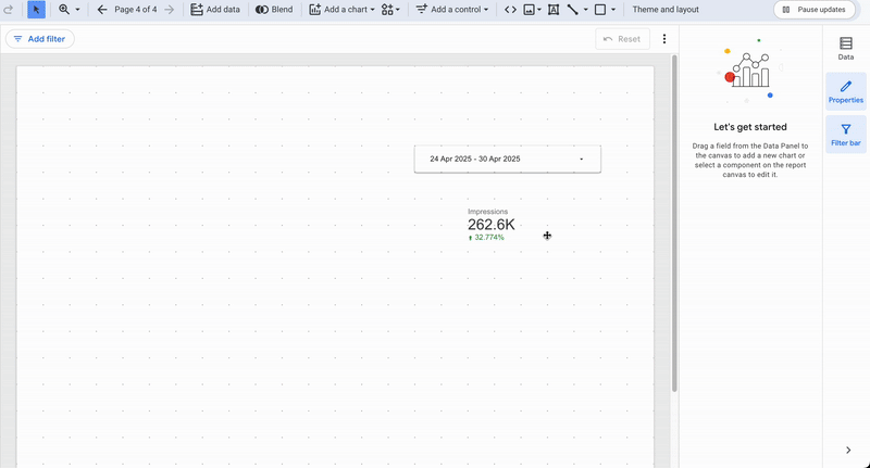
Chart title
Data Studio lets you add a chart title so each visualization can clearly identify itself. The option is available in the Chart title section at the top of every component. You can also customize the font, size, alignment, and color of the title to match your report’s style. Adding short, descriptive titles helps readers quickly understand the purpose of each chart and keeps your report organized.
Example of chart title customization
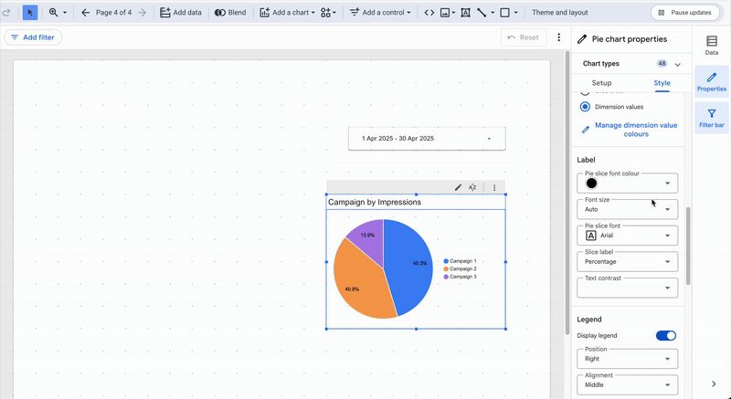
Legends et Labels
In Data Studio, the legend can be styled independently from other text elements. You can adjust its position, alignment, and font to improve readability and balance within the chart. Similarly, the labels can be customized in the Label section, where you can modify their font, color, and format to make data values easier to interpret. Well-designed legends and labels help viewers understand data at a glance and keep your visuals clean and accessible.
Example of legends customization
Units and values
Data formatting reinforcing immediate understanding, it is important to ensure that each field has the correct unit and a consistent value. Adding units to missing fields and adjusting the number of decimal places should be part of your routine. Move to the chart level if you do not want to make global changes to field types.
Conditional Formatting
Conditional formatting allows you to adapt the formatting based on the data manipulated by the component. Don't hesitate to consult our article on conditional formatting for more details.
Customization by chart type
Each chart type has its own style logic. Fine-tuning helps ensure consistency between shapes, colors, and values.
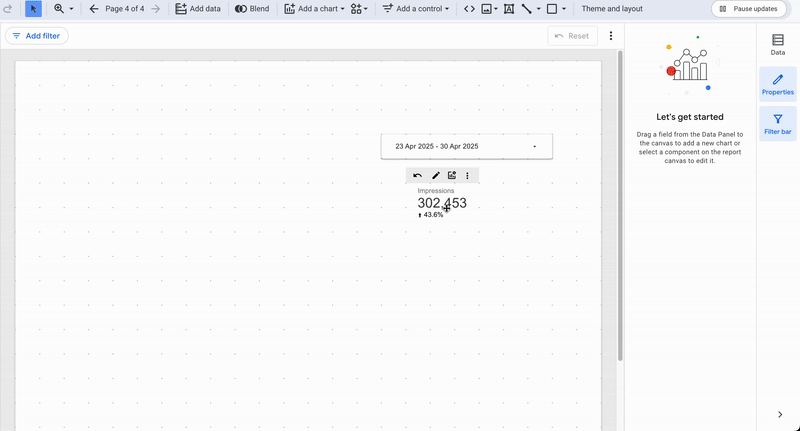
Scorecards
Scorecards can be customized to make key values stand out. You can adjust the font size, color, and alignment of the main metric to ensure it captures attention. The comparison value can also be styled by changing its color, format, or position below the main metric. Conditional formatting helps emphasize variations, such as displaying green for positive and red for negative changes, directly from the comparison fields panel. These options make it easy to highlight trends while maintaining a clean and consistent visual layout.
Example of scorecard customization
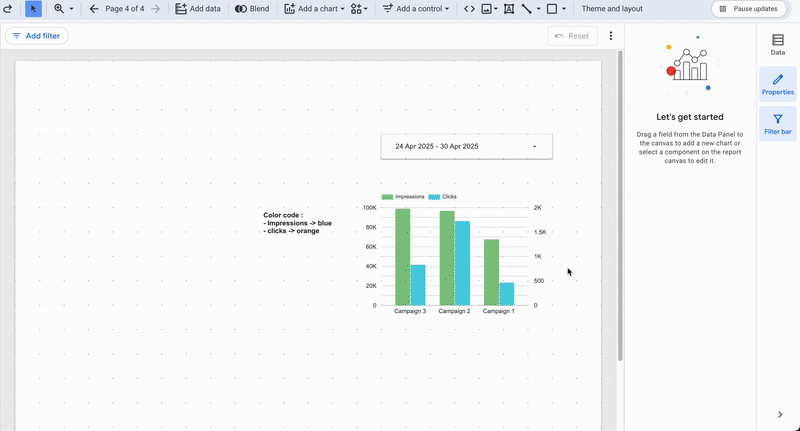
Bar, column and area charts
Bar, column, and area charts rely on visual comparison, so color and spacing play a key role in readability. Assigning a distinct color per series or per dimension helps differentiate categories at a glance. You can fine-tune bar thickness and spacing to improve clarity and prevent overlaps, especially when multiple dimensions are displayed. When a performance target is defined, enabling reference lines makes it easy to visualize thresholds or objectives directly within the chart.
Example of bar chart customization
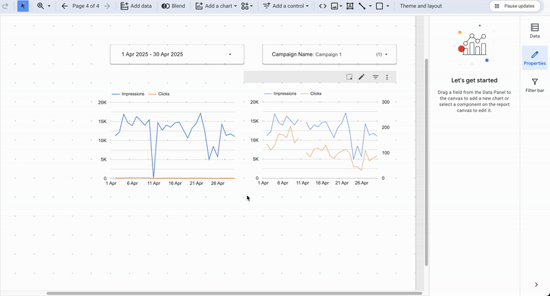
Time series and lines
Time series charts illustrate how data evolves over time, so clarity and precision are essential. Using thin lines and discreet points improves readability and helps emphasize trends without visual clutter. You can refine the appearance further by adjusting the gridlines and axes for smoother interpretation. You can also add a second axis and for missing values, choose whether to connect points or create a visual break, the right treatment helps convey meaning and ensures the evolution remains clear at a glance.
Example of time series customization
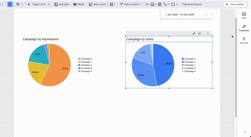
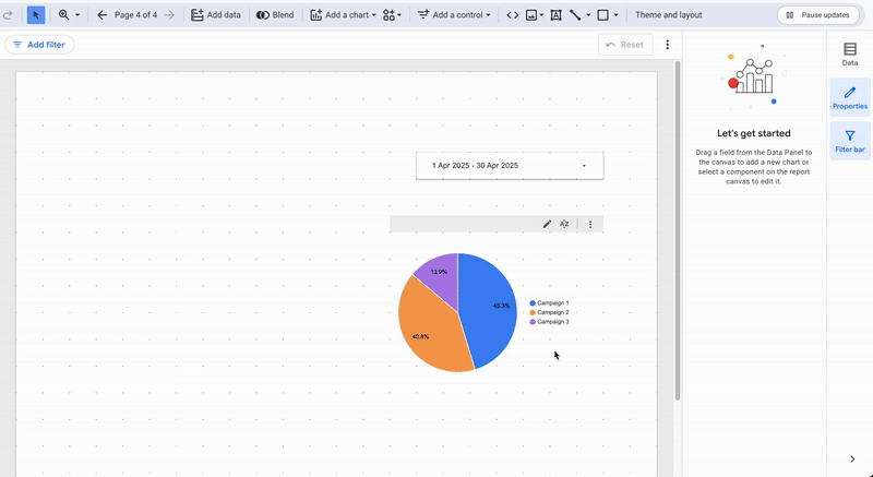
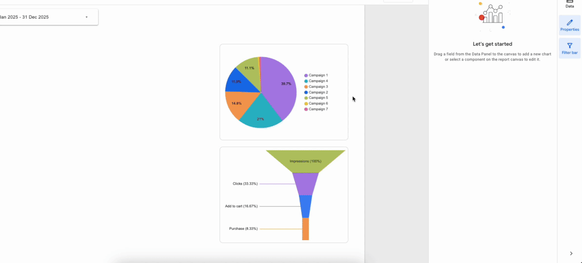
Pie and Funnel Charts
Pie and funnel charts are based on proportions, so color harmony and visual hierarchy are key. Aligning the segment colors with those used in other visuals across your report improves overall readability and consistency. For funnel charts, use smooth transitions and a clear size hierarchy between stages to make the flow intuitive and easy to interpret.
Example of pie and funnel charts
Tables
Tables play a key role in structuring and presenting detailed information. In Data Studio, you can customize header styling, row colors, and borders to make data easier to scan. Give column headers a slightly contrasting background and clear typography to visually separate them from data rows. Enabling alternating row colors helps guide the eye across wide tables, while subtle borders or shading maintain structure without clutter.
Tip: You can double-click the line between two columns to automatically adjust their width, just like in Google Sheets or Excel.
Example of a table customization

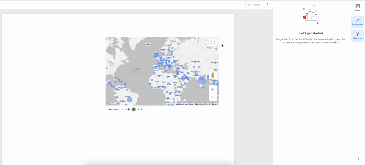
Maps (Geo Chart, Google Maps)
Maps need a balance between clarity and context. Combine data layers (bubbles, background, boundaries) to ground values geographically, and scale marker size according to the metric so patterns stand out without clutter. Manage zoom and interactions to guide the reading path rather than scatter attention; a controlled viewport keeps comparisons meaningful.
Example of map customization
Other visualizations
Treemap, Sankey, Gauge, Bullet, Timeline, and Scatter each serve specific use cases and benefit from disciplined styling. Maintain sufficient contrast to distinguish flows, levels, or categories, and avoid decorative effects that don’t add meaning, simplicity serves the data. Align legends and relative sizes with the rest of the report so comparisons remain effortless.
Conclusion
A well-designed report relies on a consistent and thoughtful style that enhances both readability and comprehension. Data Studio (formerly Looker Studio) offers a wide range of visual customization options that bring your data to life, from colors and typography to borders, spacing, and chart adjustments. Applying these settings carefully improves the visual appeal of your dashboard, strengthens its credibility, and encourages user adoption. A cohesive visual identity helps readers focus on insights rather than interpretation, making your report clear, professional, and engaging.

