How to choose the right chart in Data Studio (formerly Looker Studio)
Discover all the available charts and cards in Data Studio (formerly Looker Studio). Learn when to use each visualisation, how to configure them, and best practices to choose the right chart for your data.
If you've ever felt a bit lost staring at all the charts options in Data Studio (formerly Looker Studio), you're not alone. Picking the right visualisation can make the difference between a dashboard that's clear and one that's confusing. In this guide, we will walk through the main chart types in Data Studio, when to use them up.
Getting started
Before exploring the full list of charts available on Data Studio, you must have:
- Set up a Data Studio account
- Connect a data source
- Create a report
Also, we'll talk about data type through this lesson, so keep this in mind:
- Dimensions = categories (e.g., Country, Campaign)
- Metrics = numbers (e.g., Sessions, Revenue)
- Most charts need 1 dimension + 1 metric
We’ve already created a full lesson on fields in Data Studio, which you can check out for a deeper dive into these concepts.
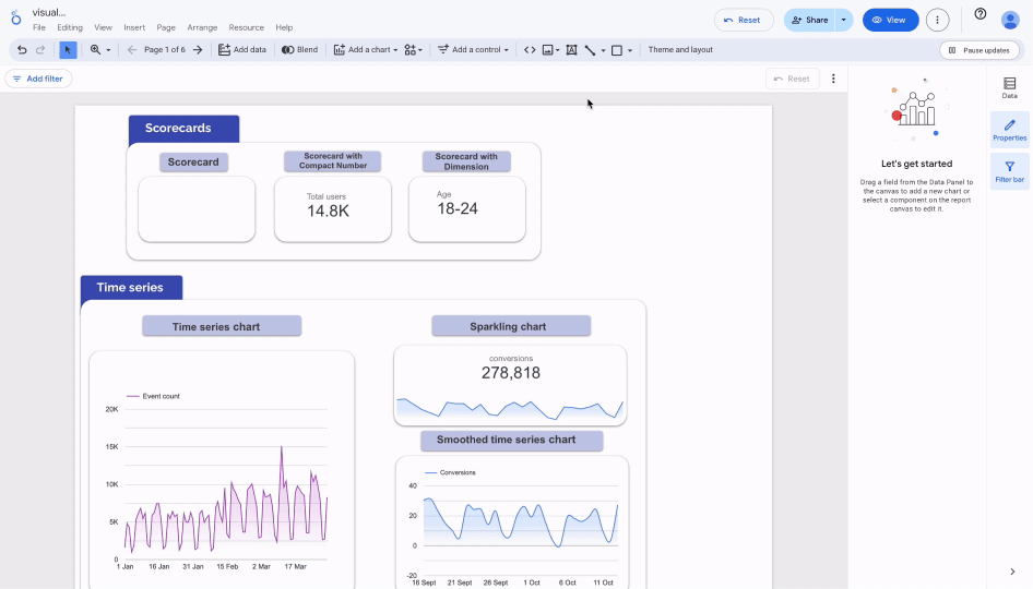
How to add and modify a visualisation
To get started, you can add a charts in Data Studio as follows:
- Go to the toolbar at the top of your report.
- Click on Add a chart (chart icon).
- From the drop-down menu, choose the chart type you want. For example: time series, table, or bar chart.
4. Click anywhere on your report canvas to place the visualization.
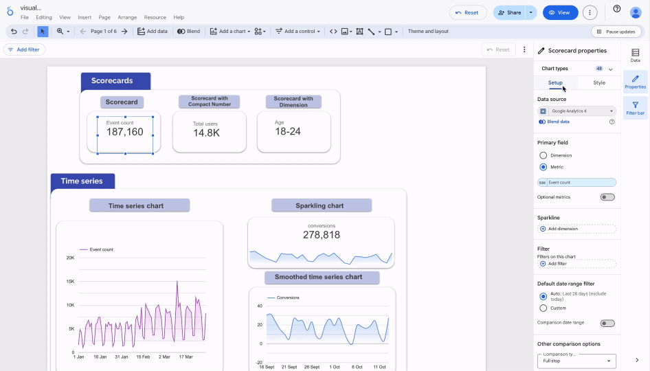
And to modify your charts:
- Click on the chart you want to edit.
- On the right-hand panel, you’ll find two tabs:
- Setup → to configure your data source, dimension(s), and metric(s).
- Style → to adjust colors, fonts, labels, legends, and display options.
Common chart types
Now let's discuss Data Studio charts. Each chart has unique traits and applications. To help you understand when they are most helpful, we will define and explain them.
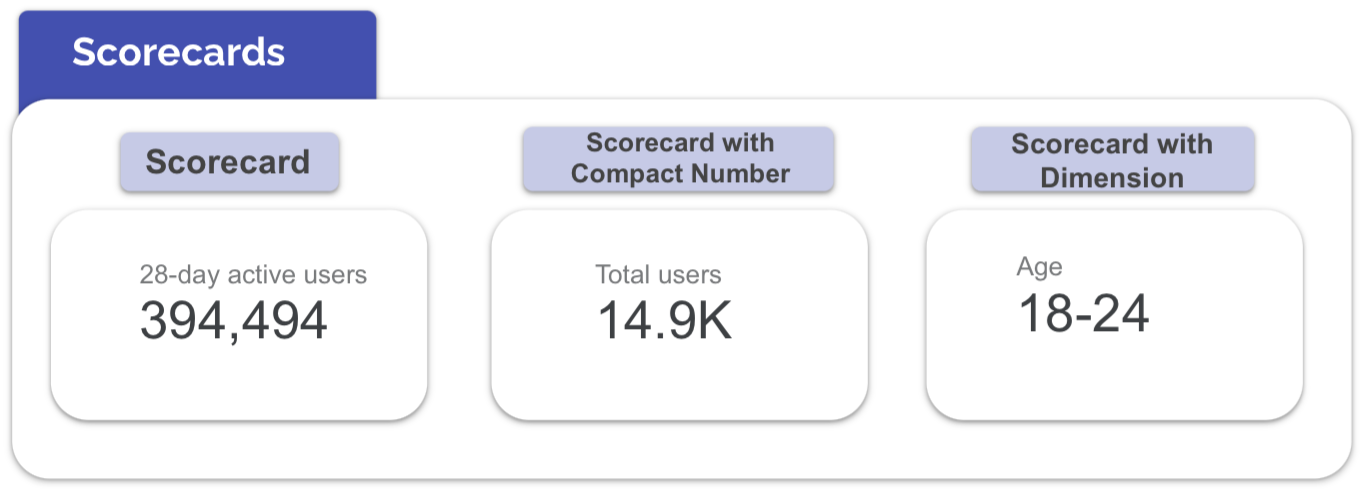
Scorecards
What is it?
A scorecard is the simplest type of visualization. It’s a small card that shows one important number (for example: total revenue, conversions, or CTR).
What is it for?
It’s used to highlight key performance indicators (KPIs) that matter the most. A scorecard makes sure the main number is immediately visible.
How to use it?
- Connect it to a metric (e.g., revenue, clicks, sessions).
- The value can be displayed as a sum, average, or count.
- You can also add a comparison field (with an arrow or percentage) to show if the number went up or down compared to the previous period.
When to use it?
- In an Ads report to show spend, revenue, or cost per conversion.
- In an SEO report to show total clicks, impressions, or CTR.
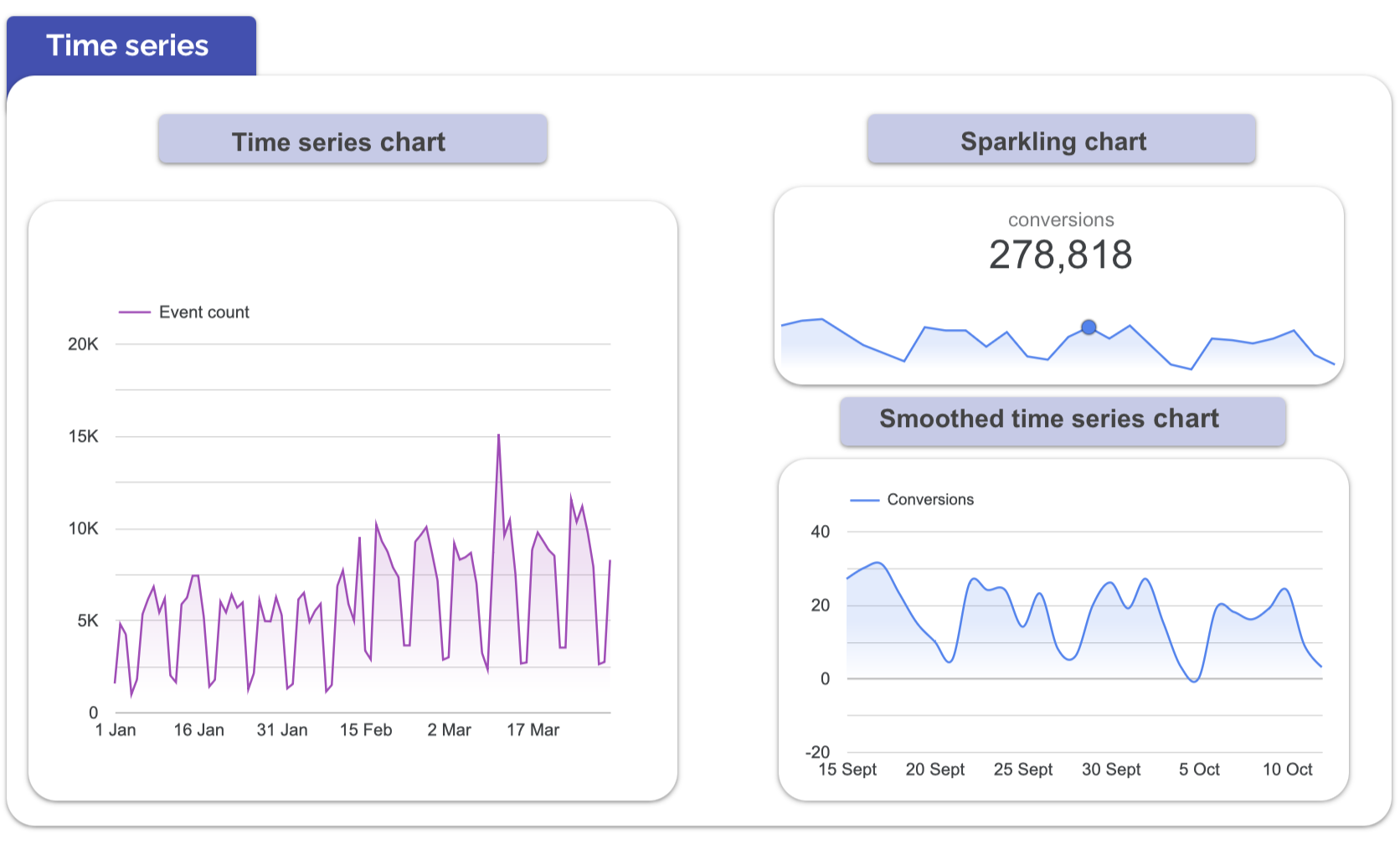
Time Series
What is it?
A time series is a chart that shows how a metric changes over time. It usually displays values along a timeline, making trends easy to see.
What is it for?
It helps you identify patterns, seasonality, or sudden spikes in your data. This makes it easier to understand whether performance is stable, growing, or dropping.
How to use it?
- Set a date field as the dimension (day, week, month).
- Add one or more metrics (e.g., ad spend, conversions).
- Choose the right type of time series:
- Combo Chart → mix bars and lines for extra context.
- Area Chart → highlight the volume of activity over time.
- Time Series with breakdown → compare multiple campaigns or categories.
When to use it?
- Campaign tracking: to monitor daily ad spend vs. conversions and spot ROI trends.
- Website traffic: to track sessions or users by day/week and see growth or seasonality.
Category comparison
What is it?
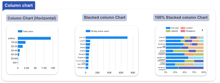
Bar and column charts are among the most common visualization types. They let you compare categories side by side, making differences easy to see.
What is it for?
They are great for spotting performance gaps and answering questions such as:
- Which campaign performed best?
- Which channel needs more attention?
How to use it?
Choose a categorical field (for example: campaign, age group, or country) as the dimension. Then assign the metric you want to measure (such as conversions, revenue, or ad spend).
There are three main types of bar or column charts, each serving a different purpose:
- Simple bar/column chart: used for straightforward comparisons between categories.
- Stacked bar/column chart: adds an extra dimension by showing the breakdown of categories within each bar.
- 100% stacked bar/column chart: compares the relative proportions or percentages across categories.
Depending on your data, you can use columns (vertical) or bars (horizontal) for better readability.
When to use it?
Bar and column charts work best for:
- Ranking campaigns by conversions.
- Comparing ad spend across channels.
- Breaking down audiences by country, device, or demographic.

Composition
What is it?
Pie and donut charts show how different categories contribute to a whole. Each slice represents a proportion of the total, making it easy to see relative shares at a glance.
What is it for?
These charts are commonly used to highlight distributions such as:
- Website traffic by source (organic, paid, social, direct).
- Device split between desktop, mobile, and tablet.
- Sales breakdown by product line or service category.
How to use it?
Assign a categorical dimension (like source, device, or product type) and a metric (such as sessions, sales, or revenue). The chart will calculate and display the proportion of each category compared to the total.
When to use it?
Use pie or donut charts when you want to show composition rather than performance ranking. They work best with only a few categories ideally no more than five to seven slices. More than that and the chart becomes cluttered and hard to read.

Correlations
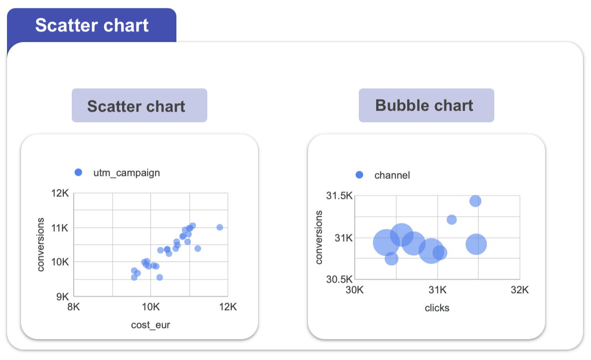
What is it?
Scatter plots are visualizations that show the relationship between two metrics. Each point on the chart represents a data entry, plotted according to its values on the X and Y axes.
What is it for?
They are ideal for exploring correlations and spotting patterns such as:
- Does higher ad spend lead to more conversions?
- Does bounce rate decrease as session duration increases?
How to use it?
Assign one metric to the X-axis and another to the Y-axis. Each dot will then represent a value pair. You can also add a dimension (like campaign or country) to label or color the points for extra context. And by assigning a third metric to control the size of each point, your scatter plot becomes a bubble chart, allowing you to visualize three variables at once.
When to use it?
Scatter plots are most useful when testing cause-and-effect assumptions or analyzing the strength of a relationship between two metrics. To make patterns clearer, add a trend line to highlight the overall correlation.
Tables & Pivot Tables
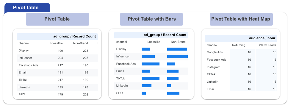
What is it?
Tables and pivot tables are data visualizations that focus on details rather than shapes or charts. A standard table lists information row by row, while a pivot table lets you summarize data across two axes for example, by region and sales channel.
What is it for?
They are essential when you need a comprehensive view of raw data or want to compare multiple KPIs side by side. Unlike simple scorecards or charts, tables allow you to display several metrics at once.
How to use it?
A regular table displays your data in a simple, structured format. Choose your dimensions (like campaign name, country, or date), these will appear as rows, and your metrics (such as impressions, clicks, CTR, or conversions), which will appear as columns.This layout makes it easy to read and compare key performance indicators across categories. A pivot table goes further by letting you cross two dimensions (e.g., region × sales channel) to see combined results.
When to use it?
- Showing campaign KPIs together: impressions, clicks, CTR, and conversions per campaign.
- Summarizing results by two categories (for instance, product line by region).
- Presenting data to users who need to export or drill into details.

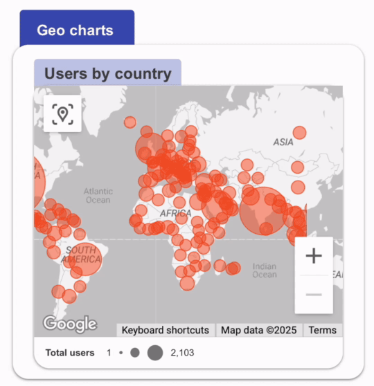
Geography
What is it?
Geo charts and geo maps display your data on a map, making it possible to see how performance varies across locations.
What is it for?
They are perfect for analyzing metrics where location is important, such as sessions by country, sales by region, or conversions by city.
How to use it?
You’ll need a geographic field (like country, city, or postal code) as your dimension, and a metric to measure (sessions, sales, CPC, users, etc.). Data Studio can then apply a color scale or bubble size to represent intensity.
When to use it?
- Comparing performance at a high level with a Geo Chart (e.g., sessions by country).
- Zooming into smaller areas with a Geo Map, which allows local targeting insights down to cities or postal codes.
- Visualizing ad performance, like CPC by country, or spotting sales hotspots by region
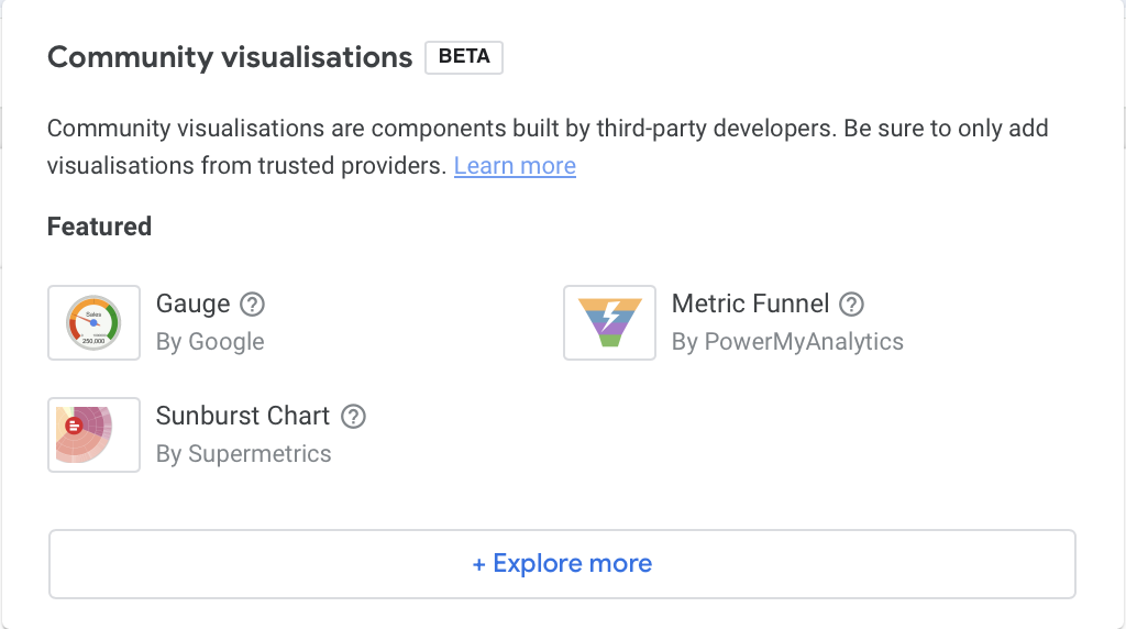
Community Visualizations
Beyond the built-in chart types, Data Studio also supports Community Visualizations. These are custom visualizations created by third-party developers, which extend the capabilities of your reports. They can include charts like gauges, bullet charts, Sankey diagrams, waterfall charts, or word clouds (depending on what developers build).
Use them to bring fresh visual styles or special chart types not included natively. But remember: community visualizations are maintained by external developers, so always test them for performance, data accuracy, and compatibility before using them in production dashboards.
Best practices
A good Data Studio (formerly Looker Studio) report should remain clear and focused on the essentials. Avoid overloading your pages with too many charts: every visualisation must answer a specific question and provide useful insight. It’s better to prioritize clarity and consistency to guide the reader, rather than multiplying visuals that might dilute the message.
Quick checklist
- Each chart should answer one clear question
- Limit the number of visuals per page to keep focus
- Use consistent colors, scales, and labels
- Prioritize readability over design effects
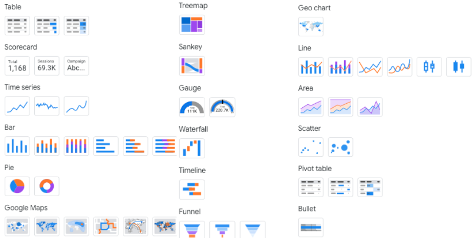
Full chart list available on Data Studio
Before choosing a chart, clarify what you want to show. Your objective will naturally determine the most relevant chart type and example to use.
Conclusion
Data Studio gives you a wide range of options to bring your data to life. The most effective dashboards are simple, consistent, and purposeful each chart should answer one clear question. When in doubt, start with the fundamentals: scorecards to highlight key KPIs, time series to track changes over time, bar or pie charts to compare categories, and maps to show geographic impact.
Always keep the audience in mind. Whether you’re reporting to executives, marketing teams, or operations and choose the visuals that best support their decisions. Don’t hesitate to experiment with different chart types, but avoid clutter and focus on clarity. With the right combination of visuals, your dashboards evolve from static reports into interactive tools that drive real understanding and actionable insights.

