Guide for using reference lines and bands
Learn how to use reference lines and bands in Looker Studio to highlight goals, trends, and thresholds directly within your charts.
Sometimes a chart needs more than just data points, it needs a point of reference. Reference lines and bands let you anchor your visuals to goals, averages, or limits directly in Looker Studio.
In this lesson, we’ll explore how to use them effectively to add meaning and context to your charts.
What are reference lines and bands on Looker Studio
Reference lines and bands are visual markers that you can add to Looker Studio charts to highlight a threshold, an average, a goal, or a specific range of values directly within the visualization.

Types of values
Reference lines and bands are based on fixed values defined by the user.
Here’s how they work:
- Reference line: a single fixed value where the line will be placed.
- Reference band: a defined range of values that highlights a specific area on the chart between two chosen points.
These values can be based on:
Compatible Charts
This feature is available for all Cartesian charts (those with X and Y axes). More specifically, it’s supported in Time Series, Line Charts, Bar Charts, Area Charts, and Scatter Plots.
Step-by-Step Setup
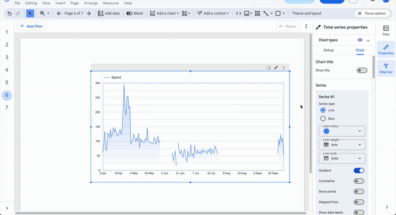
You can access this feature in the Style tab of any compatible chart, under the Reference lines section.
- Click Add a reference line or Add a reference band, depending on your need.
- New options will appear, allowing you to choose:
- Which axis the reference applies to (X or Y)
- The type of value (fixed, metric, or parameter)
- The actual value
- For reference bands, you’ll also need to define an Ending value (type and value).
Customization
Looker Studio lets you fully customize your references:
- Adjust the thickness, style, and color of your reference line(s).
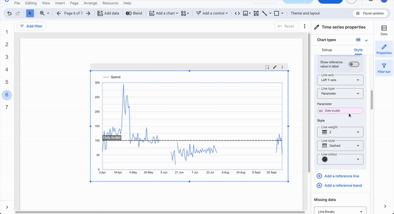
- Add a label to your reference and choose whether or not to display it.

- For reference bands, you can also change the fill color and opacity of the shaded area.
Common Marketing Use Cases
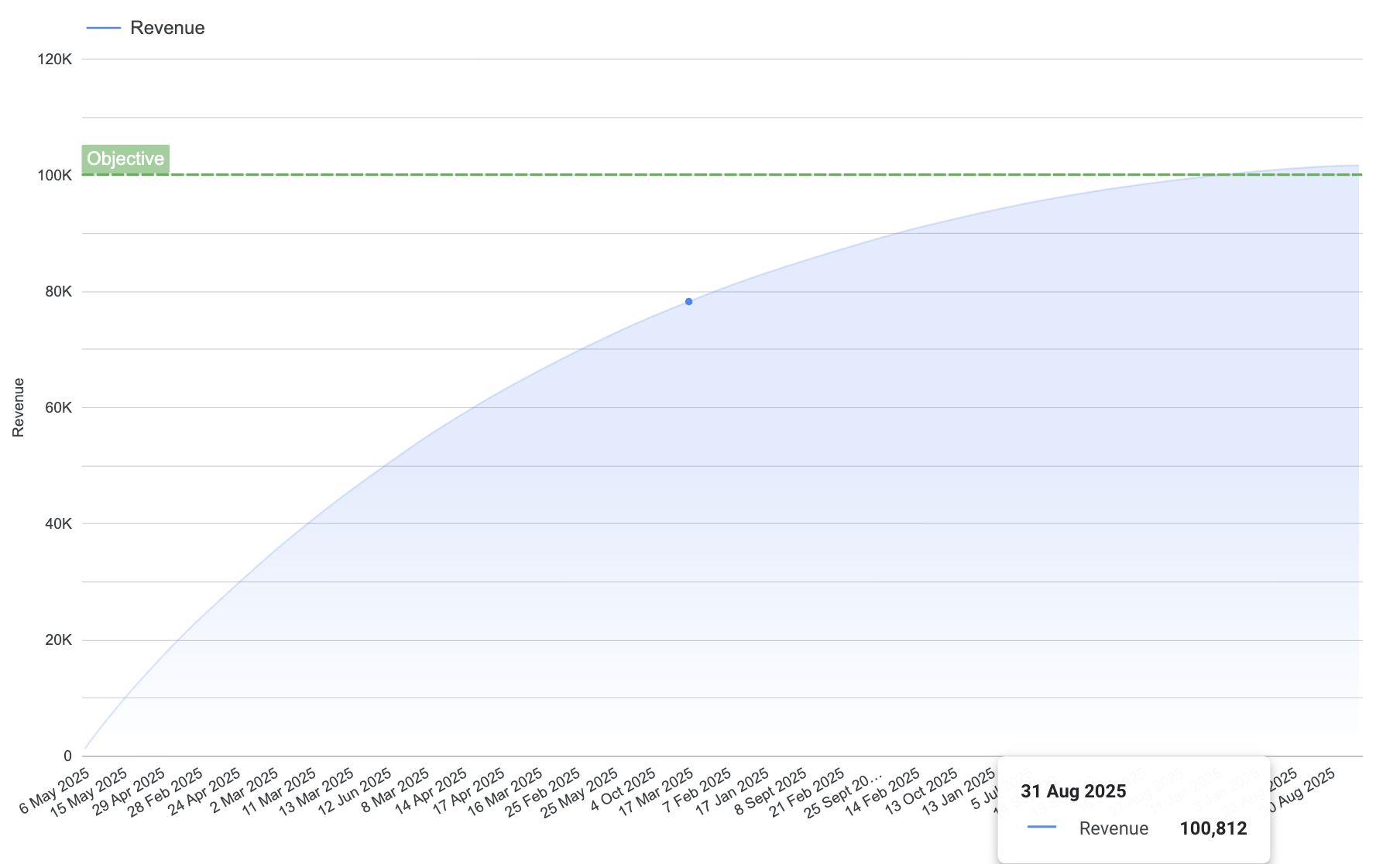
Performance Tracking
The goal here is to clearly visualize the gap between actual performance and the target value.
The user selects a Line Chart or Bar Chart and adds a reference line based on a fixed value, for instance, a target of 10,000 conversions or $100,000 in revenue.
He enable the label display, rename it to Objective, and style it according to the message it conveys (green for positive, red for negative, gray for neutral).
This setup allows you to instantly compare actual performance to your target without reading every number. The differences stand out visually, encouraging more result-driven discussions.
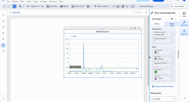
Trend Analysis
The goal here is to identify variations above or below the overall trend.
The user selects a Line Chart and adds a metric-based reference line using the Average of the observed field.
To analyze campaign CPC trends, the user display a Line Chart with CPC by date and add a reference line of type Metric → Average(CPC). This line automatically adapts to the dataset, selected date ranges, and applied filters.
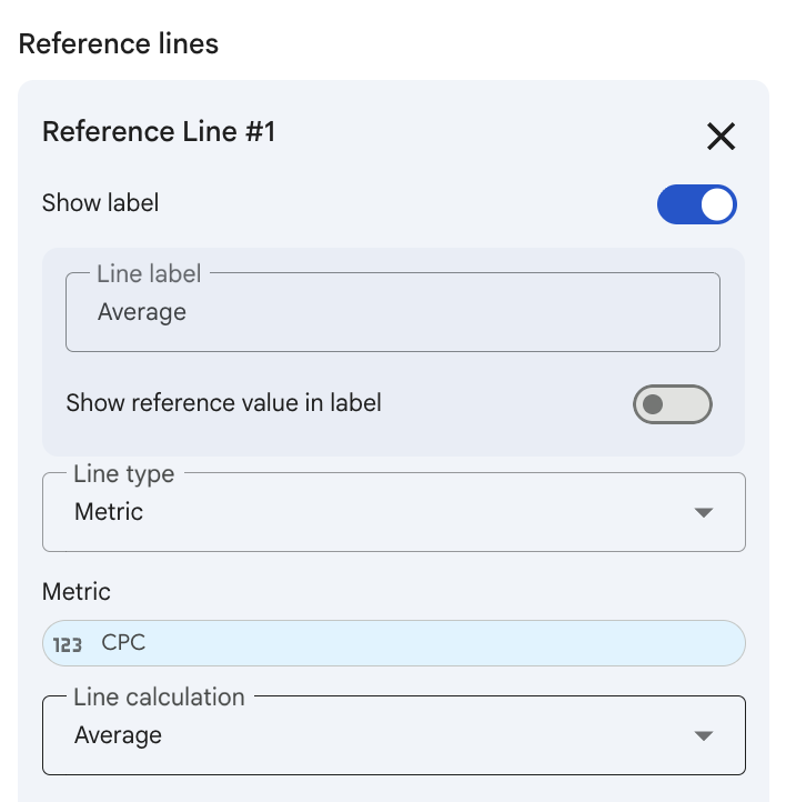
This line acts as a visual reference that helps you detect deviations or outliers in your data without manually reviewing each point.
KPI Reading
The goal here is to provide an immediate visual cue about the profitability of a key indicator.
The user selects a Bar Chart or Line Chart and adds several reference bands such as:
- Red band: ROAS < 1 → not profitable
- Amber band: ROAS between 1 and 3 → acceptable
- Green band: ROAS > 3 → highly profitable
This setup effectively turns your chart into a decision-support dashboard.

Conclusion
The reference line and band feature is a simple yet powerful tool for highlighting key data points, monitoring trends, tracking performance, identifying anomalies, or applying KPI thresholds to Cartesian charts.
It’s a well-rounded feature, and when used thoughtfully, it helps transform Looker Studio from a pure reporting tool into a real analytical companion.
