Conditional Formatting in Data Studio: meaning & practical guide
Easily spot trends and outliers in Data Studio (formerly Looker Studio) using conditional formatting. Learn how it works, explore the options, and set it up step by step.
When every number looks the same, it’s easy to overlook what truly matters. Conditional formatting helps you quickly spot key changes and patterns, transforming plain data into clear visual insights.
In this lesson, you’ll learn what conditional formatting is, how and where to use it, explore common rule types, and discover how it can make your marketing reports easier to interpret.
What is conditional formatting in Data Studio?
Conditional formatting is a feature that lets you change how a cell or table row is displayed. It highlights data based on rules (thresholds, gaps, statuses) to make key metrics easier to read, guide prioritization, and help avoid misinterpretation.
Supported components & alternatives for Conditional Formatting
Main compatible components
There are two main component families that support this feature:
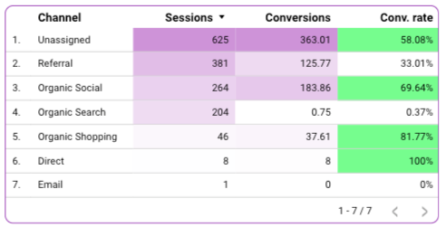
- Tables (simple and pivot): Use them when there’s a clear action threshold (e.g., ROAS < 1, CPC > target, Spend/Budget > 110%), when you need to quickly prioritize actions (highlight rows to handle, Top/Bottom performers, SLA breaches, “at risk” status), or when volumes vary greatly (heat map). You can also use it when data quality needs to be flagged (missing fields, duplicates).
- Scorecards: Use these when monitoring a specific threshold or tracking a binary or critical KPI.
Alternatives when not supported
For other components that don’t support conditional formatting, you can rely on Data Studio’s Color by dimension values option to customize colors based on segments, groups, or selected dimension values. You can check out our article on styling in Data Studio if you want to learn more about Color by.
How to add Conditional Formatting
Setting up conditional formatting works the same way for a table and a scorecard, only the formatting options differ.
- Click on a chart (table or scorecard)
- Go to Style tab
- Click on Add formatting
- Choose the rules you need
Conditional formatting rules
Color Type
You have two options for color type:
- Single color – Apply a single color to a row or cell when the defined conditions are met.
- Color scale – Apply a gradient or multiple colors to rows or cells based on the conditions.
Format Rule
If you choose Single color
Select the field and the rule that will trigger the formatting.
Available rules:
- For metric fields: equal to, not equal to, greater than, greater than or equal to, less than, less than or equal to.
- For dimension fields: equal to, not equal to, empty, not empty, contains, does not contain, starts with, regex.
⚠️ Only metric fields are available for scorecards.
If you choose Color scale
Select the field to which the conditional formatting will apply. If you’re using a scorecard, this field is automatically selected.
Color and Style
If you choose a single color
First, decide whether you want to apply the color to the entire row or only to a specific field (no action needed if you're using a scorecard).
Then, you can set the text and background colors. A quick preview of your style will appear on the right.
If you choose a color scale
Start by choosing whether to apply the color to the entire row or a specific field (again, no action is needed for scorecards).
Next, you can either select a default color scale or customize it by adjusting each point individually. Additionally, you can modify the size of each point by choosing between numerical values or percentages and setting a specific value.
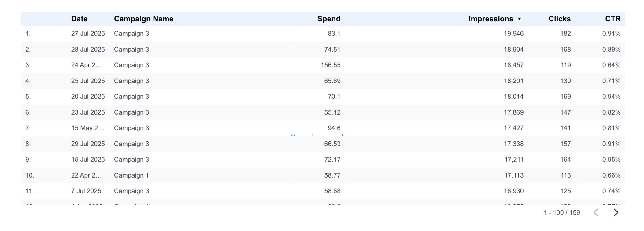
Example: Row color on CTR
We’ll apply conditional formatting to a table showing spend, impressions, clicks, and CTR for each campaign by day. Our arbitrary color rules are:
- Red for rows where CTR < 0.80%
- Green for rows where CTR > 0.80%
- Amber when CTR = 0.80%
These rules are just for demonstration, but you can adapt them and the KPIs you track as needed.
Here’s the table before applying the rules:
To apply the rules above, we’ll add three different conditional formatting rules:
- If CTR < 0.008 → light red background (#FDE8E8)
- If CTR = 0.008 → amber background (#FFF7E6)
- If CTR > 0.008 → light green background (#E8F7EE)
To do this:
- Select your table.
- Go to the Style tab in the right-hand panel.
- In the Conditional formatting section, click Add formatting.
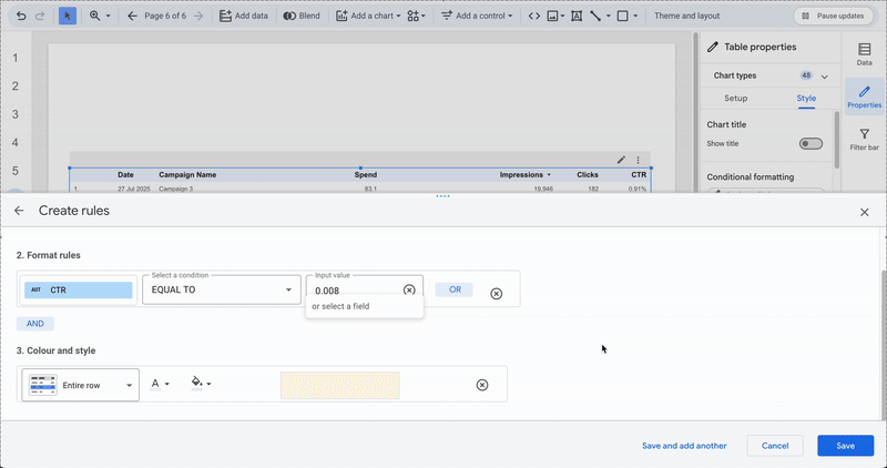
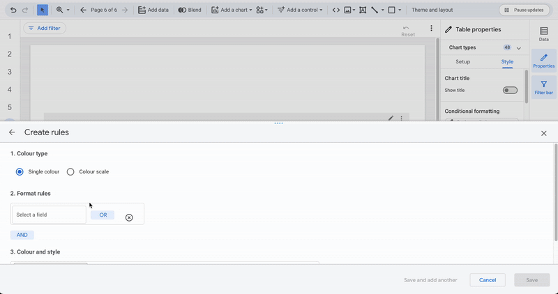
A central panel titled Create rules will open: this is where you configure your formatting rule for the first condition.
- Since we’re applying a color to specific values, select Single color under Color type.
- In Select a field, choose the field to compare (CTR in our example), set the comparison condition (for the first one, “LESS THAN”), and enter the value (0.008).
- Under Color and style, select Entire row, and set the background color (light red for this case). Save your rule.
Repeat the same process for the remaining rules.
Common marketing rules for conditional formatting
This dataset was used for the examples below. You can reuse it if you’d like to replicate them.
Fixed threshold
As seen earlier, you can format a row or cell based on a predefined threshold to easily spot rows that don’t meet your target.
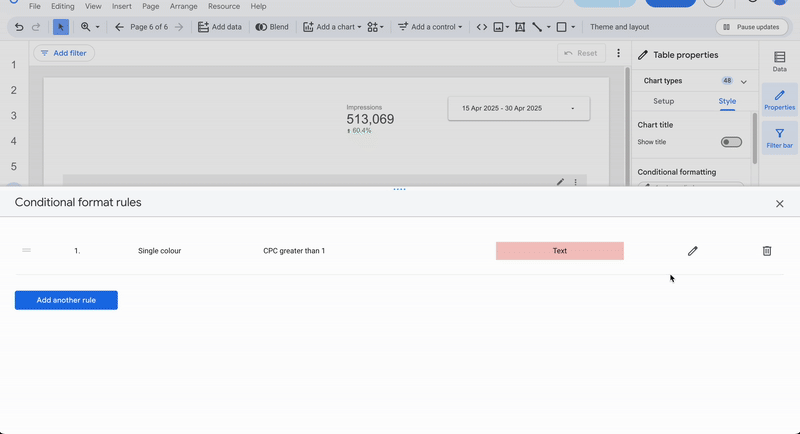
The user wants to track campaigns with CPC > €1 — those rows will be highlighted in red.
Goal deviations
If you want to compare two values, a Goal and a KPI, and calculate their variance, you can create a calculated field like (KPI / Goal) − 1.
This gives you the completion ratio relative to 1 (-1 = nothing achieved, 0 = goal met, > 0 = exceeded). Then simply add a rule to highlight the issue.
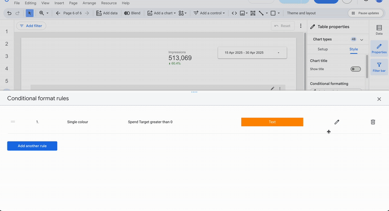
The user wants rows exceeding the daily budget to appear in orange. He create a calculated field Spend target = (SUM(Spend)/SUM(Campaign Daily Budget)) - 1, then add a rule that colors the background orange and text white when Spend target > 0.
Time variation
When working with datasets that have two states of the same source (e.g., before/after a strategy change, same fields but different date ranges, like in the tracking consistency example from our blending data article), conditional formatting can help highlight temporal changes.
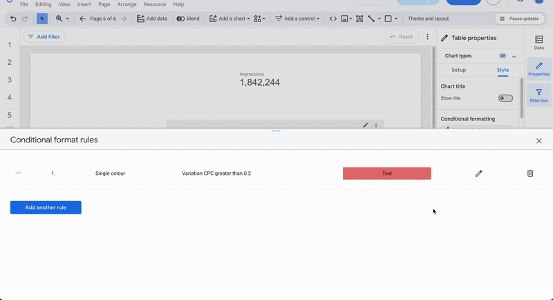
The user blends two sources, campaign data before and after a major strategy update, and wants to visualize CPC changes. He create a calculated field CPC Variation = (CPC After / CPC Before) - 1, and add a rule that colors rows red when CPC Variation > 0.2 (i.e., CPC increased by more than 20%).
Relative ranking
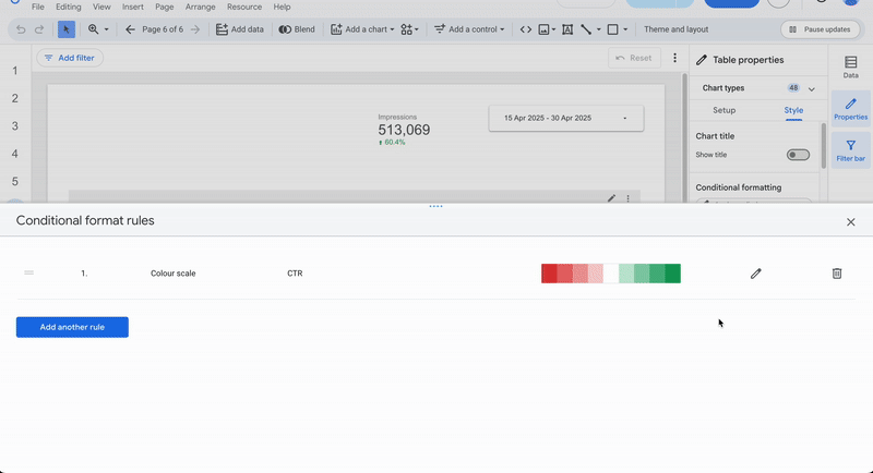
Sometimes you’ll want to visualize relative rankings to quickly identify what’s performing well or poorly. The Color scale type in Data Studio supports this.
The user wants to instantly see the bottom 10% CTRs in red and the top 10% in green. He create a rule with Color type = Color scale, select CTR, choose Entire row, and set:
- Point 1: Percent = 0 → Red
- Point 2: Percent = 10 → Transparent
- Point 3: Percent = 90 → Green
After saving, the top 10% campaigns appear in dark green, those approaching it in lighter shades, while the bottom 10% fade from dark to light red.
Dynamic rules
To make your rules easier to manage and more flexible, it’s often useful to rely on dynamic rules.
By combining parameters and calculated fields, you can simplify maintenance.
Example: CTR threshold parameter
Create the parameter (default value 0.8%) and calculated field
In our example, we have three rules defining whether the KPI is successful, failing, or exactly on target. The threshold value of 0.008 (0.8%) might change over time as your business evolves. If that happens, you’d have to update it in three different places, inconvenient and error-prone.
To fix that, first create a CTR Threshold parameter containing your chosen value. Then create a calculated field (e.g., CTR Threshold Status) that returns “above,” “below,” or “exact” depending on whether the CTR is greater than, less than, or equal to the parameter.

Next, add this calculated field to your table and update your conditional formatting rules to use it.
Now, changing the parameter value automatically updates all related rules, no need to edit them one by one.
Change the parameter from 0.8% to 1%
The user decide the new goal is 1%, he simply changes the CTR Threshold parameter from 0.008 to 0.01. The new configuration will instantly apply across all dependent calculated fields and formatting rules.

Limitations of conditional formatting feature
While conditional formatting is a powerful tool, it does come with a few caveats.
Too many rules can slow down rendering on large tables, or even the entire report if multiple visualizations update at once. Choose wisely where to apply it. If another Data Studio feature can achieve the same goal, use that instead.
Also, overlapping rules can conflict with each other. The last applied rule takes priority on any columns affected by multiple rules.
Finally, to keep your visuals clean and fluid, make sure your color palette stays consistent with your conditional formatting colors. Ideally, define your palette in advance and integrate the rules within it.
Conclusion
Conditional formatting is one of Data Studio’s most powerful features. It adds major clarity to your analysis and helps highlight data in ways that make sense for your specific needs. Its flexibility and broad coverage make it a must-use tool. Just be mindful not to overdo it, or you risk cluttering your visuals and slowing down performance.

