Aggregation and grouping in Power Query
Learn how to aggregate marketing data with Group By in Power Query, create summary tables, and prepare clean datasets for Power BI dashboards.
Marketing data is often very granular. A single export can contain thousands of rows at the keyword, ad, event, or transaction level. While this level of detail is sometimes useful, it’s not always what you need to build clear and readable dashboards.
Power Query allows you to aggregate and group data before it reaches your reports, so dashboards focus on the right level of analysis. In this article, we’ll explain what aggregation means in Power Query, when it makes sense for marketing teams, and how to use Group By to create clean summary tables for reporting.
What aggregation means in Power Query
Raw data vs aggregated data
- Raw data usually means one row per event or entity: one keyword, one search term, one conversion, one impression.
- Aggregated data summarizes that raw data at a higher level, such as campaign, channel, week, or month.
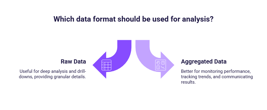
Neither approach is better by default. Raw data is useful for deep analysis and drill-downs, while aggregated data is often better for monitoring performance, tracking trends, and communicating results.
Aggregate before or after loading data in Power BI?
You can always aggregate data after loading it in Power BI, directly in visuals. However, this type of aggregation is applied chart by chart: it is mainly a reporting layer, and it does not change the underlying data structure. Aggregating in Power Query, on the other hand, creates a dedicated summarized table before the data is loaded, which can make dashboards simpler to build and easier to maintain when you rely on the same totals across multiple visuals.
- If you only need a quick chart, aggregate in the visual.
- If you need a reusable, consistent summary level across the report, aggregate in Power Query.
Why aggregate before building dashboards in Power BI
Aggregating data in Power Query helps marketing teams:
- simplify visuals and reduce clutter
- clarify KPI logic and reporting intent
- avoid repeating the same aggregations in every visual
- create datasets that are easier to understand and maintain
Aggregate with Group by in Power Query
The Group By is the way aggregation is done in Power Query. It lets you summarize data by one or more dimensions and apply simple aggregations like sum, average, or count. It’s one of the most useful Power Query features for marketing reporting. It allows you to summarize detailed rows into higher-level metrics such as campaign totals or weekly performance.
Common aggregation use cases for marketing reporting
Grouping by campaign or channel
Campaign-level aggregation is one of the most common needs in marketing reporting. Instead of analyzing data at the keyword or ad level, grouping by campaign or channel creates a higher-level view with total clicks, cost, and conversions. This makes it easier to compare performance at a glance, build cleaner tables and charts, and avoid repeating the same aggregations in multiple visuals.
Grouping by time (week or month)
Time-based aggregation is equally important. Daily data can be noisy and hard to interpret, especially for smaller accounts. Grouping data by week or month helps smooth fluctuations, standardize reporting periods, and build clearer trend dashboards that are easier to read and analyze over time.
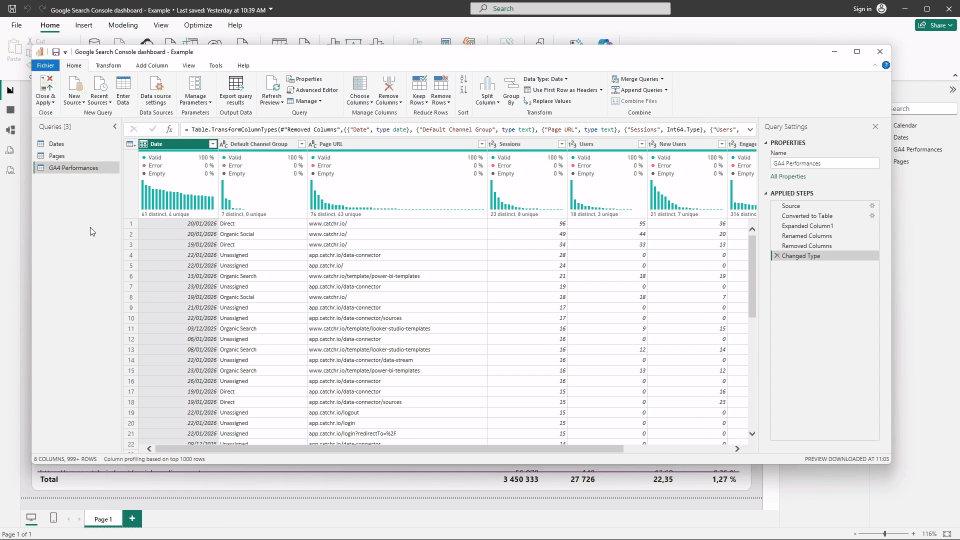
How to aggregate data with Group By (step by step)
To aggregate data in power Query, you use the Group by function. This create a summarized version of your dataset.
- Open Transform data to access Power Query.
- Select the query you want to aggregate.
- Make sure your columns use the correct data types (dates as Date, numbers as Decimal/Whole, etc.).
- Click Group By in the ribbon.
- In the Group By window, set:
- Group by: the dimension you want (Date, Week, Month, Campaign, Channel, etc.)
- New column name: a clear metric name (for example, Sessions)
- Operation: the aggregation you need (most often Sum)
- Column: the metric to aggregate (for example, Sessions)
- Add additional aggregations if needed (Cost, Conversions, Revenue, etc.).
- Click OK to apply the changes.
At this point, power Query generates a brand-new table. Only columns used for grouping and the aggregated metrics remain. All other columns from the original dataset are completely removed from this table. Thos behavior is expected and intentional.
Creating summary tables for performance dashboards
In many reports, it’s useful to have multiple tables with different purposes:
- one table with raw or detailed data for drill-down
- one or more summary tables for high-level dashboards
Power Query makes it easy to create these summary tables from the same source data, ensuring KPIs remain consistent while visuals stay simple.
This approach is especially effective for executive dashboards or recurring performance reports.
Best practices and pitfalls when aggregating with Group By
A best practice is to duplicate your query before using Group By. Aggregation creates a new summarized table and removes detail, so keeping a raw version is useful for drill-down while the aggregated version powers clean dashboards. This also helps avoid common pitfalls:
- aggregating too early and losing important dimensions
- grouping data without being clear about reporting intent
- mixing aggregated data with raw data in the same table
- double-counting metrics by applying aggregation twice
Key takeaways
Aggregation in Power Query is a design choice, not a requirement. Using Group By allows marketers to align their data with their reporting goals, whether that’s campaign-level performance, weekly trends, or high-level KPIs. By creating well-structured summary tables upstream, dashboards become easier to build, easier to read, and easier to maintain over time.
.svg)