Build an effective SEO Page in Looker Studio
Learn to build an SEO page in Looker Studio to track organic visibility, keyword rankings and page performance with the best KPIs, charts and tactics.
The SEO page helps you understand and measure your website’s organic visibility, how users discover your brand through search engines and how effectively those visits convert into actions.
Objectives of the SEO report page
The main objective is to identify which keywords, landing pages, and devices drive the most qualified traffic, while spotting opportunities to improve ranking, engagement, and conversion performance.
Which chart to use on your SEO page and why they matter
The SEO page should help you understand how your site performs in search results and how organic visitors interact with your content. Each chart must connect visibility, engagement, and performance, helping you identify what’s working and what needs improvement.
Scorecards
Scorecards give an instant overview of your main SEO metrics: Impressions, Clicks, CTR, and Average Position.
They’re the foundation of your SEO page and make it easy to track key visibility metrics at a glance, for example, seeing Impressions, Clicks, CTR, Average Position, and Sessions together instantly shows how your organic performance evolves. If clicks grow faster than impressions, your SEO relevance is improving; if CTR drops despite higher visibility, it’s time to optimize your titles or meta descriptions.

Time Series
This is the backbone of any SEO report, time series charts show how your search performance evolves.
For example, a chart showing Top Positions over time, such as Top 1, Top 5, Top 10, and beyond, helps you understand how many of your queries appear on the first pages of Google and whether that number is growing. It’s a powerful way to see if your SEO efforts are actually pushing your keywords into better ranking ranges. To understand more about adding a right axis to you chart Catchr provides you with a full lesson with tips and tricks.

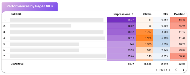
Table with conditional formatting
Tables are perfect for analyzing queries or landing pages in detail. They allow you to compare performance metrics like Impressions, Clicks, CTR, and Average Position side by side.
For example, a table showing Page Performance by Impressions, Clicks, CTR, and Position helps you quickly identify which URLs attract strong visibility but low engagement, or pages that rank well yet don’t generate enough traffic. This makes it easy to spot where title tags, meta descriptions, or content updates could improve click-through rates. To understand better conditional formatting here is a lesson that goes more in depth.
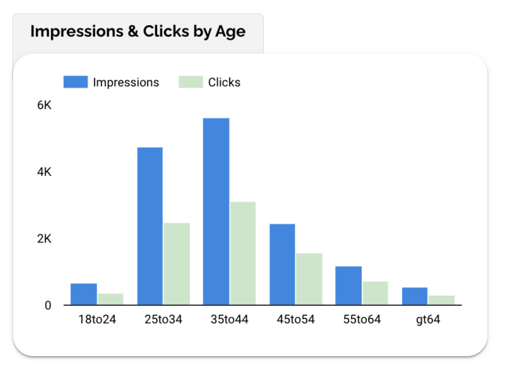
Bar chart
Bar charts help you understand which landing pages, audience, or content clusters generate the most organic clicks or conversions.
For example, a chart showing Impressions and Clicks by Age reveals which groups engage most with your organic results, younger users might generate visibility, while older ones show stronger click intent. This insight helps you adapt your content tone or focus topics that align with your most responsive audience.
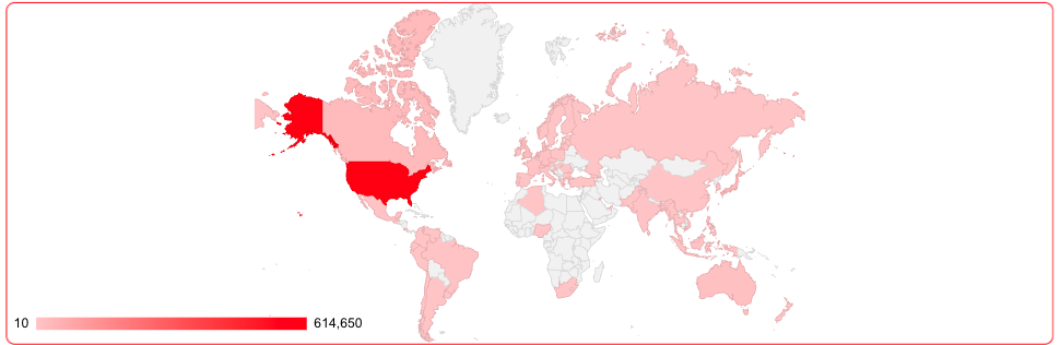
Geo Map
Geo maps visualize where your organic traffic comes from. They show Impressions, Clicks, or Sessions by Country or Region, helping you understand your website’s global reach and local SEO performance. For example, a map with Visits by Country highlights which markets bring the most organic visibility and which ones might need more localized content or optimization.
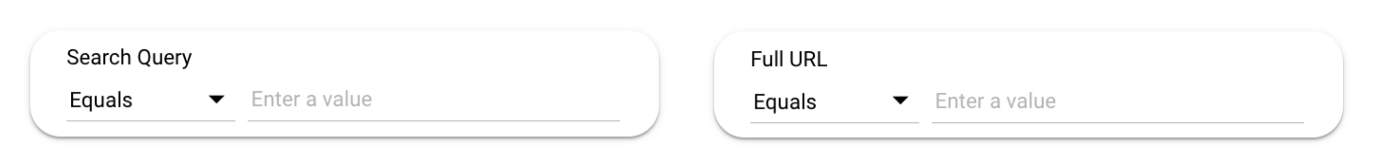
Controls
Controls make your SEO page interactive and adaptable, allowing you to explore data by search query or landing page without adding extra charts. For instance, by focusing on a specific keyword, page, or URL to see how it performs over time.
Start with a Date Range control, then add Query and Full URL controls like in this example. They help marketers analyze performance at both the keyword and page level, revealing which terms or URLs generate the most visibility and engagement.
For deeper insights, you can also include Device and Country controls to compare results between mobile and desktop, or across regions.
Best Practices
Your SEO page should make it simple to understand how your visibility evolves and where your growth comes from. The goal is clarity not to show everything, but to highlight what truly helps improve your search performance.
Start by organizing your dashboard by importance:
Place global performance metrics (Impressions, Clicks, CTR, Position) at the top, followed by trend charts to visualize ranking evolution, then detailed tables showing queries or pages. This hierarchy makes it easy to move from overview to action.
Avoid overloading your page with too many charts or keyword lists. SEO data can grow fast, focus on your top 10–15 queries or pages, and use controls (like Query or Full URL) to refine your view when needed.
When it comes to visual design, keep a consistent color scheme (for example, purple for visibility, blue for engagement). Use soft gradients or conditional formatting to highlight trends without cluttering the layout.
Lastly, always add context. Comparing your results with a previous period or annotating key events (like a Google algorithm update or a major site change) gives your data real meaning and helps you explain performance shifts clearly.
Start with a Looker Studio template
Catchr offers a range of ready-to-use Looker Studio templates specifically designed for acquisition reporting. You can connect your data and visualize your performance instantly without having to start from scratch. Instead of starting from a blank page, you can begin with a pre-structured dashboard such as :


After the trial, you can subscribe to continue syncing your data automatically or use the template as a foundation to build your own version with your current data sources. In either case, you will have a solid, well-structured starting point for your reports.
All templates are free to use and include a 14-day trial of Catchr’s connectors. This lets you explore and customize your reports before you subscribe.

