Build an effective Landing Pages & Content in Looker Studio
Learn how to track landing page performance in Looker Studio. Measure engagement, conversions, and device behavior to optimize your content strategy.
The Landing Pages & Content page helps you understand how your website’s pages perform once users arrive from the first interaction to conversion. It connects traffic, engagement, and SEO visibility to show which content resonates with your audience and contributes most to business goals.
Objectives of the Content/Landing page report page
This page is key for evaluating both UX and marketing performance: it helps identify which pages attract users, which ones keep them engaged, and which drive results.
In short, it shows what content works and why.
Which charts to use on your landing page and content page?
Each chart on this page should help you understand how visitors interact with your content: where they land, how long they stay, and what drives them to engage or convert.
It’s not just about tracking traffic volume, but about identifying which pages create meaningful experiences and which ones lose attention too quickly.
The right mix of visuals lets you analyze both the quantity of visits and the quality of engagement, giving you a complete view of your content’s true performance and its impact on your overall marketing goals.
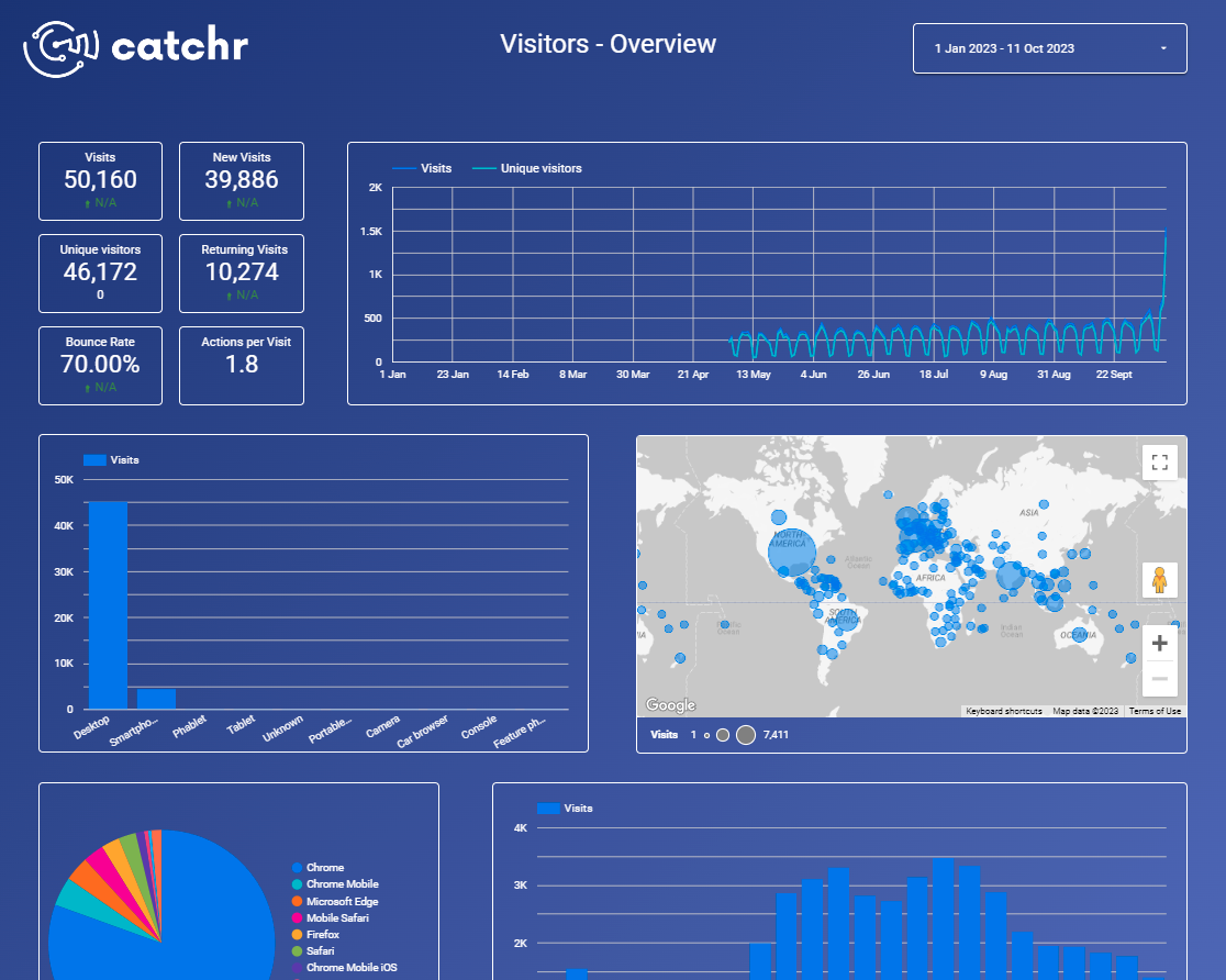
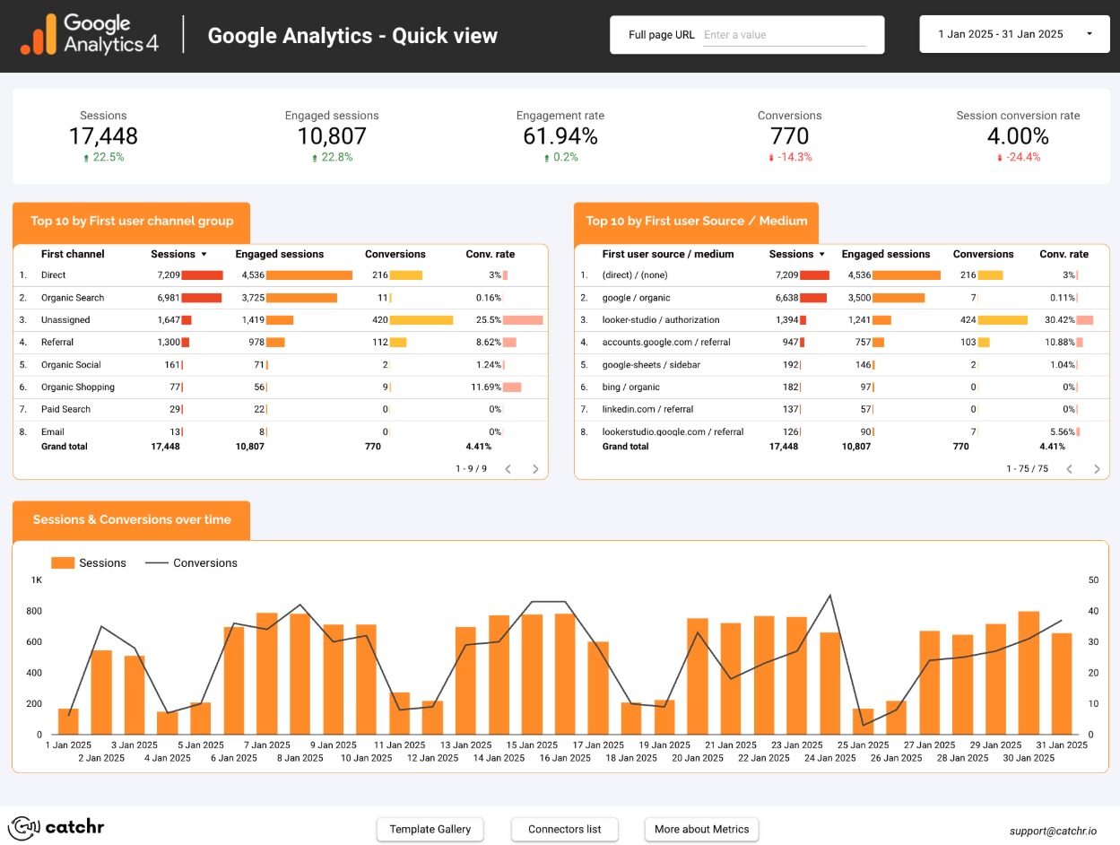
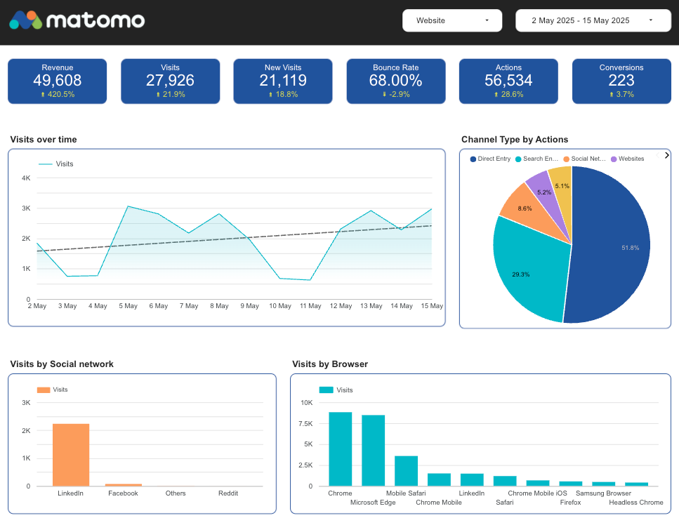
Scorecard
Scorecards provide an instant snapshot of how your site’s content performs overall.
Display key metrics such as Sessions, Engagement Rate, Average Engagement Time, and Conversions to get a quick sense of how your pages are performing.
For example, tracking Sessions, Engaged Sessions, Engagement Rate, and Conversions side by side gives a clear overview of both traffic quantity and quality. It helps you see if increased visits actually lead to deeper engagement or conversions, a crucial balance when evaluating landing page performance.

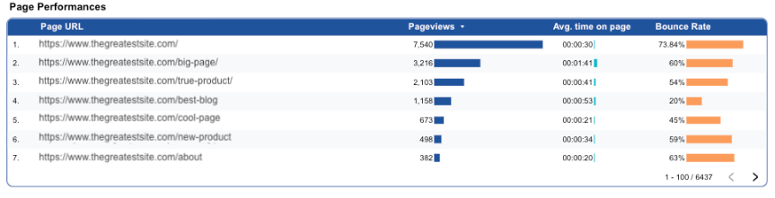
Tables
Tables are the chart you’ll encounter most often on these pages, because the goal here is to go deeper into performance details. They let you analyze each landing page with precision by combining multiple KPIs such as Average Engagement Time, Scroll Depth, Bounce Rate, and Conversion Rate. This makes it easy to identify which pages keep users engaged and which ones fail to retain their attention.
For example, a table showing Page URLs with Page views, Average Time on Page, and Bounce Rate helps you evaluate how effectively each page captures and retains user attention. It highlights which pages attract traffic but fail to keep visitors engaged, making it easy to spot where content or UX improvements are needed.
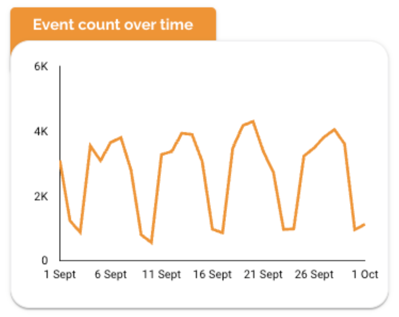
Time Series
Time series charts provide a good high-level view of how interactions evolve over time, but on this page they can feel too broad or imprecise. To make them truly valuable, it’s best to pair them with a control or filter that lets you focus on a single landing page, a group of pages, or even one specific event. Used this way, time series charts become precise and actionable rather than generic.
For example, a chart showing Event Count over time highlights peaks in engagement after publishing new content, launching campaigns, or updating a landing page.
It’s a great way to visualize when users are most active and how consistent your engagement is week to week.
Bar Charts
Bar charts are great for comparing engagement or visibility across user segments such as device type, gender, or age group.
For example, a chart showing Impressions and Clicks by Device reveals how your content performs on mobile vs. desktop, a critical insight when optimizing layout and readability.

Pie charts
Pie charts are ideal for showing how your landing page traffic is divided across key categories, like device type or acquisition source.
For example, a Device Type by Sessions chart quickly reveals whether most visitors browse on mobile or desktop, a key insight for optimizing layout and loading speed.

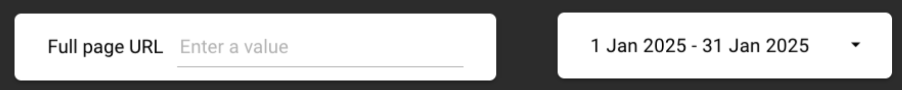
Controls
Controls make your Landing Pages & Content dashboard interactive and adaptable, allowing marketers to analyze performance from multiple angles without overloading the page. They offer the flexibility to focus on specific content, time periods, or user behaviors, essential for understanding what truly drives engagement and conversions.
You can use the following controls:
- Date Range
Date range is the most important control. It lets you compare performance before and after publishing new content or launching campaigns, making it easier to track impact over time.
- Landing Page
Allows you to analyze how each page performs in terms of traffic, engagement, and conversions. Ideal for spotting top-performing content or identifying pages that require optimization.
- Device
A key control for this page. It helps you understand how content performs on desktop vs. mobile, ensuring design and UX decisions are based on real user behavior.
- Source / Medium or Campaign
Lets you evaluate how users from different acquisition channels (email, ads, organic search, social, etc.) engage with your landing pages and content.
- Content Type or Event Name
Useful if your data includes events, goals, or content categories. It helps you isolate specific actions, such as video views, form submissions, or scrolls—to refine your content strategy.
Best Practices
When building your Landing Pages & Content dashboard, keep clarity at the center.
Start with simplicity: each visualization must have a single purpose, showing engagement trends, identifying top-performing pages, or explaining device behavior. Avoid duplicating KPIs or creating multiple tables that show the same thing. Instead, rely on one dynamic table that updates when filters such as landing page, content type, device, or traffic source are applied. This keeps the dashboard clean and efficient.
Maintain a strong visual hierarchy to guide the viewer instinctively:
- Place your key KPIs at the top (Sessions, Engagement Rate, Conversions) to answer what is happening.
- Follow with charts that explain why performance changes, for example, Engagement by Device or Performance by Content Category.
Make the design work in your favor.
Use a consistent, minimalist color palette where subtle contrasts highlight the most relevant insights rather than distract. Keep backgrounds neutral, ensure typography is coherent across titles and labels, and avoid decorative elements that don’t support comprehension.
Finally, use filters and controls to unlock deeper analysis without overwhelming the layout:
- Content Type
- Landing Page
- Device
- Traffic Source
- Date Range
This approach gives users flexibility while keeping the dashboard visually lightweight. The final result should deliver a quick understanding of performance, clear identification of high-value pages, and a straightforward path to optimization.
Start with a Looker Studio template
Catchr offers a wide range of ready-to-use Looker Studio templates that help you build acquisition and behavior reports instantly. Instead of starting from a blank page, you can begin with a pre-structured dashboard such as :
After the trial, you can subscribe to continue syncing your data automatically or use the template as a foundation to build your own version with your current data sources. In either case, you will have a solid, well-structured starting point for your reports.
All templates are free to use and include a 14-day trial of Catchr’s connectors. This lets you explore and customize your reports before you subscribe.
