Build an effective Paid Media Page in Looker Studio
Learn how to build a Paid Media page in Looker Studio that reveals ad performance, budget efficiency, and ROI, with KPIs, charts, and ready-to-use templates.
The Paid media page helps you track and understand how your advertising campaigns contribute to your brand's growth. It's designed to show which platform, audience, and creative drives real effective results, from visibility to conversions, while helping you control cost and maximize ROI.
Objectives of the Paid Media report page
The goal is to link ad spend with business impact, making it easy to see which channels perform best and where your marketing budget creates the most value.
Which charts to use on your paid media page and why?
Each chart on your Paid Media page should help you understand how your advertising budget performs, where you're spending, what results you're getting, and which campaigns or audience drive the most value. The goal is to keep visuals focused on performance, efficiency , and return on investment.
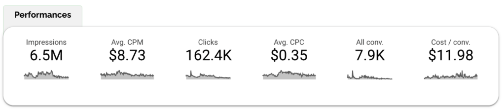
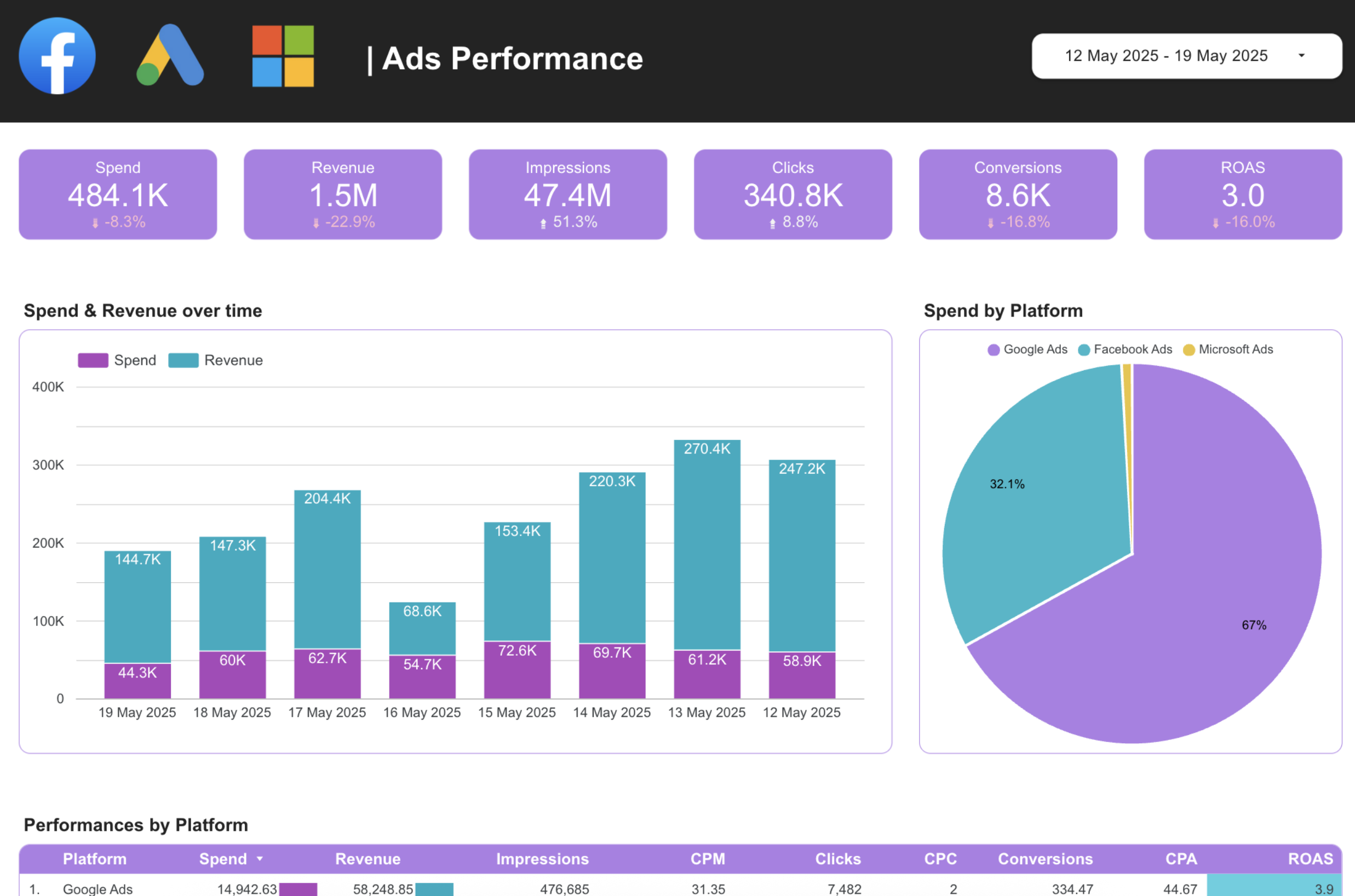
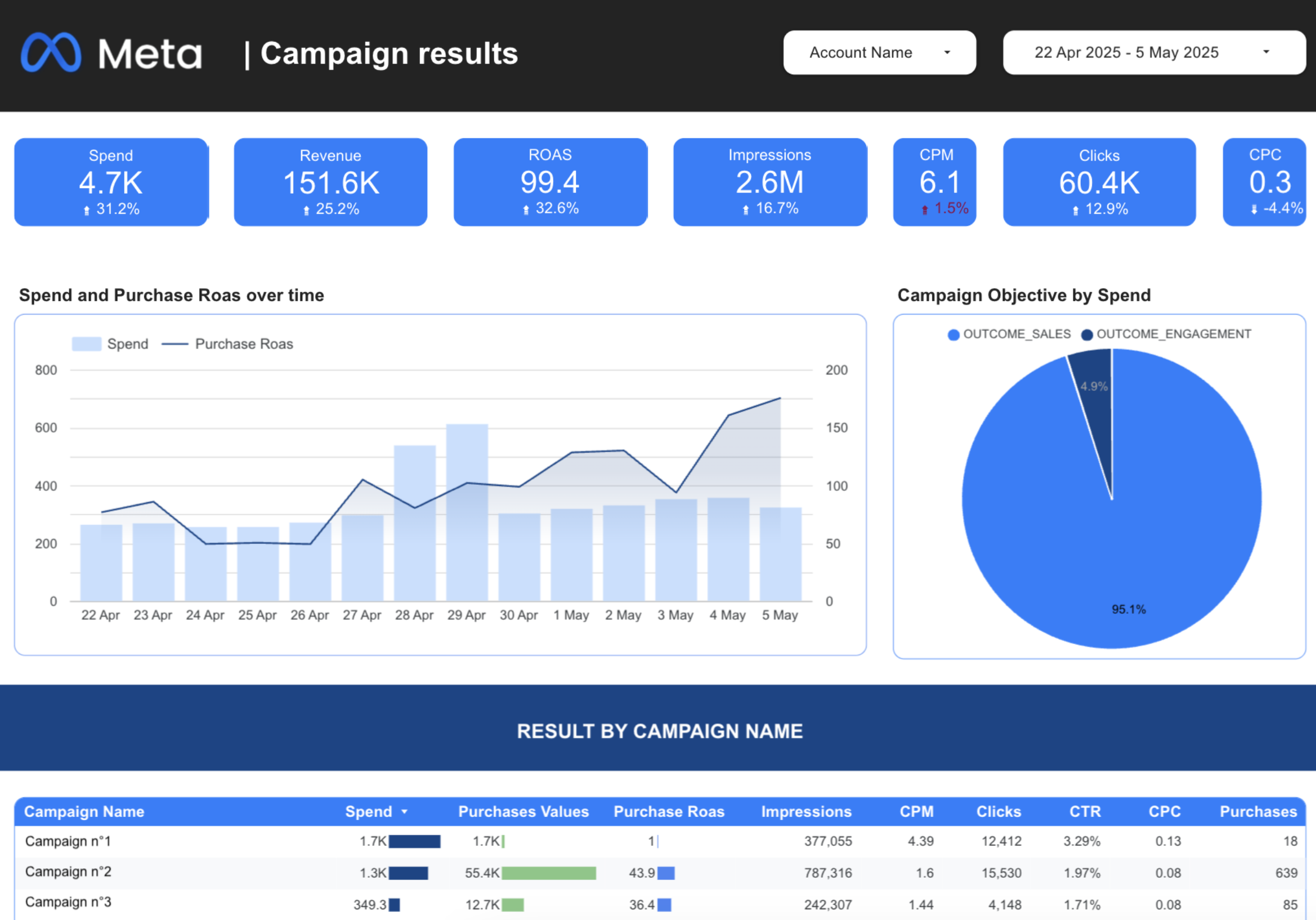
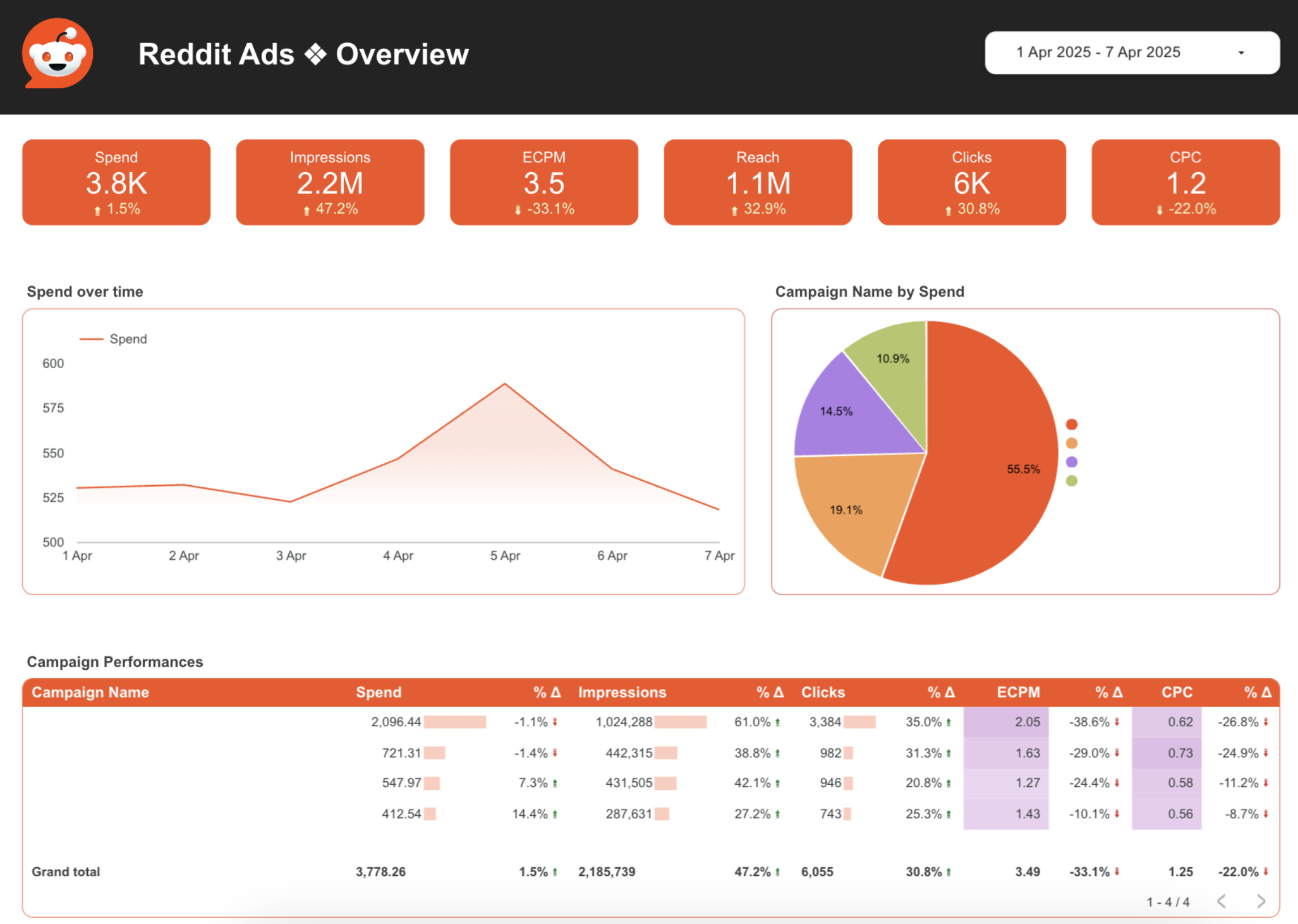
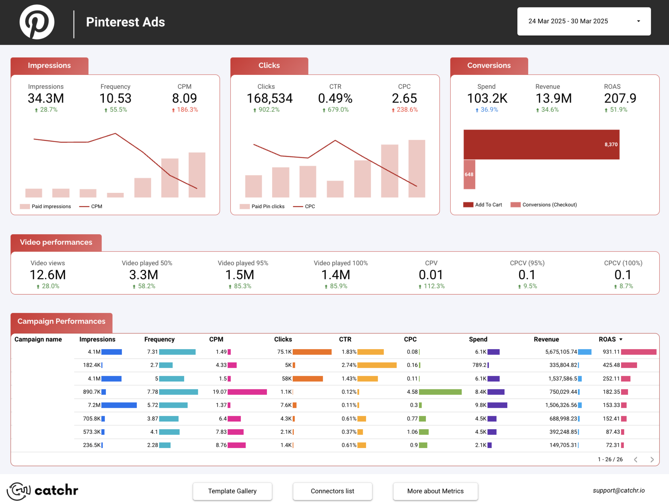
Scorecard
Scorecards are essential for any Paid Media report. They provide an instant snapshot of your key advertising KPI's like spend, conversion, CPA, or ROAS. Placed at the top of the page, they help you monitor budget efficiency and overall impact at a glance.
For example you can display the impression, average CPM, CPC and conversion. This mix provides a complete story: from visibility (impressions and CPM) to engagement (clicks and CPC) and results (conversions and cost per conversion).
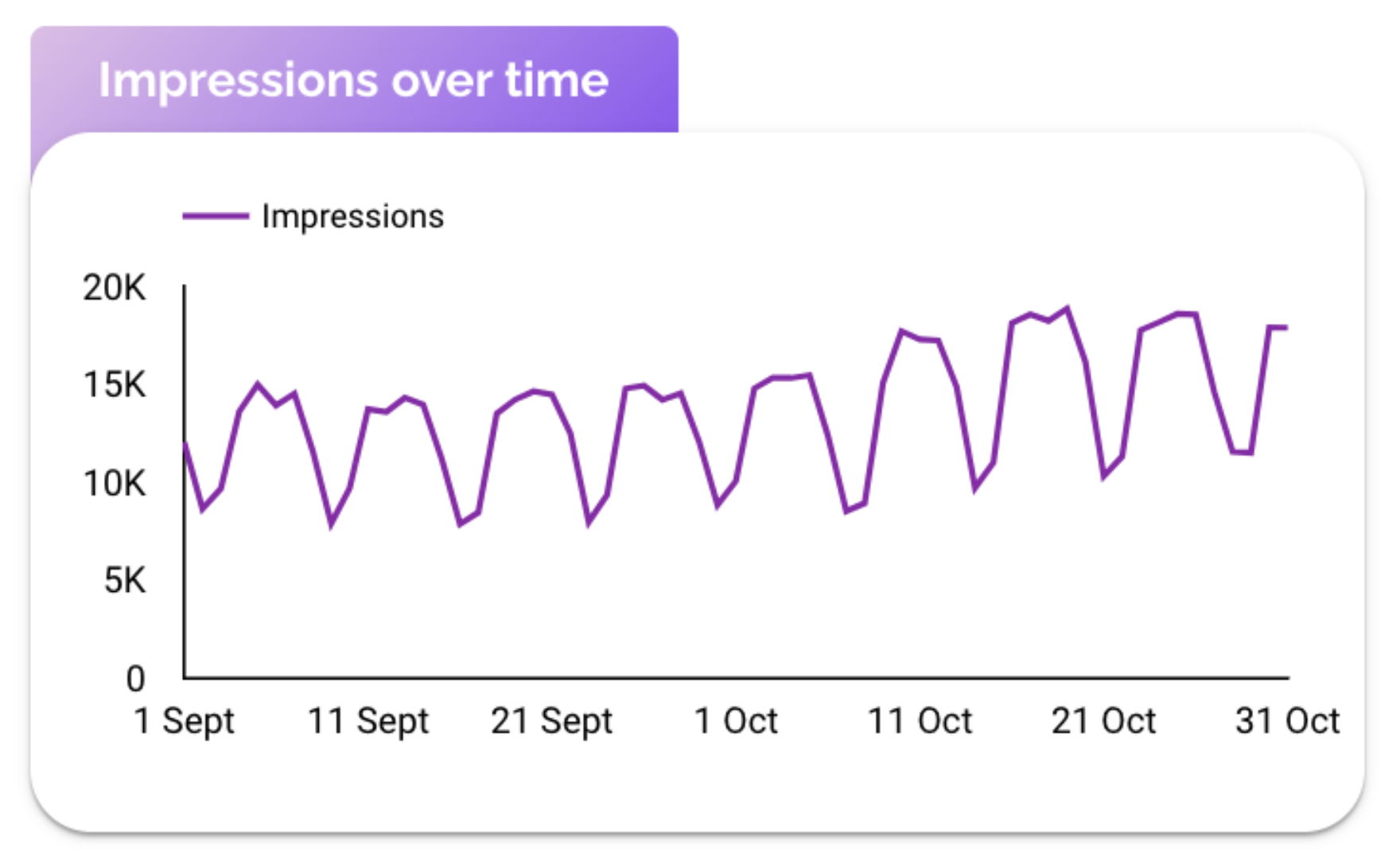
Time series
Time series charts help visualize performance trends over time, daily, weekly, or even monthly. They're perfect for tracking how spend, click, or conversions evolve during a campaign period.
For instance a chart showing Impressions over time helps you spot activity peaks and dips throughout your campaigns, making it easy to identify when visibility was highest and which days or weeks delivered the strongest reach.
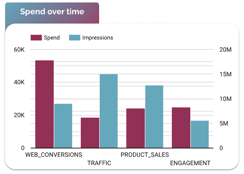
Bar chart
Bar charts are perfect for comparing performance across platforms, campaigns, or audiences. They help identify which channels deliver the most conversions or the lowest CPA.
For example, a bar chart showing progression through different engagement stages helps you see how audiences interact with your content, from initial views to full completions
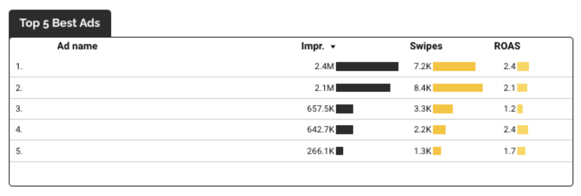
Table
Table bring clarity and context to your Paid Media page by highlighting performance across multiple metrics in on place. They're ideal for comparing ads, campaigns, or creative and quickly spotting what performs best.
For instant a table showing your top-performing assets helps you see which ones drive the most engagement and return. Using color bars or scales makes it easier to interpret performance at a glance even without reading every value.
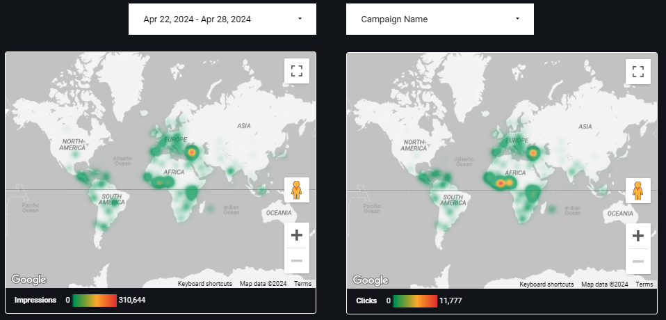
Geo Heatmap
Maps help visualize where your ads perform best, offering a clear view of how impressions and clicks are distributed across regions. They're perfect for spotting geographic patterns and understanding which markets drive the most visibility or engagement.
For example, displaying two maps side by side, one for Impressions and one for Clicks, controlled by Date Range and Campaign Name, lets you quickly compare reach versus interaction. This helps identify strong-performing regions as well as areas that may need better targeting or creative adjustments.
Together, these visuals turn your Paid Media dashboard into a true marketing command center:
Scorecards give the quick summary, Time Series shows evolution, Bar Charts highlight top performers, Tables provide detailed insights, and Geo heatmap reveal where your campaigns perform best around the world.
Controls
Controls make your Paid Media page interactive and actionable, allowing marketers to explore results by campaign, platform, or audience segment without touching the data source. They help you focus on what matters most, performance insights that guide smarter ad decisions.
Use date range control to track short-term campaign results or long-term trends, and dropdown control to switch between platforms like Google Ads, Meta, or LinkedIn. Adding controls for Campaign Name, Ad Group, or Device lets you instantly narrow down performance and compare results across segments.
Best Practices
A strong Paid Media page should make it easy to understand how your advertising spend translates into results. The layout should naturally guide the viewer from budget to performance, helping marketers see what’s working and where to optimize.
Keep your structure clear: place scorecards with key KPIs (Spend, Conversions, CPA, ROAS) at the top, followed by charts that explain trends and differences, and tables for detailed campaign insights. This order ensures your story flows from overview to depth.
Avoid overloading the page. Paid Media data can get heavy, so prioritize your most important campaigns and use controls to explore the rest. Limit tables to around 10–15 rows, and keep charts focused on one or two metrics at a time for clarity.
Consistency in design also matters. Use the same color for each platform (blue for Meta, red for Google, purple for LinkedIn, etc.) so your audience immediately recognizes them. Reserve strong contrast or bold colors to highlight outliers like exceptional ROAS or rising CPA trends.
Start with a Looker Studio template
Catchr offers a range of ready-to-use Looker Studio templates specifically designed for acquisition reporting. You can connect your data and visualize your performance instantly without having to start from scratch. Instead of starting from a blank page, you can begin with a pre-structured dashboard such as :
After the trial, you can subscribe to continue syncing your data automatically or use the template as a foundation to build your own version with your current data sources. In either case, you will have a solid, well-structured starting point for your reports.
All templates are free to use and include a 14-day trial of Catchr’s connectors. This lets you explore and customize your reports before you subscribe.
