Controls in Data Studio
Learn how to use controls in Data Studio (formerly Looker Studio) to filter data, customize views, and create interactive dashboards. Full list, use cases, and best practices included.
When creating a Data Studio (formerly Looker Studio) report, you’ll probably want to sort through your data, manage filters, and adjust display criteria. In short, get a deeper first look at what your data is really telling you. Looker Studio allows you to dig further into your insights thanks to controls.
In this article, we explain what controls are and how to use them to make data visualization easier and more interactive.
What are controls in Data Studio?
Controls in Data Studio are interactive elements that you can add to your report to manage and customize how data is displayed. Unlike static filters, set by the report creator and invisible to viewers, controls are dynamic and adjustable. This means the end user can interact with them and explore the data according to their own needs.
Controls act as a true interface between the user and the visualizations. Instead of duplicating pages or creating multiple versions of the same report, you can simply set up the right controls so that each viewer can navigate and filter data the way they want.
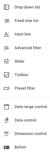
Data Studio offers 11 types of controls, covering different use cases: filtering dimensions, manipulating metrics, adjusting dates, or even improving navigation across the report.
In this article, we’ll go through the full list of available controls, explain their purpose, and show you when and how to use them effectively.
Controls in Data Studio
You can access the full list of Data Studio controls directly from your reports by clicking Add a control.
Selection controls
These controls are mainly used on dimensions but can also, in some cases, be applied to metrics. Their common purpose is to let users select data according to one or more defined criteria.
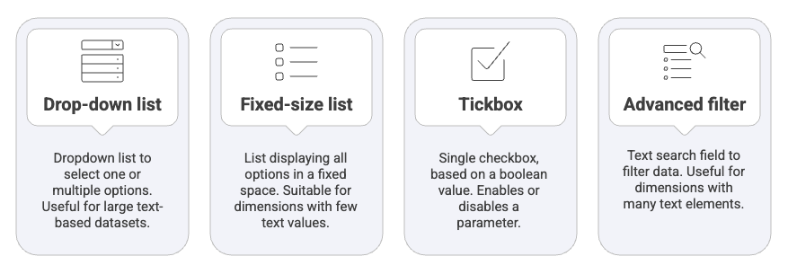
Drop-down list
The drop-down list is a control element that allows users to select one or more options from an expandable menu containing the available values of a dimension. It is particularly useful for handling large datasets without overloading the report visually and is mainly applied to text-type data.
Example: it can be used to filter a marketing report in order to select a specific ad campaign from a list of dozens of Google Ads campaigns.
How to use it:
- Click Add a control
- Select Drop-down list
- Place it on the report
- Choose a dimension

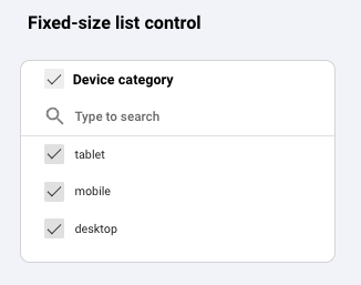
Fixed-size list
The Fixed-size list is a variant of the drop-down list. This list displays all options directly in a fixed space, without requiring additional interaction. It is suitable for dimensions containing only a few distinct values and is generally based on text data.
Use case: allowing immediate selection of a device category (tablet, mobile, desktop) in a report to quickly compare performance.
How to use it:
- Click Add a control
- Select Fixed-size list
- Place it on the report
- Choose a dimension
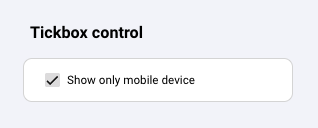
Tickbox
The Tickbox is a control that corresponds to a single checkbox, based on a boolean value (True/False). It is designed to activate or deactivate a specific parameter in a report and is not intended for browsing multiple options.
Example: it can allow the user to enable or disable the display of performance on mobile devices only.
How to use it:
- Create a boolean parameter
- Click Add a control
- Select Tickbox
- Place it on the report
- Choose your parameter
Advanced filter
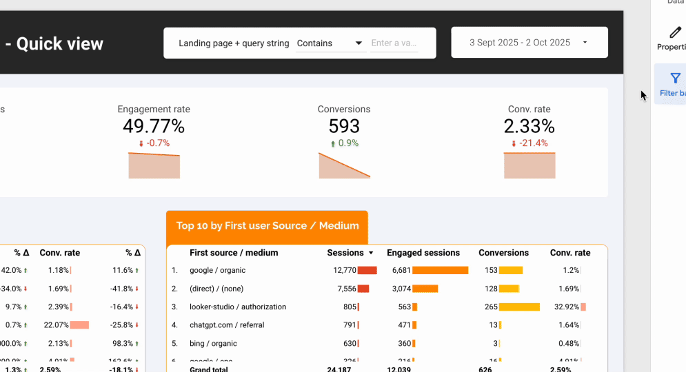
The Advanced filter is a control that corresponds to a text search field where the user enters a value to filter the data. It is particularly useful when a dimension contains a large number of elements, making it impractical to scroll through manually. This control applies to text data and offers several matching options (contains, starts with, exact match, etc.) to refine the search.
Example: it is very useful for quickly filtering a list of URLs by typing a keyword, for instance, entering “/blog/” to display only article pages in an SEO report.
How to use it:
- Click Add a control
- Select Advanced filter
- Place it on the report
- Choose a dimension

Input and value controls
These controls allow the user to directly enter or manipulate a value to influence how data is displayed. They are particularly suited for interactive analysis where one wants to test hypotheses, compare results against a goal, or quickly apply a predefined condition.
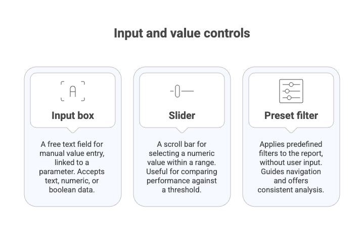
Input box
The Input box is a control presented as a free text field where the user enters a value manually. This control is always linked to a parameter, which records the entered value and makes it usable within the report. Depending on how the parameter is set up, the Input box can accept text, numeric, or boolean data. Its main purpose is to let the user customize a threshold, condition, or variable and then compare it to real data through calculated fields.
How to use it:
- Create a parameter
- Click Add a control
- Select input box
- Place it on the report
- Add your parameter to the input box
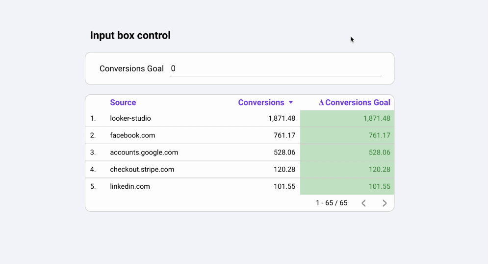
Example: we create a parameter called Conversions Goal. In a table, we add the dimension Source, the metric Conversions, and a calculated field using the parameter:
SUM(Conversions) - SUM(Conversions Goal)
When the parameter value is modified through the Input box, the column Δ Conversions Goal reacts dynamically.
Slider
The Slider is a control represented by a scroll bar that lets users select a numeric value within a defined range. It is particularly useful for comparing performance against an adjustable threshold or for dynamically exploring the impact of changing a parameter. The Slider is linked to a parameter and can be configured to accept either integers or decimal values.
Use case: allowing users to adjust a conversion rate threshold (e.g., 2%, 5%, 10%) and instantly see how many campaigns meet that objective.
How to use it:
- Create a parameter
- Click Add a control
- Select slider
- Place it on the report
- Add your parameter to the slider
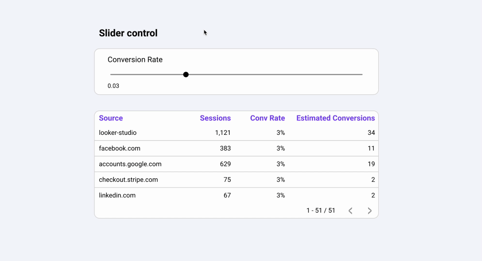
In the previous gif, we create a parameter Conversion Rate and link it to the slider. The column Estimated Conversions is a calculated field:
Sessions * Conversion Rate
Which fields, updates dynamically when the parameter changes.
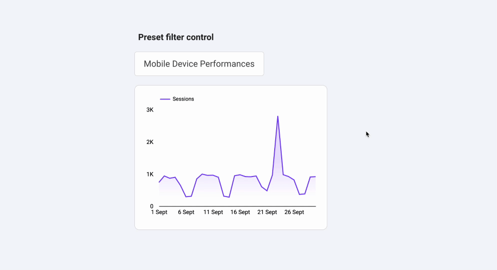
Preset filter
The Preset filter is a control that directly applies one or more predefined filters to the report, without the user needing to type or select values. Unlike other interactive filters, it does not allow free search or browsing a dimension: the filtering conditions are fully prepared in advance by the report designer. This control is especially useful to guide navigation and offer quick, consistent analysis scenarios.
The preset filter can be based on:
- Fixed conditions (e.g., “Channel = SEO”),
- Or a parameter that changes value depending on the chosen scenario (e.g., displaying only “New users” or “Returning users”).
With this logic, the user doesn’t have to manually configure filters, one click on the chosen option updates all the connected visualizations at once.
Use cases:
- Providing quick filters such as “Organic traffic only,” “Active campaigns this month,” or “Premium users.”
- Offering predefined date shortcuts like “Current month,” “Last quarter,” or “Previous year.”
- Simplifying audience comparison with scenarios like “New visitors” vs. “Returning customers.”
Data-specific controls
These controls allow you to directly modify the analytical context of a report: selected period, data source, or main dimension. They offer more flexibility than a simple filter by adapting a single dashboard to different needs, without duplicating it.
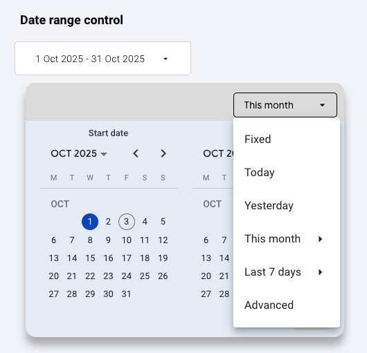
Date range control
The Date range control lets users select a time period to filter the report data. It is one of the most commonly used controls, as most analyses rely on time-based comparison. The user can choose a custom range or apply predefined shortcuts (last week, last month, current quarter, etc.).
Use case: filtering a marketing dashboard to analyze campaign performance only over the last 30 days.
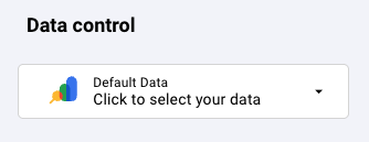
Data control
The Data control is a control that allows switching between different data sources connected to the report. It offers great flexibility, especially in multi-client or multi-account contexts. The user can directly select the source they want to analyze without modifying the report itself.
Use case: a marketing agency shares a single Data Studio dashboard with all its clients. Thanks to the Data Control, each client can select their own Google Analytics or Search Console account to instantly view their own performance data, without needing a separate report.
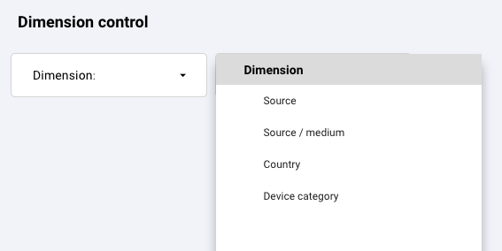
Dimension control
The Dimension control allows you to dynamically replace a dimension in a visualization. Instead of fixing a single dimension (e.g., “Acquisition channel”), the user can change it (e.g., switch to “Country” or “Device”) in order to view the data from different perspectives.
Use case: giving the option in a chart to switch between the distribution of sessions by channel, by country, or by device.
Complementary control
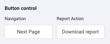
Button
The Button is an interactive control that triggers a specific action in a report. Depending on how it is configured, it can:
- apply a filter,
- reset selections,
- or redirect to another internal page or an external link.
It is particularly useful for improving user experience and guiding navigation.
Control scope in Data Studio
Controls can operate at three different scope levels, depending on how you create and configure them.
Report level
To make a control apply at the report level:
- Place it on a page
- Then right-click on it
- Select the option Make report level.
The control will then appear on all pages of the report and apply its effect everywhere, without you needing to duplicate or modify it on each page.
Page level
This is the default option when you add a control to a page. It will affect all the charts and tables on that specific page only.
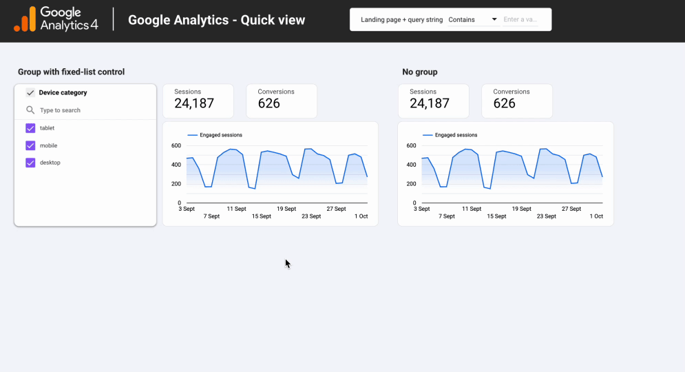
Component group level
This very useful feature allows you to apply a control only to the components that are grouped with it. To do this, place your control alongside the visualizations, select the ones you want it to filter, then right-click and choose Group.
Adding a filter to a specific chart
Finally, you can add a filter directly to a visualization if you want to restrict its application to a single chart or table without affecting the rest of the report.
Adding a filter directly in the chart editor does not constitute a control, it’s an internal setting of the chart, invisible and non-editable by the end user.
However, Data Studio also provides a feature that is closer to a control: cross-filtering. When enabled, clicking on a bar or line (on a charts) acts as a dynamic filter and lets the user interact directly with the data.
Best practices
Implementing controls in a Data Studio report is an excellent way to make dashboards interactive and adaptable to different use cases. However, overusing them or setting them up incorrectly can quickly make a report confusing and hard to use. Here are a few best practices to follow:
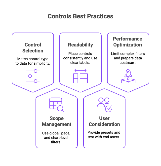
- Choose the right control: keep it simple and match the type of control to the type of data (Drop-down, Advanced filter, Input box, Slider…).
- Manage scope: use global filters for the entire report, page-level filters for specific needs, and chart-level filters for very targeted cases.
- Ensure readability: place controls consistently, avoid clutter, and use clear and user-friendly labels.
- Think about the user: provide preset filters, use cross-filtering in moderation, and test the report with end users.
- Optimize performance: limit complex filters and prepare your data upstream to ensure smooth rendering.
Conclusion
Controls are not just interactive filters, they are powerful levers to make your analyses more relevant and tailored to each context. Their effectiveness depends less on how many you add and more on how they are configured and integrated into the report. By applying a few best practices, you can transform your dashboards into true decision-making tools: clear, fast, and user-focused.

