Data blending in Looker Studio explained
Learn how to blend data in Looker Studio with a clear definition, setup guide, and best practices to combine multiple sources and improve your reporting accuracy.
When working with multiple marketing platforms, you’ll quickly need to combine those data sources to gain a complete and consistent view of your performance. To make this possible, Looker Studio offers its data blending feature.
What is the Looker Studio blend data feature?
A blended data source is a Looker Studio feature that allows you to combine up to five different data sources into one. The resulting source brings together all the data from your blend, making it easier to analyze multiple datasets in a unified view.
In the next sections, we’ll explore the key benefits of data blending and how to set it up effectively.
The benefits of data blending
Each data source you use functions as a data silo. It contains only the information relevant to its specific platform and understands only its own data schema. This can lead to several issues. But, data blending helps you overcome these challenges by connecting multiple data sources into a single, unified view.
Create relationships between data sources
While analyzing marketing data is relatively simple when an advertiser uses a single channel, working across multiple platforms quickly increases the complexity of tracking and analysis. Since these channels don’t communicate with one another, collecting and aggregating their data often becomes a time-consuming and tedious process. Blending data sources allows you to bring together specific metrics from each channel into a single, unified source, making cross-analysis effortless and revealing connections that would otherwise remain hidden.
Unify metrics and dimensions
When working with multiple data sources, each platform often defines its own metrics and dimensions — impressions, clicks, conversions, or revenue may not follow the same logic or naming conventions. This inconsistency makes comparison difficult and can lead to misleading conclusions. By blending your data sources, you can align metrics and dimensions across platforms, creating a single source of truth that ensures consistency and accuracy in your reporting.
Get an overview of your performance
Managing several platforms separately can make it difficult to see the bigger picture. Performance insights remain scattered, and identifying how each channel contributes to your overall strategy becomes challenging. Data blending brings everything together in one unified view, allowing you to analyze results holistically, uncover trends across channels, and make smarter, data-driven decisions based on a complete understanding of your marketing performance.
How data blending works
They consist of tables and join configurations.
Here is the combination of data sources we will rely on for our examples.
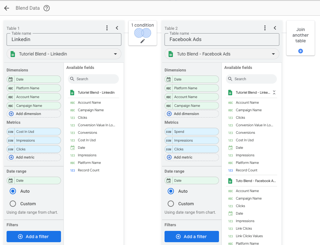
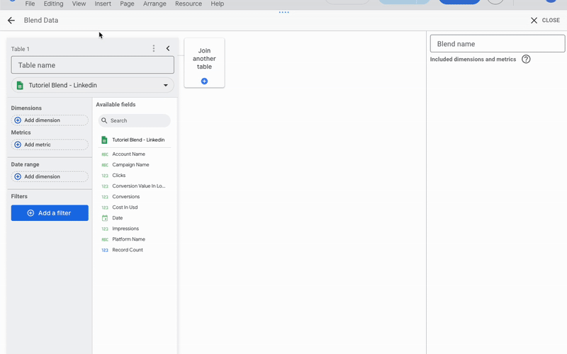
The tables
A table is simply a collection of fields taken from a data source. It’s built using fields (dimensions and metrics), which define what information you see and how it’s organized. When you create a data blend and add a table, you can configure dimensions and metrics, set the date range, and also add filters to refine your analysis.
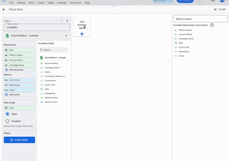
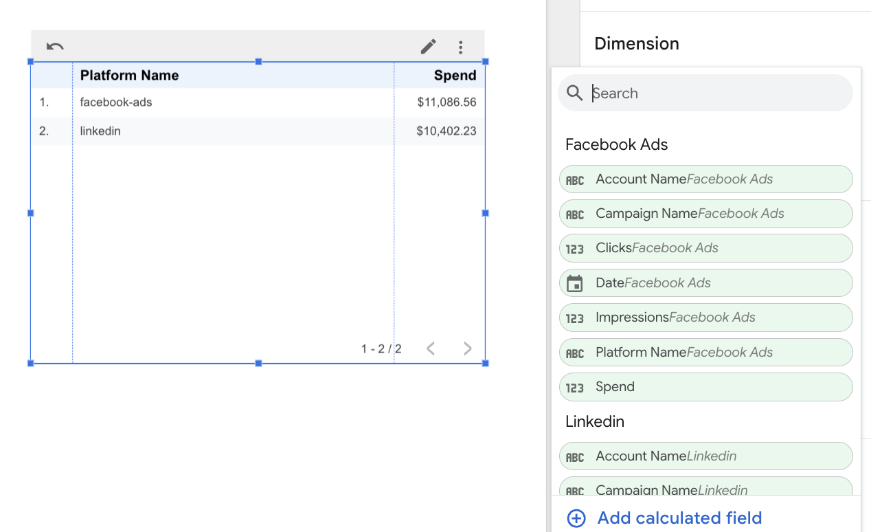
In our example, Table 1, named LinkedIn, uses the data source “Tutorial Blend – LinkedIn” connected via Google Sheets, but you can use any connector and data source you want, including Looker Studio partner connectors. The dimensions and metrics selected in this source, and therefore available in the table, are as follows:
- Dimensions: Date, Platform Name, Account Name and Campaign Name
- Metrics: Cost in Usd, Impressions and Clicks
The date range field will use the Date field from the data source. No filters are applied to this table.
In some cases it could also require a Date Range field (in the case of the sheet connector for example), and filters allowing you to refine the data to be combined.
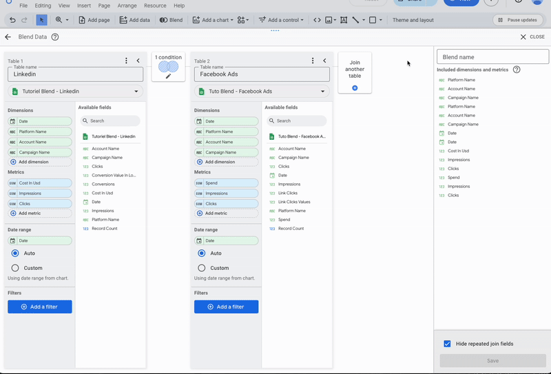
Join configurations
Join configurations are located between each of the tables. Each join configuration specifies how the two surrounding tables should be joined, and on which fields. It is composed of two indications:
- The join operator defines how the left and right tables are structurally related. There are five types of joins: left outer join, right outer join, inner join, full outer join, and cross join.
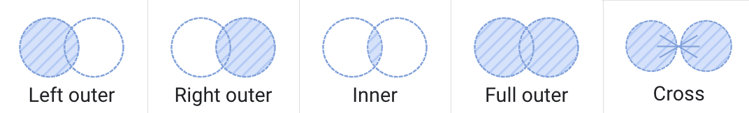
- The join conditions specify which fields the join will operate on. In other words, they define the fields that the algorithm will attempt to match in order to link the data together.
For each join configuration, at least one join condition must be provided.
How to set up a blend
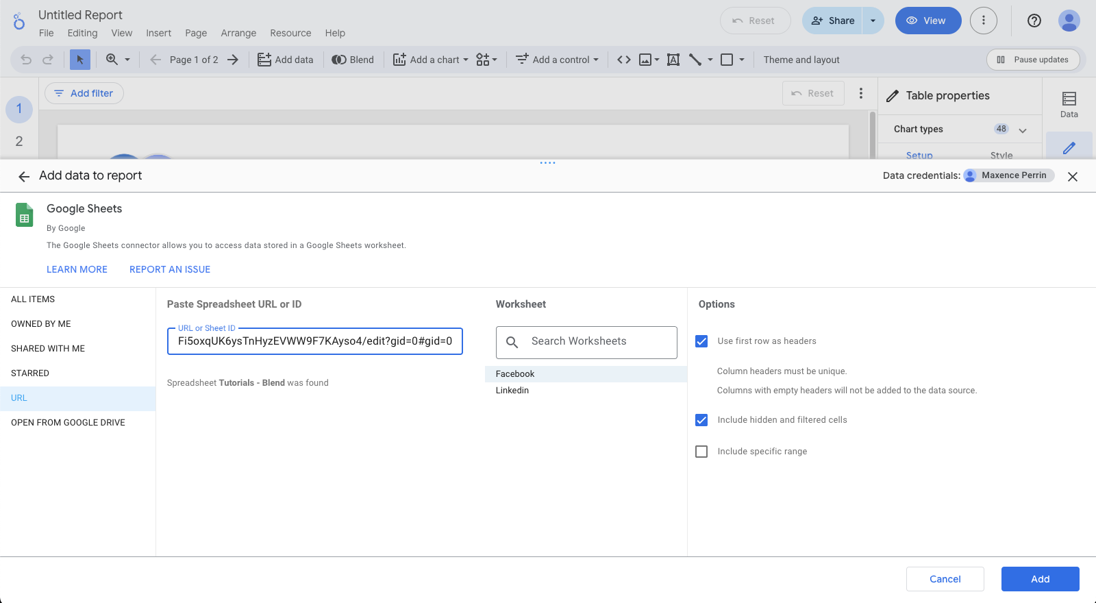
The example this chapter relies on is based on Facebook Ads and LinkedIn datasets spreadsheet. You can use this spreadsheet if you want to redo the tutorial step-by-step. You just have to create the two Google Sheets sources in Looker based on the spreadsheet URL.
Setup the tables
From the Looker Studio report interface:
- Resource > Manage blends then Add a blend
- or you can click directly on Blend
By default, the first table that appears when creating a data blend corresponds to the data source that was initially added to your report.
- Add a name to your table
- Change the source if necessary
- Choose the dimension and metric fields you need.
If you want your data to be filterable by the date control, you must configure the Date range field (only for the official Google Sheets connector).
- Then add the new table(s) by clicking on Join another table, and repeat the previous operation for each of them.
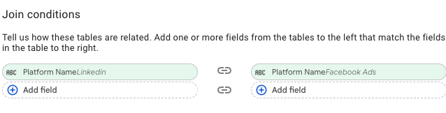
In our example, we join the LinkedIn table with the Facebook Ads table. Both data sources come from Google Sheets, but the process is the same for other sources (except for the date range, which is generally not required).
Configure joins
You need to configure the join for each table pair. To do this:
- Click on Configure join
- Select the operator and join condition(s) that suit your case.
In our example, we want to retrieve all the rows selected by each data source independently. To achieve this, we configure a full outer join operator and set a join condition on the Platform Name field (which we know is different for each source). This ensures that all rows from each source are included in the blended data, regardless of whether they match.

Set blend name and add repeated fields
To finalize the creation of your blend, name your new source in the Blend Name field on the right.
By default, Looker Studio hides redundant join fields to keep your data view clean and easy to read. If you want to display them, simply uncheck the Hide repeated join fields option at the bottom of the blend’s field list.

Don't forget to save by clicking the button Save at the bottom right of the screen.
You’ve successfully created your data blend. You can now find it under Resource > Manage blends, or in the list of available data sources when adding a chart.
Verify if the blend is correctly created
When you add a field to a Looker Studio chart using your newly created blend, you’ll notice that the available fields are grouped by data source.
In our example, we’ve blended two sources, so the available fields are organized into two groups: Facebook Ads and LinkedIn.
Data blend limit in Looker Studio
Missing feature
Due to the way the data blending system works, some features available in standard data sources are not supported. Calculated fields can only be created at the chart level, and as a result, it’s not possible to filter those fields using a drop-down control.
Join limitations
Joins in Looker Studio are intentionally simple and limited in flexibility. You can only create straightforward joins based on matching fields that exist in all data sources. Conditional joins, many-to-many relationships, and dynamic joins based on parameters or calculated logic are not supported. Each join must be configured manually, and Looker Studio does not detect relationships automatically. You are also limited to 5 data sources in a single blend.
Poor scalability
Blended data sources are always integrated into the report where they were created, which means they cannot be reused in other reports. This can make setup tedious if you manage a large number of reports and want to apply the same blends across all of them.
However, blended sources are included when a report is duplicated, ensuring that any charts or scorecards using them continue to function correctly. Keep in mind that access permissions for the underlying data sources still apply, so users viewing or editing the copied report must also have the appropriate rights to those sources.
Dashboard slowdowns
Because blended data relies on multiple sources and the generated queries can be highly resource intensive, a poorly designed combination of sources or an excessive number of blends may significantly slow down your dashboards.
Increase in the price of data storage tools
If the backend sources are fetching data from cloud storage services and the combination is fetching a significant amount of data, this can significantly increase your cloud storage costs. This is therefore something to keep in mind when building a combination.
Use cases: how marketers save time with data blending
In this section, we will discuss various practical cases that will show how source combinations can save your marketing team time.
These examples are based on the same dataset as the previous examples. If you would like more information on how to set up the blended source with it, you can read the section How to set up a blend from this same article.
Create a view by platform
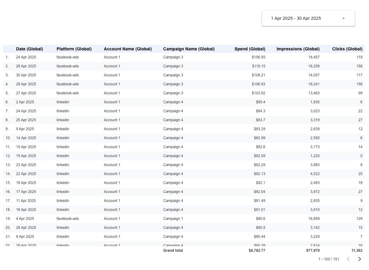
The user wants to create a page in their report dedicated to the two platforms they use to promote their real estate agency, Meta Ads and LinkedIn, at the campaign level. They want to track spending, impressions, and clicks to identify which campaigns perform best across platforms. To begin, the user creates a simple table and selects the blend as the data source.
Now it is time to group the data. Although the blend includes all the necessary information, the fields are still separate and need to be consolidated. To achieve this, the user must create the following calculated fields:
Each of its calculated fields will use Looker Studio's IFNULL function. It displays a value if it is non-null, otherwise it displays another value.
Once those fields are created, he can add them in the table to display the regrouped information.
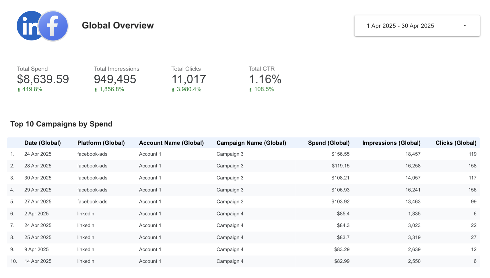
From April 1st to April 30th, the total spend was $8,782.77, the campaign that spent the most was Facebook Ads campaign 3, etc.
This process will be repeated for several charts in the report until the desired dashboard is obtained.
Analysis of tracking consistency between platforms
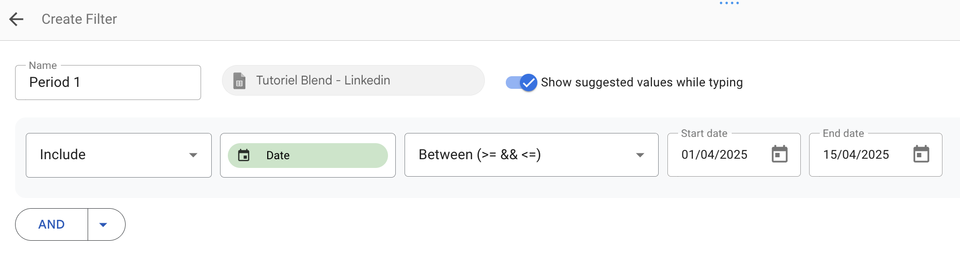
After updating their tracking setup (for example, changing the pixel or UTM parameters), the user noticed inconsistencies in their Meta Ads campaign data. To verify whether these changes affected performance, they want to compare results from two time periods within the same visualization.
The goal is to check, campaign by campaign, whether impressions, clicks, and spend remain consistent, and to quickly spot any anomalies or data losses. To do this, the user creates a self-join: blending the same Meta Ads source twice, each filtered for a different time range:
- Period 1: April 1–15
- Period 2: April 16–30

These two sources have the same structure but use different filters to separate the time periods.
The Campaign Name field serves as the join key between both tables. The user applies a full outer join to display all campaigns, even those present in only one period — for example, campaigns launched after April 15 or stopped before that date. This ensures that any tracking gaps or activity changes are visible.
Once the blend is created, the user adds global calculated fields using the IFNULL function to consolidate values from both periods.
These fields make it possible to calculate the differences between the two periods and quickly identify any abnormal variations. Once the fields are ready, the user can create a comparison table or a bar chart displaying:
- Campaigns
- Metrics from both periods side by side
- A variation field to visualize the change
For example:
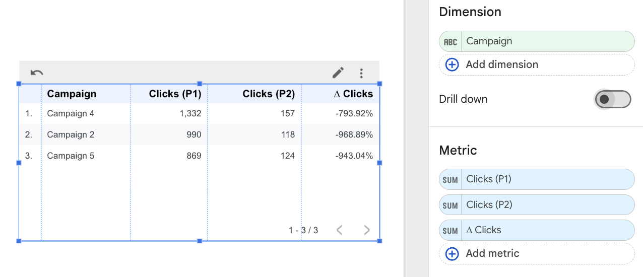
The user can immediately see that their campaigns lost almost all activity after the tracking change, which likely indicates a technical issue.
In conclusion
Combining data sources offers a powerful way to solve problems that cannot be addressed with a single source. However, because of its specific behavior and technical constraints, it should be used thoughtfully and sparingly. While data blending can handle a wide range of use cases, its limitations often make external aggregation tools such as Google Sheets or BigQuery a better choice for more complex scenarios. Still, it remains perfectly suited for most ad hoc analyses and simpler reporting needs that do not require advanced features.
