How to use Community Visualization in Data Studio
Discover how Community Visualizations extend Data Studio’s native charts — learn how to add, use, and create custom visuals for deeper insights.
Data Studio (formerly Looker Studio) offers a wide variety of charts, but sometimes you just can’t find the one that perfectly fits your needs. That’s where community visualizations come in.
What is community visualizations in Data Studio
Community visualizations extend the native charting capabilities of Data Studio. They allow you to use or create custom visualizations developed either by the community or your internal teams to address more advanced visualization needs than those offered by default.

Understanding the Feature
By default, Data Studio offers a broad range of standard visualizations: bar charts, line charts, pie charts, tables, geographic maps, and more.
However, some visuals may be missing, or the default ones may lack the configuration depth you need. You may hit limitations when you want to:
- Represent flows, relationships, or complex hierarchies
- Add specific interactions that aren’t natively supported
- Make your design more original or immersive
That’s exactly where community visualizations come in.
They enable the integration of external visuals developed in JavaScript, HTML, and CSS, hosted on secure servers. Once created, these visuals can be embedded directly in Data Studio and used just like any native chart.
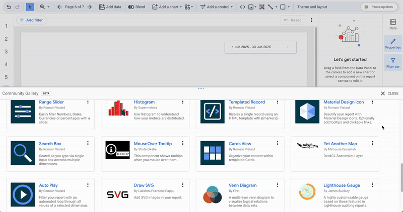
The Community Visualization landscape
Since the launch of the Community Visualizations program, the ecosystem has expanded significantly. There are now dozens of ready-to-use visuals, available for free or from third-party publishers, accessible from Data Studio’s official gallery.
Beyond the official gallery, you can also use your own in-house visualizations if you have any, and there’s a wide range of open-source manifests available across the web.
Here are some of the most popular community visuals:
Some of these visuals are open to all users, while others require specific authorization links to be used in a report.
How to use a Community Visualization
Finding Community Visualizations
- Open your report in Edit mode
- Click on Community visualizations and components in the toolbar
- At the bottom of the menu, click Explore more
- The central panel will display the gallery of community visuals: choose the one that best fits your needs

Adding a Visualization
- In the community gallery, select your desired visual
- Grant it access to your data
- Place the visualization within your report
If you want to add a visual that doesn’t appear in the gallery, select Build your own visualization and enter the manifest path.
Revoking Access to a Visualization
To revoke access:
- In the toolbar, open the Community visualizations menu
- Under Added report resources, click Manage visualization resources
- The central panel will open, listing all visuals in your report.
- Click Revoke, then confirm your action

For users with an IT team interested in developing custom visuals, Data Studio’s documentation provides a dedicated section on how to do this, via the Visualization SDK.
Summary
Community visualizations are a major way to enrich Data Studio’s analytical and storytelling capabilities. They allow you to:
- Extend the range of available chart types
- Tailor reports to specific business or marketing use cases
- Add a more engaging and visually appealing dimension to your dashboards
By combining native and community visuals, your Data Studio (formerly Looker Studio) reports evolve into powerful, flexible tools for both data analysis and custom storytelling.
