Power BI dashboard design best practices
Learn Power BI dashboard design best practices to build clear, readable, and consistent dashboards using layout, hierarchy, titles, spacing, and formatting.
Good dashboard design is not about making dashboards “look nice”. In Power BI, design is about clarity, readability, and trust. A well-designed dashboard helps users understand performance faster, avoid misinterpretation, and make better decisions.
For marketing teams, design is especially important because dashboards are often shared with non-technical stakeholders. The goal is not to impress visually, but to communicate insights clearly and consistently.
Power BI dashboard layout best practices
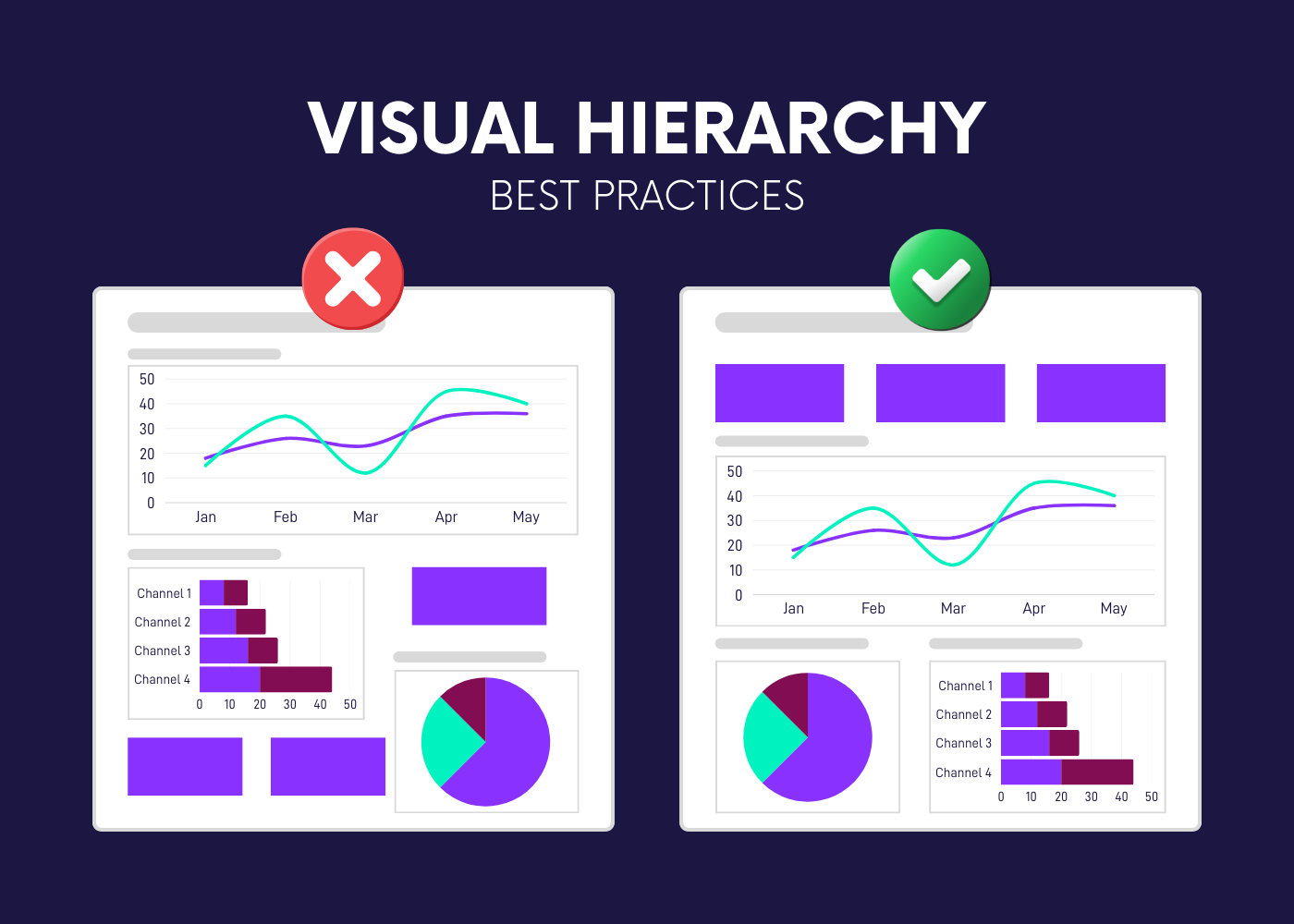
Visual hierarchy in Power BI dashboards
A good dashboard follows a clear visual hierarchy. Users typically scan dashboards from top to bottom and from left to right, so the layout should guide their attention naturally.
- KPIs belong at the top to provide an immediate snapshot
- Trend visuals usually sit below to explain how performance evolves
- Breakdowns and details come last
This hierarchy helps users understand the story before diving into details.
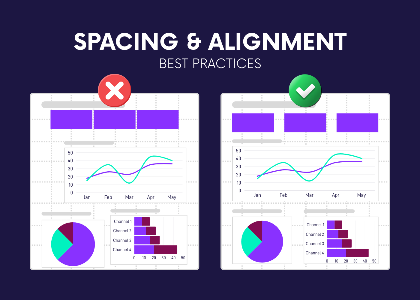
Spacing and alignment in Power BI dashboards
Spacing and alignment play a major role in readability. Misaligned visuals or inconsistent spacing increase cognitive load and make dashboards harder to scan.
Good practices include:
- aligning all visuals to a grid
- keeping consistent margins between visuals
- leaving enough white space so elements can breathe
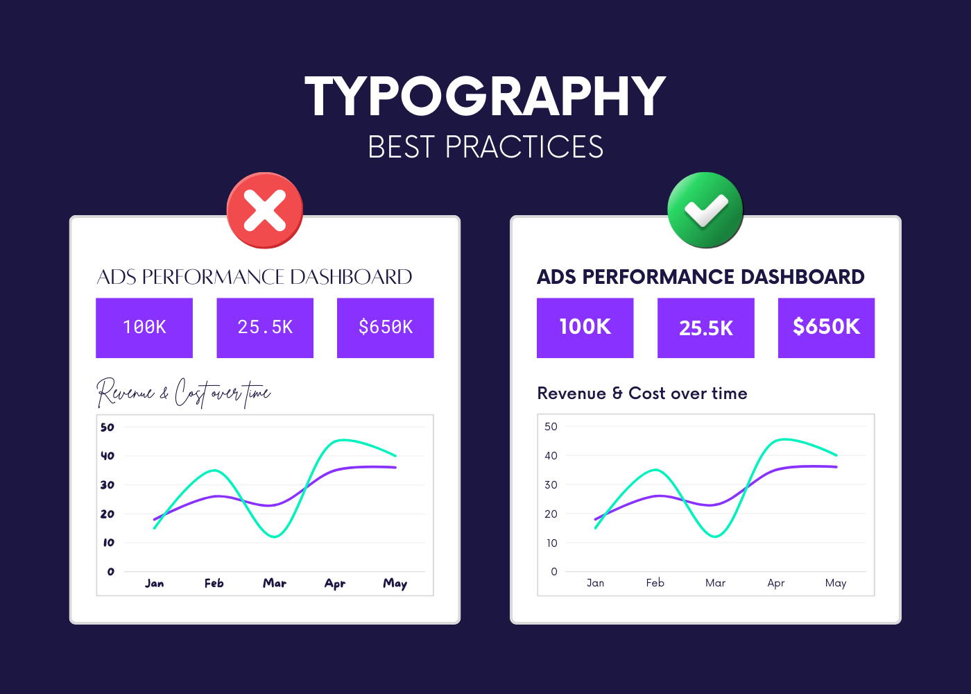
Typography and readability in Power BI
Typography should remain simple and consistent. Dashboards are not documents; text should support numbers, not compete with them.
A few rules go a long way:
- limit the number of font sizes
- use larger text for KPIs and section titles
- avoid long explanatory paragraphs
Clear typography makes dashboards easier to read, especially during quick reviews.
Recap: layout and structure best practices
Power BI dashboard titles, labels, and annotations
Writing effective titles in Power BI dashboards
Titles should explain what the user learns, not just what is being displayed. Generic titles often force users to interpret the visual themselves.
Instead of:
- “Spend by Channel”
Prefer:
- “Search drives most of paid spend this period”
Clear titles reduce ambiguity and make dashboards more self-explanatory.
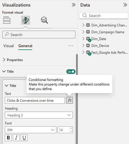
You can create a dynamic title using a function.
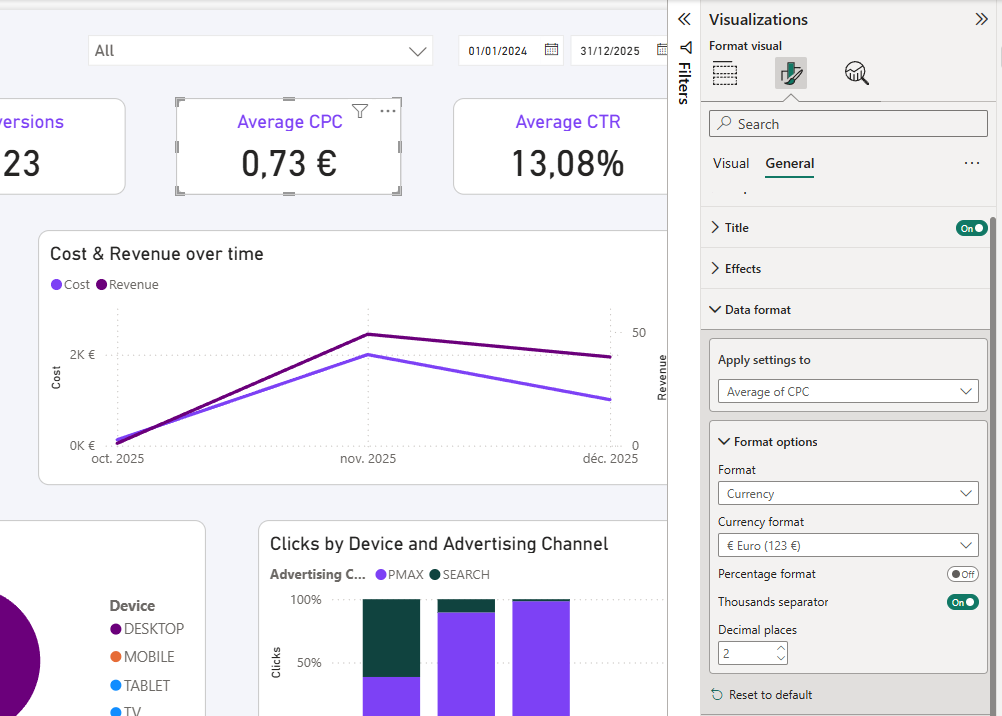
Labels, units, and formatting consistency
Units and labels should always be explicit. Missing units or inconsistent formatting can quickly undermine trust in a dashboard.
Best practices include:
- always displaying currency symbols or percentage signs
- using consistent decimal precision
- keeping number formats stable across pages
This avoids confusion and ensures numbers are interpreted correctly.
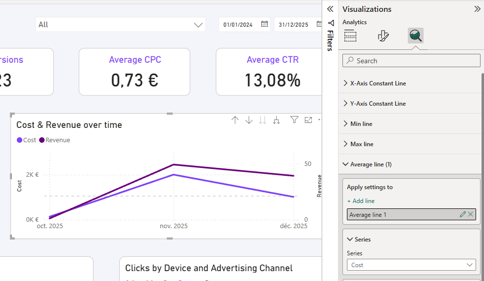
Using annotations to add context
Annotations can be useful to explain unusual events, spikes, or drops, but they should remain minimal.
Use annotations to:
- highlight a specific change
- provide brief context
- guide attention without clutter
Overusing annotations reduces their effectiveness.
Consistent formatting across Power BI marketing dashboards
Consistent KPI formatting and ordering
Consistency is critical when dashboards scale across pages or reports. The same KPI should always look and behave the same way.
This means:
- same KPI order on every page
- same number format and naming
- same aggregation logic
Consistent color usage in Power BI dashboards
Colors should encode meaning, not decoration. When colors are used consistently, users can interpret dashboards faster.
Examples of good color usage:
- green always means positive or above target
- red always means negative or below target
- neutral colors for context
Avoid changing colors between pages or visuals for the same metric.
Common Power BI dashboard design mistakes to avoid
Even with good intentions, some design mistakes appear frequently and reduce dashboard effectiveness.
Most common issues and how to fix them
Design dashboards for scale, not just for one report
A good Power BI dashboard design should work beyond a single use case. As reporting grows, dashboards should remain easy to maintain and consistent.
Designing for scale means:
- reusing layout patterns
- applying the same formatting rules everywhere
- keeping dashboards simple and replicable
Conclusion
Good Power BI dashboard design is about making data easier to understand and easier to trust. By focusing on hierarchy, spacing, clear titles, and consistent formatting, marketing dashboards become more readable, more scalable, and more effective.
A well-designed dashboard does not draw attention to itself. It lets the data speak clearly.
.svg)