One of Looker Studio’s latest features in 2025 is the Responsive Report option. In this lesson, we’ll explore how it works, how to set it up, and how to ensure your reports look great on every device.
What is a responsive report in Looker Studio
A responsive report is a report whose layout automatically adapts to the size of the screen it’s displayed on, much like a responsive website.
This means that elements (charts, controls, text, images, etc.) dynamically resize and rearrange themselves based on the browser window’s width or the type of device being used.
Before this feature, Looker Studio reports used a fixed layout. When viewed on smaller screens, visuals would overflow or become unreadable, forcing users to manually zoom out.
Now, Looker Studio automatically adjusts components for smooth readability across all devices.
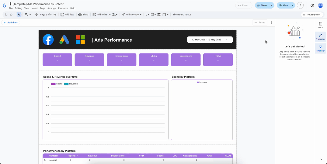
How to Enable Responsive Mode
- Open your report in Looker Studio
- Switch to Edit mode
- In the top menu bar, click File > Theme and layout
- In the right-hand panel, under Layout mode, select Responsive
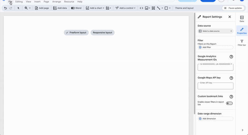
From Freeform layout to Responsive layout
If you’re starting from a report originally built in Free layout mode, you may encounter an error message like this one:
Cannot change to responsive layout
You cannot directly change from freeform layout to responsive layout at this time. To use this layout, create a new report in responsive layout mode and copy components from this report into the new one.
As indicated in the message, create a new report and copy your components over one by one into the new responsive layout.
Key differences between Free and Responsive layout
Enabling responsive mode isn’t just about checking a box, your design will need a few adjustments. Here are the key points to review.
Container Structure
Elements are no longer freely floating. They now organize themselves within a fluid grid system.
Group related elements so they resize together. Each group acts as a grid row with 12 columns. Every new row creates a new group, and each group has its own Style section. You can place your components on any column you like.
.gif)
Sizes and Margins
You can stretch an element horizontally across as many columns as you want, or stack multiple elements vertically within the same column of a group.
.gif)
While the vertical size of individual components is fixed, the group container adapts automatically. Its height corresponds to the length of the tallest element in the grid row.
Since horizontal sizing is handled as a percentage (not a fixed value), your layout will maintain the same proportions on any screen size.
Mobile Reading
The mobile view is automatically generated, and you can’t manually adjust it. However, you can still control how your report is displayed:
- Click the arrow next to the View button
- Select Tablet or Mobile
- Preview your report to see how it adapts to each device
Text and Fonts
Long text or titles can overflow and get cut off. To prevent this, use automatic line breaks and test your report on multiple screen sizes to make sure everything fits nicely.
Navigation and Filters
Filter bars or menus may shift or become compressed. Place them in a stable upper area, or create a dedicated mobile page with a simplified layout.
Best Practices
- Test across multiple screen sizes using preview mode or by resizing your browser window.
- Check all interactions (filters, drills, zoom, etc.), some behaviors may differ with visual resizing.
- Adjust fonts and spacing to maintain a clear visual hierarchy.
- Use Looker Studio’s grids and alignment guides to structure your layout effectively.
Conclusion
Looker Studio’s responsive report feature is a recent, and very welcome, addition to the platform. It’s remarkably simple to set up and surprisingly reliable across most expected use cases. With just a bit of thoughtful layout adjustment, responsive mode can make your reports not only look cleaner but also work seamlessly across all devices, from desktop monitors to mobile screens.