Build an effective Acquisition Page in Looker Studio
Build an effective Acquisition report page in Looker Studio. Discover which visuals best show traffic sources, top channels and overall marketing performance.
The acquisition page helps you understand where your visitors come from and which marketing channels attract the most qualified traffic. It's your starting point for analyzing visibility, engagement, and conversion potential across campaigns.
Objectives of the Acquisition report page
The acquisition page's main goal is it show how each marketing channel helps your brand grow and become more visible. It helps you see which sources bring in the best visitors and how well they convert, so you can make smarter marketing decisions based on concrete results.
Which charts for an Acquisition report page
Every KPI and piece of information should be presented as effectively as achievable. In addition to making your data easier to read, a suitable graph enables your audience to quickly grasp what is most important. We'll examine the best chart formats for displaying acquisition performance in the next section. With Catchr’s connectors library, you can plug in all your main acquisition channels (ads, analytics, SEO, etc.) into a single report.
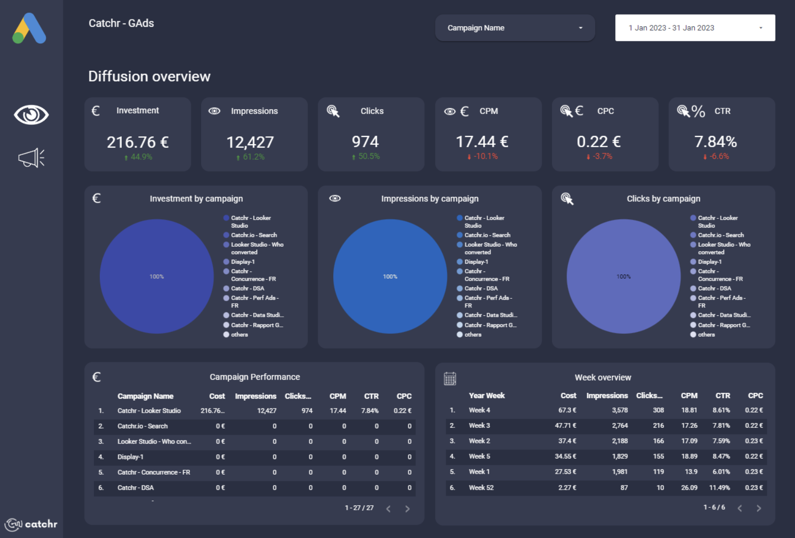
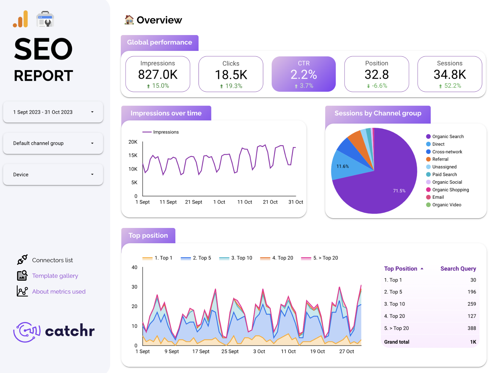
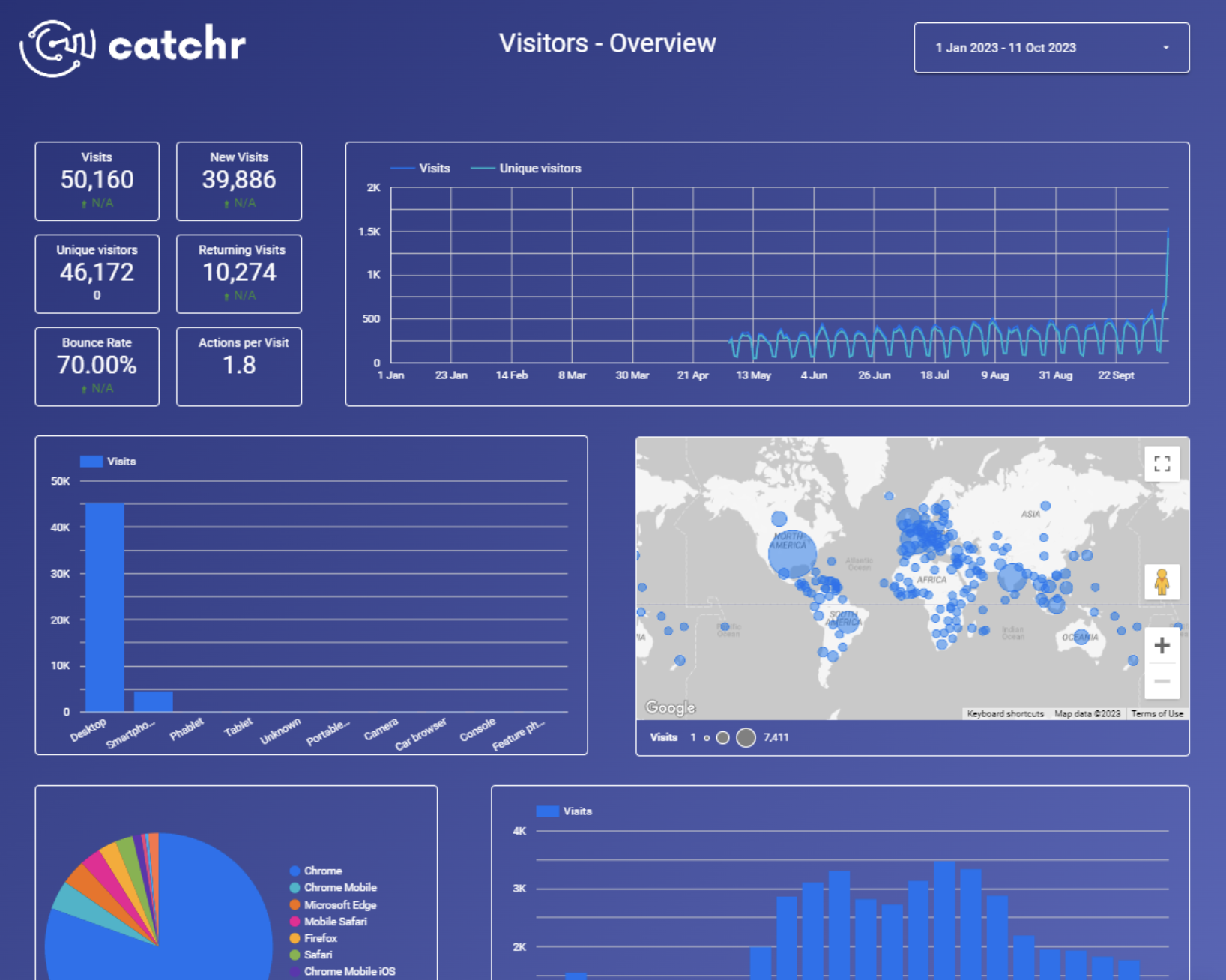
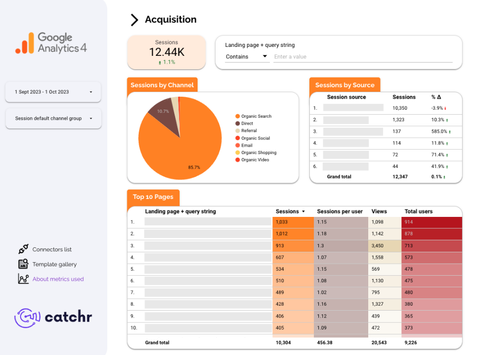
Scorecards
Scorecards are the base of your acquisition dashboard. They instantly highlight key metrics such as Sessions, Users, CTR, Conversion rate, or CPA. Placed at the top of the page, they give you a fast snapshot of your performance and make it easy to monitor goals over time. Or instance, you might display your Total Sessions, Conversions, Engagement and Average CPA, with a small comparison to the previous month to show whether acquisition costs are improving.
In this case , you could add a scorecard showing the number of new or returning users, data that might be too detailed for an overview page but highly relevant for an acquisition page. Its important to avoid repeating insights already displayed elsewhere in your report.

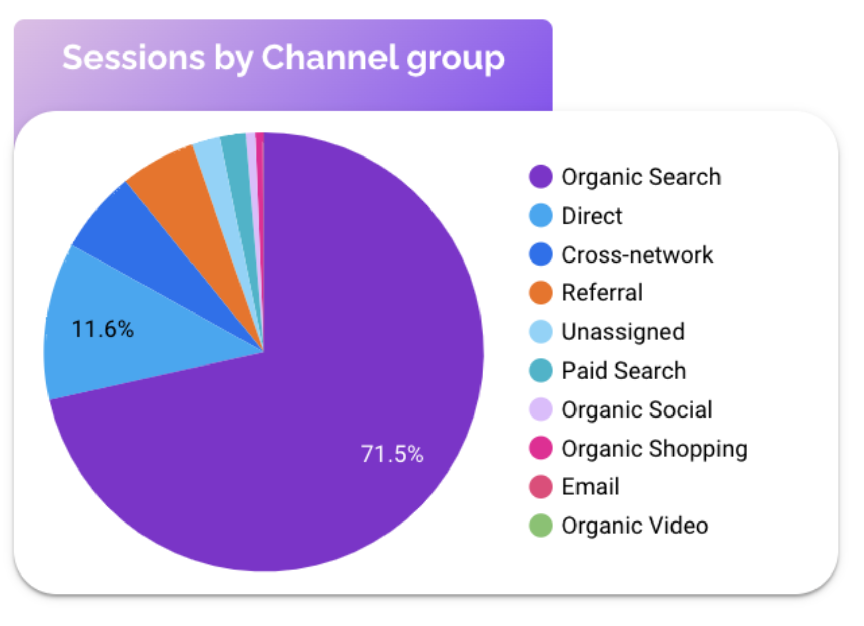
Pie chart
Pie chart are great for visualizing how traffic is divided between channels like organic, paid, social, referral or email. They help you see at a glance which acquisition levers the most visibility or conversion. For example your chart might reveal that 45% of visitors come from organic search, 30% from paid ads, and 25% from social.
Treemaps
Treemaps are ideal for visualizing top keywords, campaigns, landing page or channel. The larger the block, the greater its impact in traffic or conversion. This chart helps you understand which drivers deliver the most value. Like for example, a treemap comparing, a chart showing Top Landing Pages by CTR might reveal that specific pages (like pricing pages) attract fewer visits but drive much higher engagement than general homepage traffic .
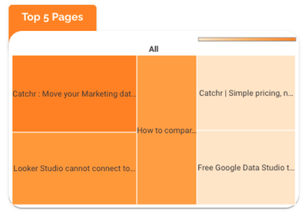
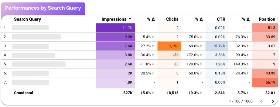
Table with conditional formatting
Tables with conditional formatting provide depth and precision. They're perfect for comparing channels, campaigns, or keywords across KPIs like sessions, CTR, conversion rate and ROAS. Conditional formatting turns a basic table into a visual performance matrix.
Together, these visuals create a full picture of your acquisition strategy: Scorecards summarizes performance, Pie charts shows balance, Treemaps uncover opportunities and Tables deliver details.
Controls
Controls make your acquisition page interactive and customizable, allowing users to explore data without editing the report each time. They can help filter insights quickly and focus on what's important for your campaign.
Adding a few well chosen controls can completely change how to use your dashboard. For example controls for date range, campaigns, channel type or device allows you to instantly adjust your view to match a specific analysis goal, whether it's checking performance for last month's campaign or comparing which landing page has the most users.

You can also use the drop-down menus or the checkbox to switch between sources, campaigns or regions, giving it more flexibility without adding clutter.
Best Practices
These best practices apply to every page of your report, but they’re especially important for the Acquisition page, since it’s where your marketing story begins. This view should immediately show where your audience comes from and which channels deliver results.
Keep your Acquisition page focused and easy to read. Avoid overloading it with too many visuals, especially tables, which can quickly become overwhelming. Instead, use filters and controls to let users explore the data with precision, rather than multiplying charts and tables that repeat the same insights.
Always design your page around a clear objective. When you know what story you want to tell, for example, which channel drives the most qualified traffic, it becomes easier to keep only the most relevant information and avoid clutter.
Finally, don’t hesitate to limit the number of data points in your charts. A pie chart works best with 3–4 slices, a treemap with 5–10 elements, and a table with around 10 rows plus a scroll option for more detail. Simplicity improves readability and ensures your key insights stand out.
Start with a Looker Studio template
Catchr offers a range of ready-to-use Looker Studio templates specifically designed for acquisition reporting. You can connect your data and visualize your performance instantly without having to start from scratch:
After the trial, you can subscribe to continue syncing your data automatically or use the template as a foundation to build your own version with your current data sources. In either case, you will have a solid, well-structured starting point for your reports.
All templates are free to use and include a 14-day trial of Catchr’s connectors. This lets you explore and customize your reports before you subscribe.

