Build an effective Funnel & Conversions page in Looker Studio
Learn how to track funnel stages, analyse drop-offs, and optimise conversions in Looker Studio using the right charts, controls, and best practices.
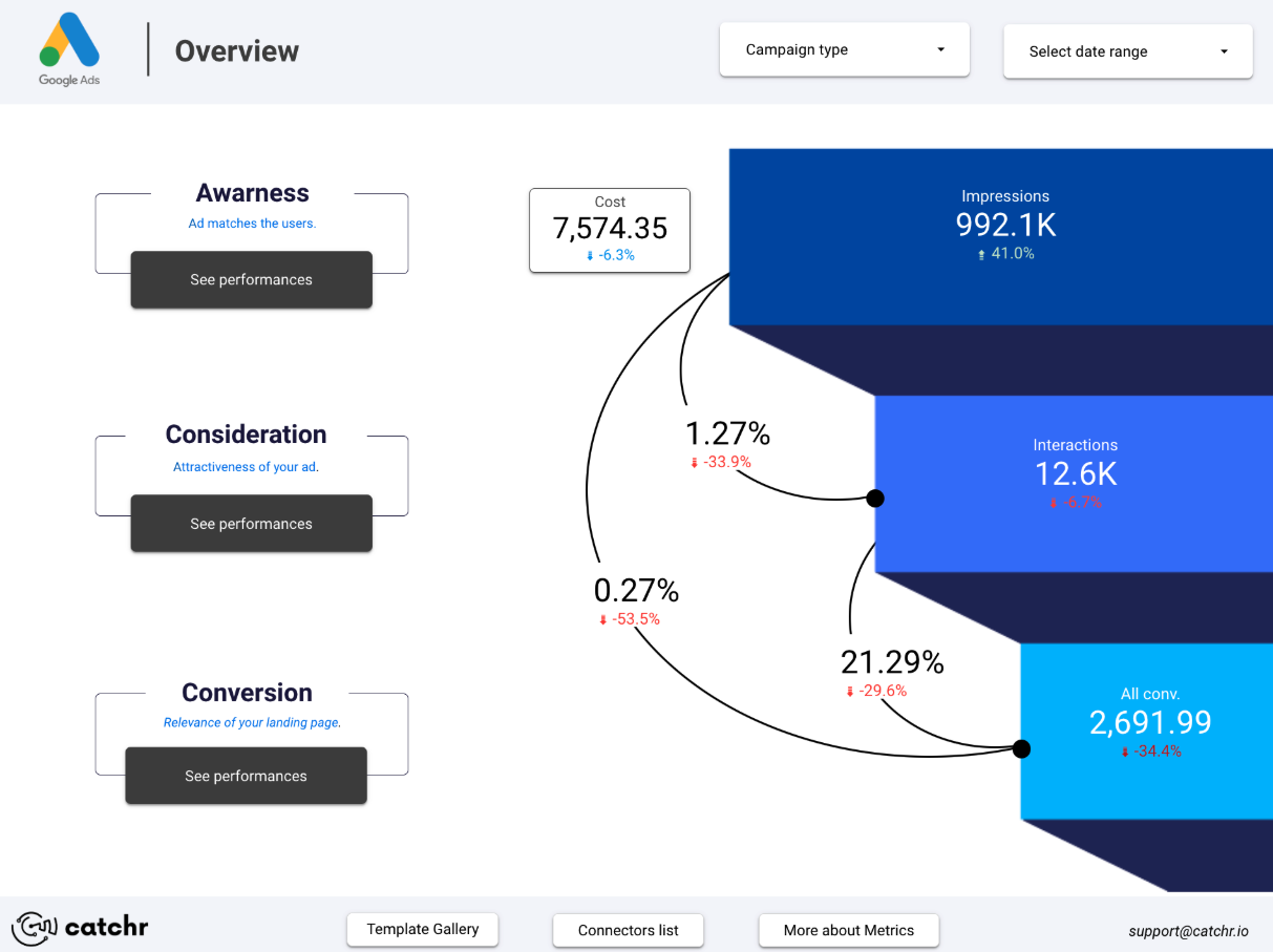
The Funnel & Conversions page helps you understand how users move through your conversion journey, from the first impression to the final action. It reveals where people enter the funnel, how they progress from one step to another, and where they drop off. By showing the transition between each stage, it becomes easy to identify friction points and understand what slows down or accelerates conversions.
Objectives of the Funnel & Conversions report page
This page connects visibility, engagement, and final outcomes in a single view, allowing you to see which channels, campaigns, or pages contribute the most to conversions, and which steps weaken the performance of the funnel. The goal is simple: improve efficiency at every stage of the user journey and focus your optimisation efforts where they will have the greatest impact.
Which charts to use on your Funnel & Conversions Page
Every chart on this page should help you understand how users progress from one step to another and where the conversion journey breaks down. A well-built funnel view highlights strong stages, reveals friction points, and clarifies whether your marketing efforts actually move users toward the final action.
The objective is not just to visualise the funnel, but to understand how behavior at each step influences the final conversion rate. The right mix of charts lets you analyse the flow clearly and make confident optimisation decisions.
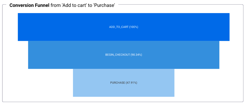
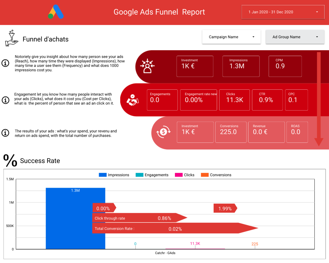
Native Funnel Chart
The native funnel chart is the clearest way to display how many users reach each step of your journey. It visualises the structure of your funnel vertically and immediately exposes where drop-offs occur. Whether you track impressions, clicks, sessions, sign-ups or a multi-step purchase flow, this chart turns your conversion path into an intuitive, readable diagram.
It’s especially useful for spotting stages that bring a lot of visibility but fail to move users forward, for example, a high number of impressions but very few clicks, or many clicks that lead to only a handful of purchases.
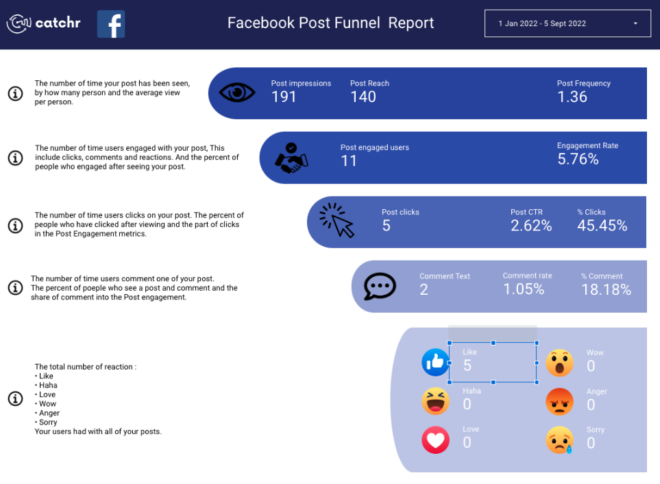
Custom Funnel
Custom funnels are far more flexible than Looker Studio’s native funnel chart. They allow you to choose exactly which metrics and dimensions you want to track, define how each step should look, and highlight key moments with specific colors, sizes, or shapes.
They’re especially useful when your conversion journey includes unique steps or when you need to enrich the funnel with additional context not available natively.
Below are several ways custom funnels can be represented:
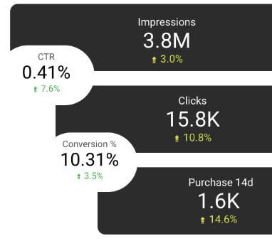
1. Funnel with Cards
This version displays each step as a card, showing clear metrics like Impressions, Clicks, Purchases. Cards work well when you want a clean, minimalist funnel with strong focus on the key numbers.
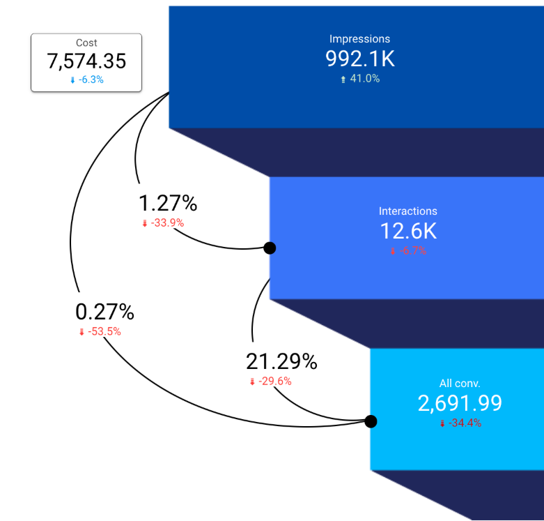
2. Funnel with Cards + Shapes
Here, the cards are combined with funnel shapes to emphasize progression. This style is visually stronger and makes drop-off between steps immediately noticeable.
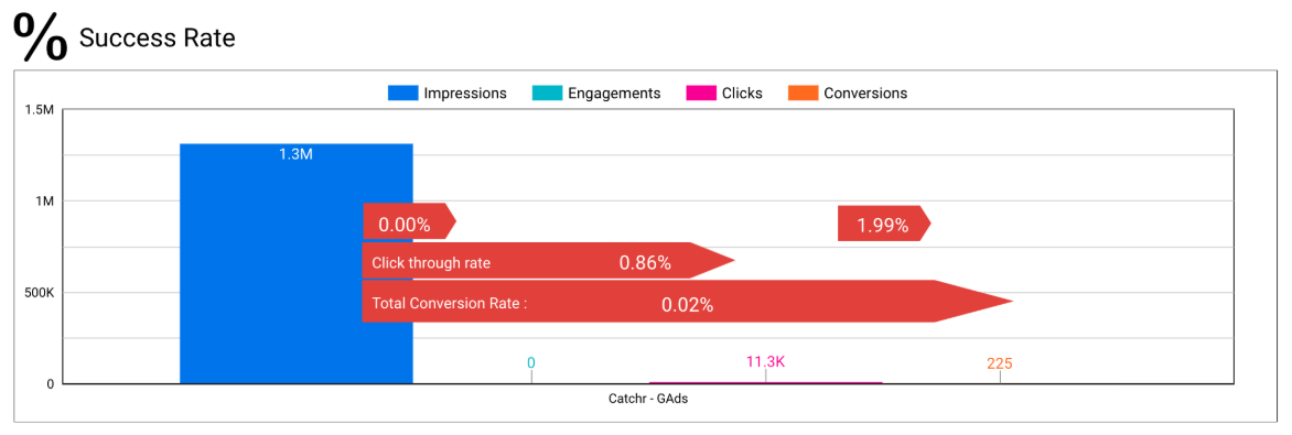
3. Funnel with Bar Chart
Bars allow direct comparison between steps. They’re ideal if you want to visualize both the volume per step and the percentage drop at a glance. Horizontal bars also help keep long labels readable.
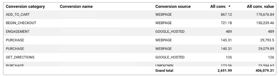
Table
A conversion table is ideal for going deeper into the details of your funnel. Unlike visual funnel charts that focus on the step-to-step progression, the table lets you analyse each conversion action individually, compare volumes, study value generated, and understand how different steps contribute to the overall journey.
It goes beyond percentages: you can compare real volumes, see how actions differ by source, and identify which conversions matter most for business outcomes. With conditional formatting, you can instantly highlight strong signals (high-value actions, high volumes) and weak ones (low-value or underperforming steps) without adding visual clutter.
This makes the table especially useful when you want to:
- compare campaigns, sources, or device types
- identify high-volume but low-impact actions
- detect low-volume actions that generate disproportionate value
Because it’s precise and granular, the table complements your funnel charts by surfacing the exact points that require attention.
Time series
A time series chart is essential for monitoring how your conversions evolve and understanding what drives changes in performance. In the example above, the chart compares Purchase Value with Spend over time, making it clear whether increases in investment actually translate into higher revenue. This kind of visual helps you immediately spot useful patterns, a stable spend paired with rising purchase value indicates a more efficient funnel, while the opposite suggests wasted budget or a drop in conversion quality.
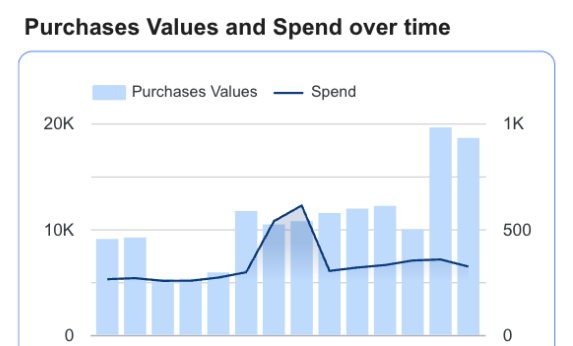
By observing how your conversion metrics fluctuate day by day, you can evaluate the impact of specific actions, such as a new landing page, a pricing update, or a promotional campaign. It also helps determine whether improvements lead to consistent growth or only short-lived spikes.
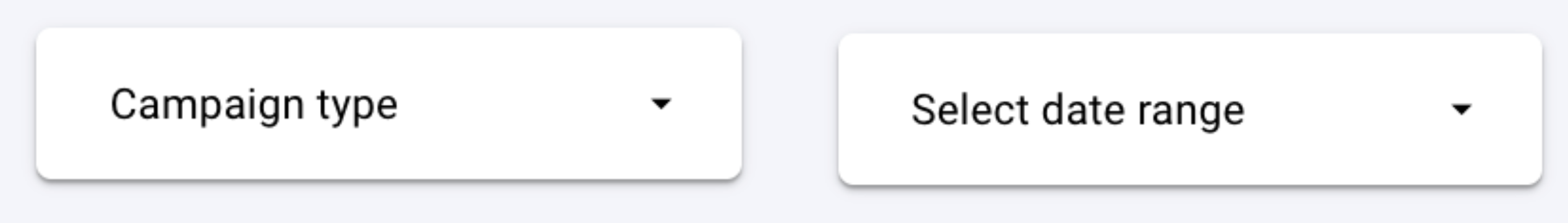
Controls
Controls make the Funnel & Conversions page easier to explore by allowing you to filter the journey by time period, channel, device, or specific funnel steps. They keep the dashboard clean while giving you the flexibility to analyze performance in detail without adding more charts.
The most important control is the Date Range. It lets you compare your funnel before and after a new campaign, a landing page update, a change in messaging, or an optimization test. This is essential for measuring how your actions impact each step of the journey.
It’s usually more valuable to analyze funnel steps as part of the entire journey rather than isolating a single one. Seeing steps like Add to Cart, Begin Checkout, or Purchase within the full funnel provides clearer context and makes drop-offs easier to interpret. The weaknesses become more obvious when each step is compared directly with the previous and next ones.
To go deeper into the analysis, add these key controls:
- Source / Medium or Campaign – compare funnels by channel and see which acquisition sources bring users who actually progress through the funnel.
Recommended control: Dropdown list (simple, intuitive, and easy for comparing multiple channels).
- Device – understand whether mobile, tablet, or desktop users complete more steps and where friction points differ.
Recommended control: Dropdown list or buttons (ideal for quick switching between device types).
- Landing Page – analyse funnel performance depending on where users first arrive, especially if multiple landing pages feed into the same journey.
Recommended control: Advanced filter (useful when many landing pages exist or when filtering by URL contains, starts with, etc.).
These controls help you isolate behavior, identify why certain segments convert better, and understand where the funnel needs optimization.
Parameters
Parameters let you test what-if scenarios inside your funnel instead of only observing past performance. They turn your dashboard into a simple simulator where you can adjust key values and instantly see the impact on conversions and revenue.
With parameters, you can:
- Model changes in conversion rate, cart abandonment, or CPC
- Estimate revenue or conversions if a step improves
- Compare scenarios before launching UX or marketing changes
- Identify which stages have the highest leverage
Examples of useful funnel parameters:
- Final Conversion Rate: test how a +1% uplift affects purchases and revenue.
- Cart Abandonment: lower the rate to see how many more users reach checkout.
- CPC or Budget: simulate traffic and conversion impact before scaling ads.
Why it matters
Parameters make your funnel page actionable: instead of only diagnosing drop-offs, you can predict the outcome of improvements and prioritize what will bring the highest ROI.
Best Practices
A Funnel & Conversions page works best when the layout is simple, structured, and focused on helping users understand where the journey breaks. The goal is to highlight drop-offs clearly and make it easy to see which stages require optimization.
To keep the page clean and effective, apply these principles:
- Prioritize the funnel visual. Place the main funnel chart at the top so users immediately see step progression and drop-offs.
- Use supporting charts wisely. Add time-series trends or drop-off bar charts only if they help explain why performance changes.
- Limit tables to essential steps. Include only the actions that truly matter (Add to Cart, Checkout, Purchase…), keeping them concise and easy to scan.
Design plays a big role in how well your funnel is understood. Use a consistent palette from one step to the next, and avoid too many color variations that make the journey harder to read.
- Use progressive colors. A light-to-dark gradient helps users instantly identify strong and weak funnel steps.
- Keep visual hierarchy clear. Important metrics like conversion rate or drop-off percentage should stand out with stronger contrast.
Filters should replace unnecessary extra charts. They let your audience explore different angles without cluttering the dashboard.
- Rely on channel, device, or step filters instead of duplicating visuals.
- Keep filters limited to the most essential ones so the page stays clean and fast to interpret.
Start with a Looker Studio template
Catchr offers a wide range of ready-to-use Looker Studio templates that help you build acquisition and behavior reports instantly. Instead of starting from a blank page, you can begin with a pre-structured dashboard such as :

After the trial, you can subscribe to continue syncing your data automatically or use the template as a foundation to build your own version with your current data sources. In either case, you will have a solid, well-structured starting point for your reports.
All templates are free to use and include a 14-day trial of Catchr’s connectors. This lets you explore and customize your reports before you subscribe.
