Build an effective Overview & KPIs Page in Looker Studio
Learn how to build a clear and impactful Overview & KPIs page in Looker Studio to highlight your main metrics and make your reports easier to understand.
When creating a new dashboard or report in Looker Studio, we always start with an Overview & KPIs page. This page is often the most essential part of the report. In this guide, we’ll explore how to build it effectively so that it always delivers the right information clearly and efficiently.
Objectives of the Overview & KPIs report page
Let’s start by defining the purpose of this essential page by answering a few key questions:
- Who is the intended audience for this dashboard or report?
- What is the most important data to highlight?
- How frequently will it be reviewed or updated?
Overall, the answers will depend on your role, your company’s objectives, and your industry.
However, we can generally assume that the most important KPIs to include on a Marketing Overview page are related to:
Which charts for an Overview & KPIs report page
In this section, we’ll look at the most effective chart types you can use to build your Overview & KPIs page in Looker Studio, whatever your business or objectives. Each chart type has a specific purpose and helps convey information quickly and clearly.
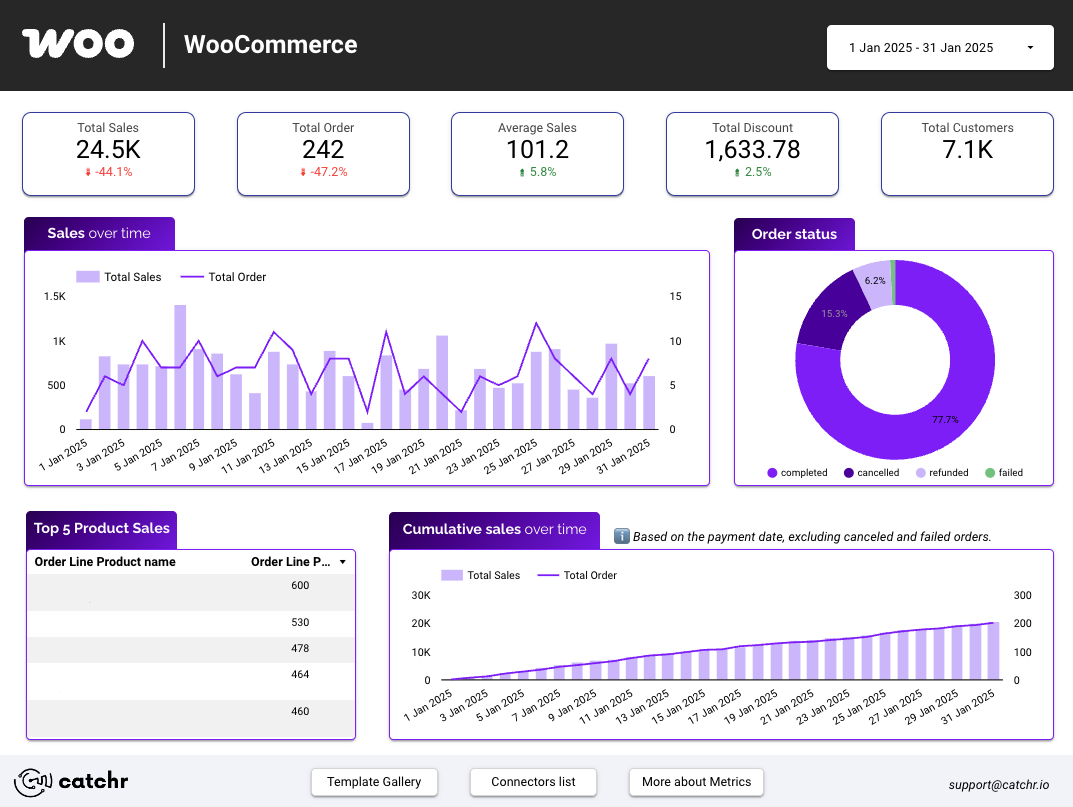
Scorecards
Scorecards are the best visualization to display key figures at a glance.
Often placed at the top of your report, they immediately draw attention to the most important metrics, such as Total Revenue, Cost, Sales, ROAS, or ROI.
To keep your dashboard clear and easy to read, we recommend using a maximum of six scorecards on this page. If you find yourself needing more, it might be a good time to redefine your priorities or consider grouping related KPIs in another chart type.

Time series
Time series charts are ideal for showing data evolution over time. They help you identify trends, seasonality, and anomalies in your KPIs — for example, daily revenue, monthly traffic, or campaign performance over a period. Use them to contextualize your key metrics: a KPI alone gives a snapshot, but a time series helps you understand how and why things are changing.

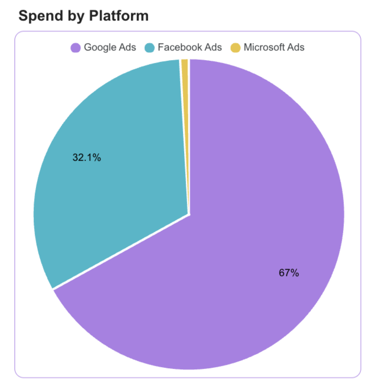
Pie chart
Pie charts are perfect for showing the distribution or share of a total.
They’re great for visualizing how your revenue, conversions, or costs are divided across channels, campaigns, or devices.
Bar Charts
Bar charts are excellent for comparing performance across multiple dimensions, such as channels, campaigns, products, or countries.
They make it easy to identify top performers and underperforming segments at a glance.
For example, you might use a bar chart to compare Revenue by Channel, Conversions by Campaign, or Sales by Product Category.
Horizontal bars work best when you have long category names or when you want to emphasize ranking.

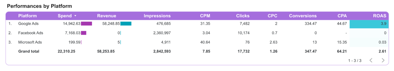
Tables with Conditional Formatting
Tables are ideal for displaying detailed information while still keeping it visual. By adding conditional formatting, like color scales, icons, or bold text, you can turn a simple table into an interactive performance matrix.
For instance, you can highlight your best and worst campaigns based on ROI or show traffic sources with increasing or decreasing trends.
Filter Controls
Adding filter controls such as date ranges, campaigns, or channels allows users to interact with the dashboard and focus on what matters most to them.
This interactivity transforms a static report into a dynamic analysis tool, enabling each user to tailor the view to their specific needs.
For example, a marketing manager might filter by “Last 30 days” or “Google Ads,” while a CEO might prefer a global overview across all channels.
Place controls at the top or in a fixed sidebar to ensure they’re always accessible without cluttering the main visuals.

Best practices
These best practices apply to every page of your report, but they’re especially crucial for the Overview & KPIs page. As the entry point of your dashboard, it should immediately deliver clarity, impact, and a strong first impression.
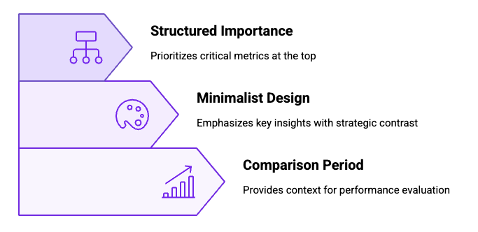
Don’t hesitate to add a comparison period to your charts. It provides valuable context and helps you visualize your overall performance and evolution at a glance. Seeing how your current results compare to previous periods makes it much easier to identify trends, progress, or potential issues.
When it comes to design, less is more. Use a limited and consistent color palette, and highlight only what truly matters. Overusing colors can make your dashboard look cluttered and cause your most important insights to get lost. Instead, use contrast strategically — for example, to emphasize growth, alert users to drops, or spotlight top-performing channels.
Finally, always structure your dashboard by importance. The most critical metrics should appear first, ideally at the top of the page, followed by secondary insights. This hierarchy ensures that anyone opening your report immediately sees the key takeaways, while more detailed or contextual information comes later.
You can also learn more about how to create an effective Marketing Report by following our dedicated guide.
Start with a Looker Studio template
Catchr provides ready-to-use Looker Studio templates to help you build dashboards in just a few minutes using our official connectors. Choose your favorite template below, click “Use this template”, and you’ll be redirected to Looker Studio. From there, simply connect your data, and your dashboard is ready to go!
All our templates are free to access, and you can explore them with a 14-day free trial of Catchr’s connectors. This allows you to fully experience how the template works with your live data, no commitment required.
After the trial, you can subscribe to continue syncing your data automatically, or use the template as inspiration to build your own version with your current data sources. Either way, you’ll have a solid, well-structured starting point for your reports.
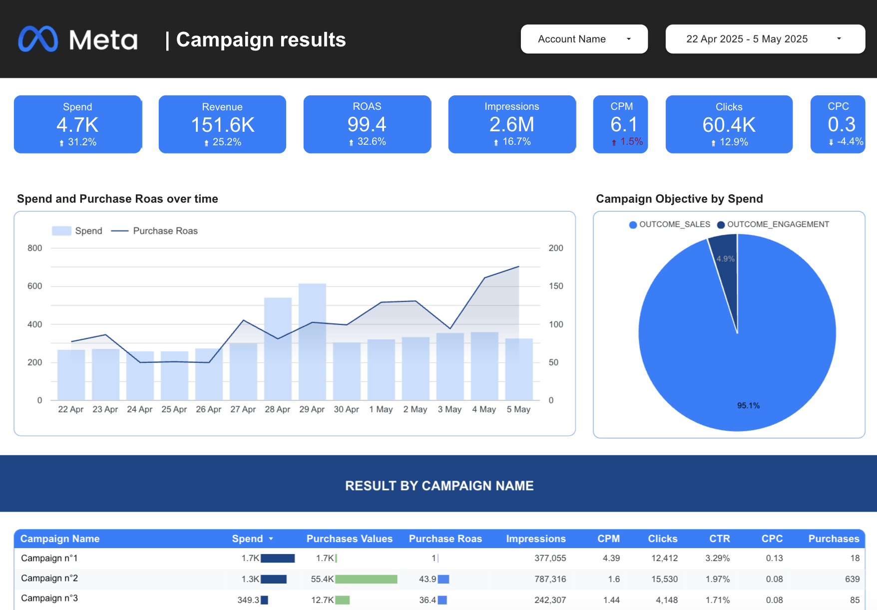
Ads performance dashboard template for Looker Studio
Take control of your advertising results with our Ads Performance dashboard for Looker Studio, a streamlined solution that helps you monitor spend, conversions, and ROAS with ease.

Meta Ads dashboard template for Looker Studio
If you’re looking to improve decision-making with real-time analytics, explore our complete Looker Studio Meta Ads reporting template.
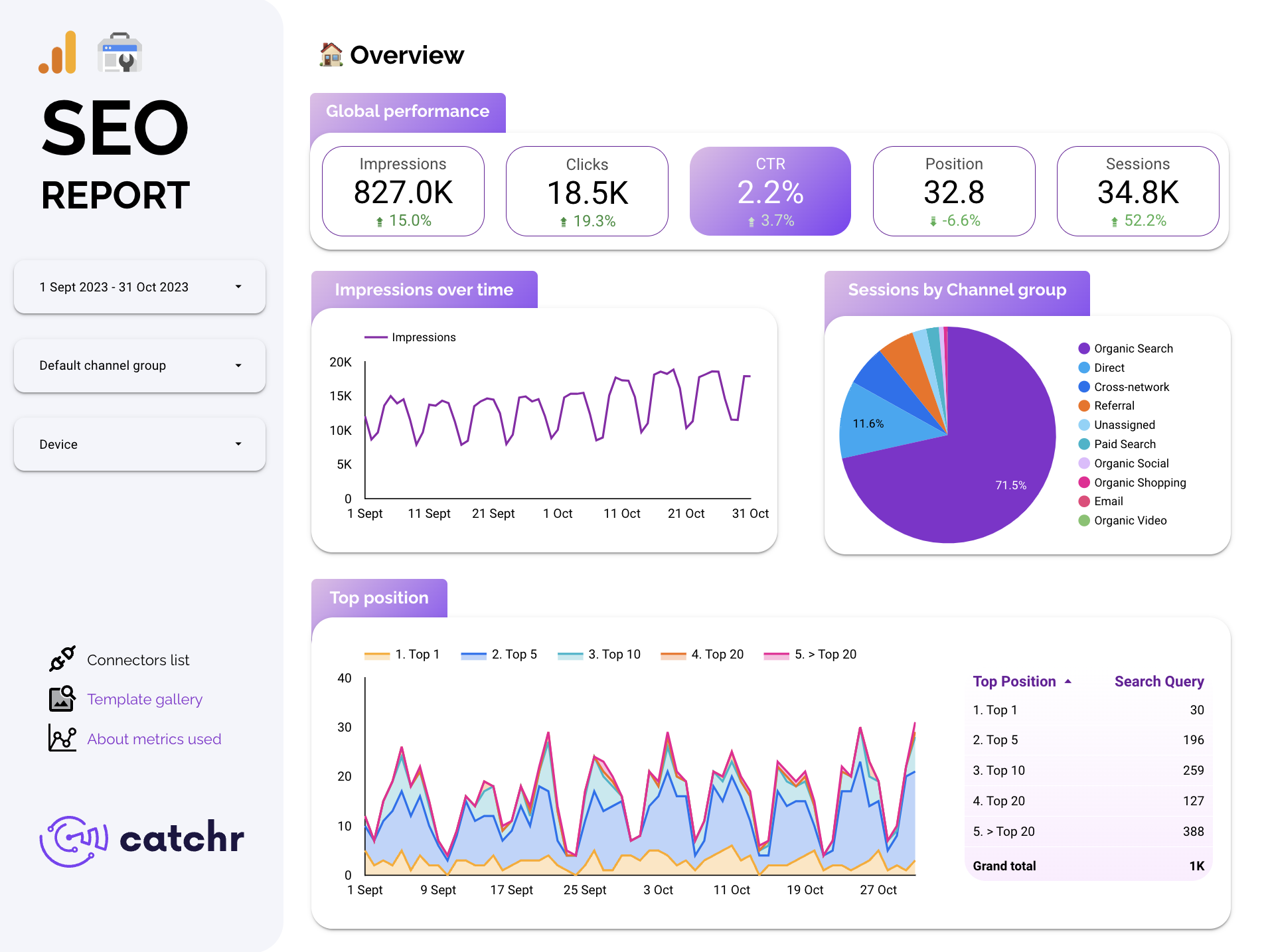
SEO template dashboard template for Looker Studio
Elevate your organic strategy with the SEO Looker Studio Template, designed to highlight keyword trends, landing-page insights, and technical metrics in a clean, actionable format.
Social Media dashboard template for Looker Studio
Stay ahead of engagement trends with the Social Media Looker Studio Template, which consolidates performance across platforms into one beautifully organized dashboard.

E-commerce dashboard template for Looker Studio
Boost your store’s performance with the E-Commerce Looker Studio Template, offering clear insights into revenue, product ranking, acquisition channels, and customer behavior.