Supermetrics is a powerful data integration and reporting tool. However, it may not always be the best fit—whether due to its high pricing, limited flexibility for your specific needs, or other constraints.
In this guide, we’ll explore the top alternatives to Supermetrics and help you find the solution that aligns best with your goals and workflow!
Gain insights into how these 10 competitors compare through a detailed analysis of their offerings versus Supermetrics.
- Catchr.io
- Funnel.io
- Improvado
- Windsor.ai
- Fivetran
- Porter Metrics
- Power My Analytics
- DataSlayer
- Adverity
- Whatagraph
Understanding Supermetrics
Supermetrics is a popular marketing data integration tool that helps businesses pull data from various platforms (such as ad networks, analytics tools, and CRMs) into a destination for analysis or live reporting. In essence, Supermetrics acts as a pipeline, offering data connectors to over 100 sources (about 138+ data sources, including Facebook Ads, Google Analytics, LinkedIn Ads, etc.) and feeding that data into reporting destinations.
Common destinations supported by Supermetrics include Google Sheets, Microsoft Excel, Google Looker Studio (formerly known as Data Studio), and data warehouses like Google BigQuery. This enables marketers and analysts to automate data collection for reporting and dashboarding.
Core features of Supermetrics include no-code data extraction, scheduling automated refreshes, and the ability to blend data from multiple sources. However, Supermetrics itself provides no built-in visualization or reporting interface – it’s purely a “data-moving” tool that relies on third-party BI tools for dashboards.
Supermetrics has become well-known for simplifying marketing reporting, but it also comes with some drawbacks that prompt teams to seek alternatives.
Supermetrics Pricing

Supermetrics offers various products and plans (for Google Sheets, Looker Studio, warehouses, etc.), and its pricing model can be complex. Plans are typically tiered based on the number of data sources, users, and destinations required. Entry-level packages (e.g., the “Essential” plan) start around €29 per month for a limited set of connectors. However, as you add more connectors or additional users, costs rise quickly.
Beyond cost, some users have reported other limitations of Supermetrics, such as occasional connector bugs or delays, a steep learning curve for complex setups, and heavy reliance on support (which, in Supermetrics’ case, has been criticized when only chatbots are available).
Additionally, because Supermetrics doesn’t provide its own visualization features, users must be comfortable using another tool, such as Tableau or Looker Studio, to build reports. These factors have led many companies to search for a Supermetrics alternative that better fits their budget or offers expanded capabilities.
Fortunately, the market in 2025 offers many Supermetrics competitors and alternatives. Some focus on ease of use and affordability for small teams, while others provide more advanced data management features for enterprise needs. Below, we analyze 10 of the best Supermetrics alternatives – their key features, pricing models, and what makes each one stand out. After the detailed reviews, you’ll also find a side-by-side comparison table to help you identify the ideal alternative to Supermetrics for your use case.
Supermetrics vs Competitors: Benchmark Criteria
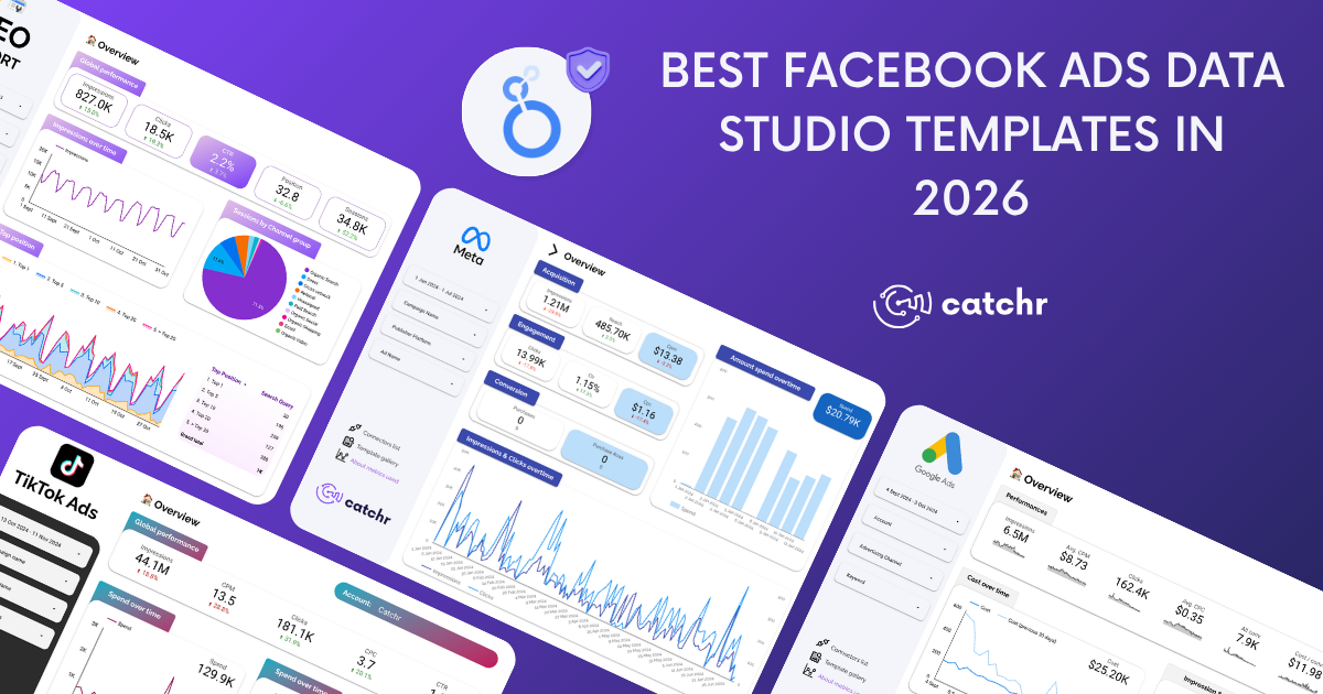
Catchr.io: the best in balanced, accessible data integration
Catchr.io Features
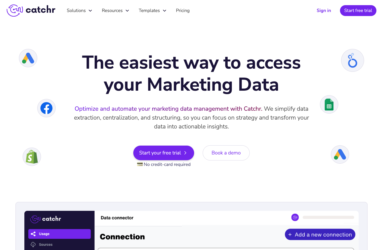
Catchr.io is a no-code data integration and visualization platform that has quickly become a top Supermetrics alternative for marketers, agencies, and even developers. Catchr positions itself as an all-in-one solution that is both powerful and accessible – meaning you don’t need to be a data engineer to use it. It offers more than 50+ ready-to-use data connectors for crucial marketing and sales platforms. These include popular sources like Facebook Ads, Google Ads, Instagram, TikTok Ads, LinkedIn, Google Analytics, and more. Catchr covers the essential connectors that digital marketers need, and the list is continuously growing.
Catchr supports a wide range of destinations for your data. With Catchr, you can easily send data into Google Looker Studio, Google Sheets, Excel, popular data warehouses (Google BigQuery, Amazon Redshift, Snowflake, etc.), cloud storage (Amazon S3, Google Cloud Storage, Azure Blob), BI tools like Power BI and Tableau, or even retrieve data via API in JSON/CSV format. This flexibility means you can use Catchr for both reporting (feeding dashboards in your BI tool of choice) and general ETL/ELT needs. All connectors and destinations are available on every plan, which is a refreshing change from some competitors that lock certain connectors behind higher tiers.
Key features of Catchr include:
- No-code, user-friendly interface: Marketers can set up data pipelines without coding. The platform is designed to be straightforward, reducing the learning curve.
- Live data and scheduling: Data updates can be scheduled so that your dashboards always show fresh information. Catchr ensures data is available instantly once connected.
- Unlimited users and dashboards: All plans allow unlimited team members and unlimited dashboards/report creations, which is ideal for agencies collaborating on reports.
- 24/7 support: Catchr emphasizes its highly responsive support team available around the clock. This is a major plus for users who might have experienced slower support with other tools.
In short, Catchr.io covers end-to-end data needs – from data connectors to providing ready-made report templates for Looker Studio. All of this comes with a no-code approach, making Catchr a balanced solution that caters to both technical and non-technical users.
Catchr.io Pricing
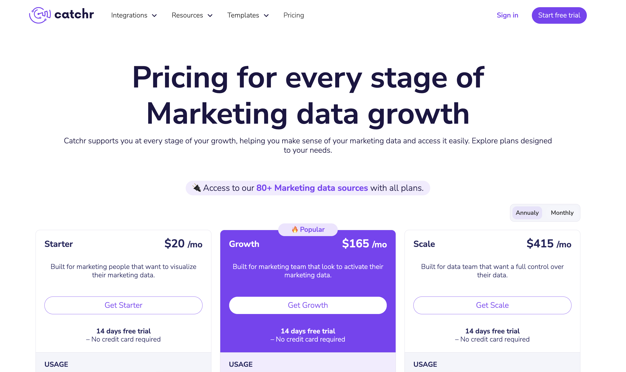
Catchr’s pricing is one of its strongest selling points, especially compared to Supermetrics. It offers a 14-day free trial (no credit card required) for anyone to test the platform. After that, Catchr offers simple, tiered plans that are budget-friendly for individuals and small teams, while still scaling to meet more significant needs. Paid plans start at $20 per month for the Starter plan.
Notably, even the lowest plan includes access to all connectors – you are not limited by the types of data sources you can use.
As you move up the tiers, the main limits that increase are the number of platforms and data source accounts you can connect. The Starter plan, at $20 per month, includes 1 platform and 10 accounts for teams just getting started. The Growth plan, at $165 per month, scales this up to 10 platforms and 100 accounts, while the Scale plan, at $415 per month, supports 25 platforms and 500 accounts for mature, data-heavy teams. All plans include unlimited users and unlimited requests, so even agencies on a lower-tier plan can bring their entire team on board without extra per-seat charges.
Catchr’s pricing is transparently listed on their site and is designed to grow alongside your business: you “pay only for what you need,” starting small and moving to higher tiers or unlocking extras (like more platforms, more accounts, or accelerated data) as your data volume and reporting needs evolve. There are no hidden fees—integrations with reporting tools, data scheduling, templates, and support are all included, while higher tiers add options such as BigQuery storage, API access, custom schema mapping, and priority support.
Compared with Supermetrics, Catchr isn’t just more affordable; it’s also more adaptable to different stages of growth. Marketers and agencies can begin with a low-risk entry point, then seamlessly upgrade as they add channels, clients, or complexity to their reporting. For the value and scalability it offers, Catchr.io is arguably one of the most balanced choices—you get a broad, enterprise-grade feature set at a fraction of Supermetrics’ cost, with pricing and plans that are truly aligned with your evolving needs.
Supermetrics vs Catchr.io
Funnel.io: the best in enterprise-scale marketing data management
Funnel.io Features
Funnel.io is a long-standing competitor in the marketing data integration space and is often considered when evaluating enterprise-grade Supermetrics alternatives. Funnel.io provides an end-to-end data pipeline that not only pulls data from sources but also offers tools to transform and organize it before sending it to your chosen destination. It connects to 500+ data sources out-of-the-box , covering virtually every major marketing and advertising platform (from Google, Facebook, and Twitter ads to CRMs like Salesforce, analytics platforms, and more).
If a specific connector isn’t available, Funnel even allows you to import data via Google Sheets or request their team to build a new connector, ensuring you can consolidate all your marketing data.
A key strength of Funnel.io is its robust data transformation capabilities. Users can create custom dimensions and metrics, perform currency conversions, and apply business logic to data within Funnel before it reaches a dashboard. This is extremely useful for large teams that need to standardize data from different sources. Funnel also includes a “Data Explorer” feature, which is essentially a built-in interface for data analysts to slice and dice the collected data (though it’s described as geared more toward data scientists)
Unlike Supermetrics, Funnel.io does provide some native visualization in the form of basic dashboards. These built-in dashboards let you view key performance metrics directly in Funnel for a quick snapshot. However, these are relatively basic and not meant to replace complete BI tools (Funnel openly notes it’s not a replacement for Tableau or Looker).
Most users will still export data to their preferred destinations. Funnel supports output to data warehouses (such as BigQuery, Snowflake, and Azure SQL), databases, cloud storage, as well as direct integrations with Google Data Studio, Google Sheets, Excel, and various business intelligence (BI) platforms. Essentially, unlimited data destinations are possible with Funnel, which is a big plus for enterprises managing multiple data workflows.
In summary, Funnel.io is highly comprehensive, with its wide range of 500+ connectors, ability to handle large-scale data transformation, and solid reliability. It’s well-suited for enterprises and data-driven organizations. The trade-off is that this power comes with complexity – Funnel has a lot of features to learn, and new users might find there’s an initial learning curve. It’s often recommended for companies that have data analysts or data engineers on the marketing team who can take full advantage of its capabilities.
Funnel.io Pricing

Funnel.io’s pricing model is notably different from flat subscription services. It operates on a usage-based system using “Flexpoints” as credits. Essentially, everything you do in Funnel (connecting a data source, running transformations, sending data to a destination) consumes Flexpoints. The more data and connectors you use, the more Flexpoints you’ll need.
Funnel offers three main plans: Starter, Business, and Enterprise, each with a different Flexpoint cost and included features:
- Starter: Priced at $1.2 per Flexpoint. This plan is designed for smaller operations; it lets you connect 3-5 sources for free (using 350 Flexpoints monthly at no charge) and includes 121 “core” integrations and 3 core destinations. It also provides access to the Data Explorer.
- Business: Priced at $1.5 per Flexpoint. This adds on a vast number of connectors (381 additional “Business” integrations beyond the core ones) and more destinations (37 in total). It also allows for unlimited workspaces to organize data by teams or clients.
- Enterprise: Priced at $2.0 per Flexpoint. This top tier includes everything in Business, plus a few exclusive connectors (11 enterprise-only sources), an additional destination (Snowflake, specifically), options for data regions (necessary for GDPR compliance), and a dedicated technical account manager.
Because of this credit system, the actual cost can vary widely. For a company with modest needs (a few data sources), costs might remain a few hundred dollars a month. But larger deployments can get expensive. Funnel.io itself estimates that organizations needing dozens of sources and destinations might spend anywhere from $1,500 up to $4,000 per month. In some cases, enterprise customers pay even more if their data volume is very high.
It’s important to note that Funnel’s pricing includes unlimited users on all plans (no per-seat fee) and they do include premium support. However, the complex pricing structure can be a hurdle for some – it requires monitoring your Flexpoint usage to manage cost. For teams that prefer predictable billing, this model might be challenging.
In comparison to Supermetrics, Funnel.io is generally more expensive at scale. Supermetrics might charge per connector or package, whereas Funnel charges per data volume and actions. That said, Funnel delivers enterprise value – companies that pay for it are often those that need its extensive connector library and data processing power. If your organization has a sizeable marketing budget and requires a scalable, robust data pipeline with great support, Funnel.io can be worth the investment. (For a detailed head-to-head comparison of these two tools, read our in-depth Supermetrics vs Funnel.io analysis.)
Supermetrics vs Funnel.io
Improvado: the best in AI-powered enterprise marketing analytics
Improvado Features
Improvado is an enterprise-grade marketing analytics platform often touted as an advanced alternative to Supermetrics for large companies. It provides an end-to-end data pipeline: Improvado will extract data from your sources, transform and normalize it, and load it into your chosen destination.
With Improvado, you can connect to over 500 marketing and sales data sources – a very high number, rivaling Funnel and Adverity (more later in this blog post). This includes all common ad platforms, analytics tools, CRMs, and more. Notably, Improvado’s connectors cover everything Supermetrics does (Supermetrics has around 100 connectors), and then some, providing enterprises with a one-stop solution for data aggregation.
Once data is in Improvado, the platform shines with its data transformation and enrichment capabilities. Users can harmonize data across channels, meaning if different platforms use different naming conventions or metrics, Improvado can map and unify these into a single schema. This helps create a single source of truth for multi-channel marketing data. Improvado also offers a fully-managed data storage option – essentially a cloud data warehouse where your cleaned data can live, if you don’t have your own warehouse.
For output, Improvado supports sending data to all the usual destinations (BI tools like Tableau, Looker Studio, databases, spreadsheets). While Improvado itself is not a dashboarding tool, it does provide pre-built dashboard templates that you can use in your preferred visualization tool. This is handy – for example, you can take an Improvado template for a marketing KPI dashboard and load it into Looker Studio, saving time on report creation. It’s a step towards making reporting easier, although the actual visualization still happens outside Improvado.
In terms of ease of use, Improvado is powerful but complex. Implementing Improvado can take some time – reports suggest it can take months to fully onboard and integrate into a big organization’s workflow. This is because of the vast customization and integration options available. Improvado is typically used by data teams and marketing analysts in large enterprises, often with dedicated support from Improvado’s team during the setup process. The platform includes dedicated account managers and support engineers for enterprise clients, reflecting that it’s meant for serious, long-term deployments.
Overall, Improvado is feature-rich and oriented toward very large-scale marketing operations. It’s best for organizations that require advanced data transformation, governance, and perhaps AI-driven oversight on their marketing data. If Supermetrics is an economy car and Funnel is a business-class sedan, Improvado is like a high-end sports car with custom tuning – powerful and loaded with extras, but you’ll want an expert driver (or team) to get the most out of it.
Improvado Pricing

Improvado does not publicly list straightforward pricing on their website. This typically means pricing is custom-negotiated based on the needs of the client (common for enterprise software). However, various industry sources and reviews indicate that Improvado is one of the more expensive options on the market. Reported costs for Improvado range roughly between $2,000 to $5,000 per month for the complete solution, depending on factors like data volume, number of sources, and any added services. This puts Improvado well beyond the budget of small businesses and even many mid-sized companies.
In summary, Improvado’s pricing aligns with its positioning: a high-end Supermetrics competitor for those who need an enterprise solution. For those who can afford it, Improvado delivers a lot – but for many marketers, this is beyond scope. (To see a more direct feature and pricing comparison, check out our detailed Supermetrics vs Improvado article.)
Supermetrics vs Improvado
Windsor.ai: the best in marketing attribution and flexible pricing
Windsor.ai Features
Windsor.ai distinguishes itself among Supermetrics alternatives by combining data integration with marketing attribution analysis. It’s a platform designed to bring all your marketing and analytics data together in one place, helping you understand the customer journey across touchpoints.
Windsor.ai offers a solid range of connectors (315+ data sources) out-of-the-box. These include standard marketing channels (Google Ads, Facebook, LinkedIn, Twitter, etc.), web analytics (GA4, Adobe Analytics), CRM and sales platforms (Salesforce, HubSpot), and more. Essentially, Windsor.ai covers most of the sources a marketing team would use, similar to Supermetrics, and even has some less common ones. The platform is continuously updated with new integrations. Notably, Windsor also provides a connector for attribution data, if you’re using their attribution modeling, which we’ll get into.
A key strength of Windsor.ai is its ability to have multi-touch attribution and machine learning. In addition to just moving data, Windsor.ai can apply attribution models (such as linear, first-click, last-click, time decay, or even algorithmic models) to your marketing data, helping you determine which channels contribute to conversions. This is a feature that Supermetrics and many other ETL tools don’t provide. Companies interested in understanding the customer journey could value Windsor for this reason.
On the data integration side, Windsor.ai is quite flexible with destinations. It supports major BI and data storage destinations: Google Looker Studio, Power BI, Tableau, Google Sheets, Excel, Google BigQuery, Snowflake, Azure SQL, and more.
In terms of usability, Windsor.ai offers a web interface where you can select data sources and destinations, map fields if needed, and schedule data refreshes. Daily or hourly refresh intervals are available on standard plans. Another notable aspect is that Windsor.ai allows unlimited users on all plans, which means teams can collaborate without incurring extra costs per seat.
One more feature: Windsor.ai has an API for those who want to programmatically fetch data or integrate it into custom workflows. This means developers can also use Windsor as a backend data pipeline, retrieving raw data in JSON or CSV format via API if needed.
Overall, Windsor.ai is a well-rounded tool, but its unique selling point is the attribution modeling. It tends to attract marketers who want both data pipelines and advanced analytics in one. It’s an excellent option for data-savvy marketing teams or agencies that need to consolidate data and also deliver insights on marketing ROI across channels.
Windsor.ai Pricing
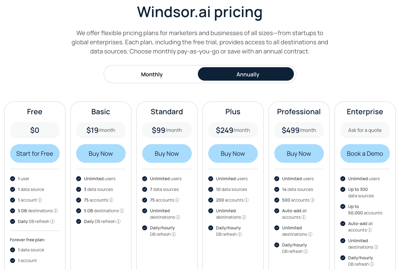
Windsor.ai offers a more transparent and tiered pricing model compared to some enterprise competitors, and it is known to be relatively affordable, starting at a low entry price. Windsor’s Basic plan starts at $19 per month (if paid annually), which is highly affordable. This plan includes 3 data sources and up to 75 connected accounts, with 5 data destinations allowed. Even the Basic tier supports unlimited users and a daily refresh, making it a viable option for small businesses or individual marketers.
The pricing tiers scale primarily by the number of data sources and accounts (accounts meaning individual account connections, e.g., connecting 10 Facebook ad accounts counts as 10). For example, the Standard plan is around $99 per month and allows 7 data sources (still 75 accounts, but unlimited destinations) with hourly data refreshes. The Plus plan at ~$249/month increases to 10 data sources and 200 accounts, and the Professional plan at ~$499/month goes up to 14 sources and 500 accounts. All standard plans allow unlimited destinations (so you can pipe data into as many places as you want) and unlimited users. This is generous, as some other tools charge extra for more destinations or user seats.
For organizations with very large needs, Windsor.ai has an Enterprise plan (custom pricing) which supports up to 300 data sources.
An important note: Windsor.ai also has separate pricing for its attribution modeling product. The marketing attribution plans reportedly start around $399/month (for advanced attribution and mix modeling). This is an add-on for those who need the full power of multi-touch attribution. However, if you just want to use the connectors and basic attribution reports, the standard plans might suffice.
Additionally, Windsor.ai provides a 30-day free trial for any plan, which is quite a generous trial period compared to the typical 14 days. There might even be a very basic free tier (some sources mention a limited free plan), although the current focus is on the free trial of paid plans.
In summary, Windsor.ai’s pricing is flexible and comparatively lower-cost for the capabilities it offers. A small agency could feasibly start at $99 per month and have a functional Supermetrics alternative with attribution features – something that would cost much more if it were to combine Supermetrics with a separate attribution tool.
Supermetrics vs Windsor.ai
Fivetran: the best in robust data pipeline reliability
Fivetran Features
Fivetran is a well-known data integration platform that is not exclusively for marketing data, but for all types of business data. It’s often considered when companies want a highly reliable, maintenance-free data pipeline. If your team has data engineers or analytics engineers, Fivetran might come up in discussions as a Supermetrics alternative, especially if you need to integrate more than just marketing sources (like databases, product analytics, etc.).
Fivetran supports a vast array of connectors – over 300 fully managed connectors spanning marketing sources, databases (such as SQL servers), cloud applications (like Salesforce and NetSuite), and more. In total, Fivetran’s site claims to support over 500 data sources, including connectors built through their partner network and APIs. For marketing teams, Fivetran covers all major ad platforms and analytics tools similar to Supermetrics.
The hallmark of Fivetran is its focus on automation and reliability. Once you connect a source, Fivetran continuously syncs the data to your destination without you needing to write code or manage servers. It handles schema changes gracefully (if new fields are added in the source, Fivetran updates the target schema), and it has very high uptime (a 99.9% SLA for many customers). They even tout 1-minute sync intervals for specific connectors and a history of near-perfect uptime. This means data in your warehouse is almost real-time and rarely delayed.
Fivetran does not provide visualization or reporting tools – instead, it focuses on loading data into a data warehouse or database. Common destinations include Snowflake, BigQuery, Redshift, Azure Synapse, and Databricks, among others.
That said, Fivetran has introduced features like “Fivetran Transformations” which let you execute SQL-based transformations (powered by dbt) after the data is loaded. This is useful for cleaning or combining tables within your warehouse automatically. Also, Fivetran offers API access and a robust management console, so you can programmatically control connectors or integrate Fivetran status into your monitoring systems.
Ease of use: For technical users, Fivetran is relatively straightforward – it’s often described as “set it and forget it.” For non-technical users, however, Fivetran may feel complex because you need a data warehouse to receive the data and likely some SQL skills to utilize the raw data tables. Unlike Supermetrics, which can spit data directly into a Google Sheet for a marketer, Fivetran’s output is raw tables in a database. Therefore, Fivetran is typically favored by data engineers or analysts who are comfortable with databases. Many marketing teams use Fivetran in collaboration with their data team, rather than as a standalone marketing tool.
In summary, Fivetran’s feature set is robust connectors + reliability, with less emphasis on marketing-specific niceties (no templates or dashboard, no UI for marketers). If your primary concern is having a bulletproof pipeline that rarely needs intervention, Fivetran is best-in-class. It’s essentially a back-end infrastructure choice compared to Supermetrics’ more front-end approach.
Fivetran Pricing

Fivetran uses a usage-based pricing model known as Monthly Active Rows (MAR). This means you pay based on how much data you sync. Specifically, one “Active Row” is essentially a row of data that is inserted, updated, or deleted in your destination in a month. The more data changes you have, the more you pay. This model is different from paying per connector or user – it’s purely about data volume. Fivetran’s pricing can be a bit complex to calculate, but they provide some guidance and even a free tier to start:
- Free Plan: Fivetran offers a free tier, which includes all Standard plan features for up to 500,000 monthly active rows (and up to 5,000 monthly model runs for transformations). This is great for trial or very small pipelines; it’s essentially a way to test Fivetran or use it on a small scale without cost.
- Standard Plan: Once you exceed the free limit, you move into the Standard plan, which operates as pay-as-you-go. On average, Fivetran has stated that the Standard plan costs about $500 per 1 million rows synced. This can vary, but as a ballpark, if you synced 5 million rows in a month, you’d pay roughly $2,500 that month.
- Enterprise / Business Critical Plans: For larger companies, Fivetran offers volume discounts and higher tiers like Enterprise and Business Critical. For example, an Enterprise plan might start at ~$667 per million rows, and Business Critical (with the highest SLA and security features) around ~$1,067 per million rows. These plans also include features such as SOC2 compliance, security isolation, and sync options that range from 15 minutes to even 5 minutes. Large contracts for Fivetran (annual commitments) can range significantly, but some reports mention Fivetran deals being in the tens of thousands per year for mid-sized companies, up to hundreds of thousands per year for very large ones.
In practical terms, if a marketing team has a moderate amount of data (let’s say a few million rows across all tables per month), you might be looking at a few thousand dollars per month for Fivetran. If you have a small dataset (under 0.5 million rows), you can fit the free plan or one just above it, making Fivetran effectively very affordable. Fivetran’s model benefits those who are efficient with data – you only pay for what you use, which is great for scalability, but can make costs spiky if your data volume suddenly increases.
One nice thing is that Fivetran allows unlimited connectors on the plans – you aren’t charged more for connecting to more sources, except insofar as those sources contribute to your row count. It also allows unlimited users. So, organizations don’t have to juggle connector-based pricing; they can connect to many sources and only watch the row counts.
For many pure marketing use cases, Fivetran might end up being more expensive than tools like Catchr or Windsor if those tools have fixed, reasonable fees, because marketing data (such as impressions and clicks) can generate millions of rows quickly. However, for companies already investing in data warehouses and looking for an all-in-one pipeline for not just marketing but also product and finance data, the cost can be justified, as it consolidates all ETL into one service.
In conclusion, Fivetran’s pricing is usage-based and can scale high, but the free tier and granular pay-as-you-go nature mean you only pay for what you need. It’s a different philosophy from Supermetrics’ connector-based subscriptions. For a smaller business, Supermetrics’ fixed plans might be easier to predict, whereas Fivetran could be overkill. For a data-driven firm that values the flexibility of adding lots of sources without negotiating new contracts, Fivetran provides that – you simply hook up any of their 700+ connectors and your bill grows with usage.
Supermetrics vs Fivetran
Porter Metrics: the best in affordability
Porter Metrics Features
Porter Metrics is a lightweight marketing data connector tool known for its simplicity and affordability. It’s often mentioned as a Supermetrics free alternative or a low-cost alternative, particularly for users of Google Data Studio (Looker Studio) and Google Sheets. Porter Metrics provides connectors primarily for popular PPC, social, and analytics platforms. In total, Porter has around 15-20 data sources available (as of recent counts, about 19 connectors).
These include major ones like Facebook Ads, Instagram Insights, Google Ads, Google Analytics, LinkedIn Ads, Twitter Ads, Shopify, HubSpot, and a few others. While this is a much smaller library compared to Supermetrics, Porter covers the essentials needed by many small businesses or solo marketers.
Porter’s primary offering is connectors for Looker Studio. It essentially allows you to pull data from those marketing platforms directly into Data Studio to build live dashboards. They also support Google Sheets as a destination, so you can fetch data into your spreadsheets. The tool does not support data warehouses or databases – it’s focused on those two destinations, which keeps it straightforward.
Porter does not have complex transformation features; it generally pulls raw data with the fields provided by the source. It also lacks advanced things like an API or custom metrics – it’s intentionally simple. There is no internal dashboard or data explorer in Porter; you do all your analysis in Data Studio or Sheets after the data is connected.
One convenience is that Porter’s connectors often come with easy authentication and quick refresh rates (data can usually be refreshed on demand or a schedule, like daily). It also supports multiple accounts per connector (depending on your plan) so agencies can fetch data for several clients in one connector.
Because Porter is a smaller tool, it might not have the same polish or extensive documentation as bigger competitors, but it makes up for that by being very focused on one job: connecting a handful of marketing data sources to Google’s free tools. If that’s exactly what you need, Porter is very handy.
Porter Metrics Pricing

Porter Metrics is praised for its affordable pricing structure. It offers a few simple plans, generally much cheaper than Supermetrics’ offerings. According to recent info, Porter has three main pricing tiers (often named Solo, Team, and Agency or similar):
- Solo Plan: roughly $15 per month. This typically allows 1 user and a limited number of data sources (e.g., up to 3 connectors) and 1 account per connector. It’s aimed at individual marketers or a single business owner reporting on their own accounts.
- Team Plan: roughly $40 per month. This might allow 2-5 users, more connectors (maybe up to 10), and multiple accounts per connector (e.g., 5 accounts each). It’s for a small team managing a few brands.
- Agency Plan: roughly $100 per month. This usually offers unlimited or a high number of connectors and accounts (Porter’s site mentions up to 40 accounts or more), plus priority support. It’s meant for marketing agencies with many clients or larger marketing teams.
All Porter plans come with a 14-day free trial so you can test all connectors.
However, with the low cost comes limitations: Porter’s connectors are fewer (if Porter doesn’t support a data source you need, you’re out of luck unless you route data via Google Sheets manually). Also, Porter does not include data mapping or advanced features – it’s a basic pipe. For some, that’s perfectly fine. But it means if your needs grow, you might hit Porter’s ceiling and need to upgrade to a more powerful tool.
Support on Porter’s lower plans might be primarily email. The company is smaller, so while many users report the interface is easy, one should not expect extensive enterprise-level support.
In summary, Porter Metrics’ pricing is its biggest appeal – you get a simple Supermetrics competitor for a fraction of the cost. It’s best suited for those who only need to connect a handful of major platforms to Google Data Studio/Sheets and want to save money. Porter Metrics proves you don’t always need a large, expensive platform if your reporting needs are straightforward. Just be aware of its connector limitations.
Supermetrics vs Porter Metrics
Power My Analytics: the best in cost-effective data pipelines with caching
Power My Analytics Features
Power My Analytics (PMA) is another popular Supermetrics alternative, particularly known among agencies and small businesses for its balance of features and affordability. It is a data ETL (Extract, Transform, Load) tool focused on marketing data, quite similar in concept to Supermetrics. PMA supports 40+ native connectors to digital marketing platforms, which includes all the common ones: Facebook Ads, Google Ads, Bing Ads, Twitter, LinkedIn Ads, Amazon Ads, Google Analytics, YouTube, Shopify, and many others. This connector count is more than Porter's, and in the same ballpark as Supermetrics’ core offerings (Supermetrics has more total, but many may not be used by a typical user).
One standout feature of Power My Analytics is its data caching and backfilling mechanism. PMA automatically stores your data and can fill in historical data for your reports. This caching means that when you build a dashboard, the data loads faster and is more reliable, because PMA can serve the data from its cache rather than hitting the source API every time. It also provides a buffer against source outages – if, say, Facebook’s API is down, PMA might still have yesterday’s data cached to keep your report up-to-date. Users often cite this reliability as a big plus, since one common complaint with Supermetrics was occasional broken connectors or slow loading reports. With PMA, reports load quickly and are less likely to break due to an API issue.
PMA allows you to send data to various destinations: Google Looker Studio, Google Sheets, Microsoft Excel, data warehouses like BigQuery or MySQL (on higher plans), and it also has its own built-in “Data Explorer” tool. The Data Explorer is a simple dashboard within the PMA platform where you can view and check your data. It’s not meant for client reporting or heavy visualization, but it’s useful for internal monitoring or quick checks on metrics. For client-facing needs, you’d use something like Looker Studio or another BI tool with the data PMA provides.
When it comes to ease of use, PMA is often praised for a clean and clear interface
One potential limitation to be aware of: while PMA’s 40+ connectors cover most needs, extremely niche data sources might not be supported. Also, PMA doesn’t have advanced data transformation features like Funnel or Adverity (more later in the blog post) – it’s more of a passthrough (with caching). You can do basic things like select date ranges or filters, but if you need complex multi-source blending or calculated metrics, you’d handle that in the BI layer.
Power My Analytics Pricing

Power My Analytics is known for straightforward and affordable pricing plans, with clear limits on how many data sources and accounts you can connect. As of late 2024, PMA offered four main plans:
- Single – $14.95/month: Supports 1 data source connector, 1 account (for that source), and 1 admin user. This is a very entry-level plan, ideal for a single marketer who just needs, for example, to pull Facebook Ads into a sheet.
- Business – $39.95/month: Supports up to 5 data source connectors, 1 account each, and 2 admin users. Good for a small business with a handful of channels to monitor.
- Pro – $99.95/month: Supports unlimited data source connectors (all 40+ are open to use), up to 20 accounts (total), and unlimited admin users. This plan is often the sweet spot for agencies, as it allows them to gather data from many sources for many clients. Unlimited users means you can have your whole team manage or view data.
- Enterprise – $295/month: Also offers unlimited sources and 20 accounts, with the key addition of your own data warehouse managed by PMA and a dedicated representative. Essentially, Enterprise gives you a private BigQuery instance for your data and premium support. If an agency or company needs to store large amounts of raw data or have higher account limits, they’d go Enterprise (and likely negotiate custom terms if needed).
One nice aspect is that all connectors are available even on the lower plans; the limitation is how many you can use simultaneously. So, for instance, on the Business plan you could choose any 5 connectors out of the library. This is more flexible than Supermetrics which often segments connectors by package.
Comparatively, PMA’s pricing is more cost-effective than Supermetrics for equivalent usage.
PMA also offers a 14-day free trial on any plan, and often there are no long-term commitments (month-to-month is available, with discounts for annual). This makes it easy to try.
Supermetrics vs Power My Analytics
DataSlayer: the best in Google Sheets & Looker Studio integration
DataSlayer Features
DataSlayer is another toolkit that will interest anyone seeking a Supermetrics alternative, especially if they primarily use Google Sheets or Google Data Studio for reporting. It provides connectors to around 40+ marketing data sources, which is comparable to Power My Analytics in scope.
These connectors include Google Ads, Facebook/Instagram Ads, Google Analytics, Bing Ads, Twitter, LinkedIn Ads, Pinterest Ads, Reddit Ads, Snapchat Ads, SEO tools like Google Search Console, and many more. Essentially, DataSlayer covers all the digital marketing basics and a few extras, making sure you can get most campaign and website data in one place.
DataSlayer’s claim to fame is its tight integration with Google’s ecosystem. It offers a Google Sheets add-on, a Excel add-in, and a Looker Studio connector. This means you can use DataSlayer to pull data directly into a spreadsheet via formulas or an add-on sidebar (very much how Supermetrics functioned with Google Sheets). Many users find the Sheets add-on extremely useful for custom analysis or combining data in ways that a dashboard tool might not allow. It basically replicates Supermetrics’ functionality in spreadsheets at a lower cost.
Additionally, DataSlayer has an API feature included in its plans. This allows you to programmatically retrieve data (similar to Supermetrics’ JSON/CSV and API access on higher plans) and even do things like schedule queries. For example, you could use the API to feed data into a custom application or to pull data into systems like Google Data Studio if you prefer not to use their native connector.
One difference from Supermetrics: DataSlayer doesn’t impose limits on users or connectors per plan – all plans include all connectors and unlimited users, and they instead limit by usage (API call quotas, etc.). DataSlayer emphasizes “unlimited connectors on all plans”, which means even a lower-tier subscriber can use any of the 40+ connectors.
DataSlayer also supports scheduling refreshes in Sheets and Data Studio, automated reporting, and has features to import queries from Supermetrics to make migration easier.
One thing to note: DataSlayer does not provide its own visualization or dashboards (beyond what you do in Sheets or Data Studio). It also does not have advanced transformation features; calculations or data blending would be done in the spreadsheet or Data Studio side. Essentially, DataSlayer focuses on being a pipeline and leaving the analysis to the user’s tool of choice.
DataSlayer Pricing

DataSlayer’s pricing is attractive, particularly for those who might have been on Supermetrics and felt the cost was too high. They offer separate pricing based on destination focus (since some users only need Data Studio, others need Sheets/Excel, etc.). According to G2 and other sources, DataSlayer has multiple pricing editions ranging from €25 up to €355 per month.
- Data Studio Plan – Starting at €25/month: This plan is for using DataSlayer connectors in Google Looker Studio only. It includes unlimited users and all connectors for Data Studio dashboards, with a certain limit of daily API calls (sufficient for normal use, limits mainly affect heavy usage). It’s a great deal if all you need is to power Looker Studio reports.
- Google Sheets Plan – Starting at ~€34.90/month: For pulling data into Google Sheets. Similarly includes unlimited users, all connectors, unlimited rows, and scheduling. If you primarily work in spreadsheets, you’d pick this.
- Excel Plan – Starting at ~€34.90/month: For Excel integration, with similar features to the Sheets plan.
- BigQuery Plan – Starting at €355/month: This is a higher-tier plan meant for those who want to pipe data into BigQuery (5 million rows per month included). Essentially, it turns DataSlayer into an ETL for a data warehouse. This plan likely appeals to larger agencies or businesses that want a managed warehouse without going to a tool like Fivetran.
All of DataSlayer’s plans include a free trial and unlimited connectors. The main limiter is daily API calls – each plan will have a quota of how many API requests you can make per day (for example, X number of queries). The quotas are generally generous for normal use (e.g., 1000 calls/day), but extremely heavy users (tons of automated queries) might need higher tiers or enterprise arrangements.
A big selling point: unlimited users on all plans. This means a whole team can use DataSlayer’s add-on without extra cost. Supermetrics, in contrast, charges by number of users in many cases or requires higher plans for more users. For an agency, this could save a lot.
In comparison to Supermetrics, DataSlayer’s entry price (€25, roughly $27) for a Data Studio connector plan is significantly lower than Supermetrics for Data Studio (~$19/mo per connector, which can add up if you need multiple connectors). And DataSlayer’s €35 for Sheets is close to Supermetrics’ €29, but with unlimited sources vs Supermetrics limiting to a handful on that tier. Essentially, DataSlayer tends to offer more freedom for a similar or lower cost.
Supermetrics vs DataSlayer
Adverity: the best in advanced data integration for large enterprises
Adverity Features
Adverity is an enterprise-level data analytics platform positioned as a comprehensive solution for data integration, transformation, and visualization (to some extent). It’s often compared to tools like Funnel or Improvado and is a strong Supermetrics competitor for large organizations. Adverity is a no-code data platform that can connect to an enormous range of sources – reportedly 600+ integrations out-of-the-box, one of the largest libraries in the industry. These include marketing and advertising sources (all the usual suspects and many niche ones), but also databases, e-commerce platforms, etc. Essentially, if a data source exists, Adverity likely can pull from it, or they will build a connector for you.
Once data is ingested, Adverity provides a powerful data transformation engine. Users can cleanse, normalize, and unify data from different sources using Adverity’s interface. For example, you can map fields from different ad platforms into a unified schema (so “Clicks” mean the same thing across sources), create calculated metrics, and apply business rules. This is similar to having an internal ETL/ELT process without writing SQL – a big plus for enterprises that want consistent, analysis-ready data.
Adverity also includes a basic data visualization layer in the form of its “Data Explorer” dashboards.
The platform includes features for monitoring data flows and ensuring that connectors run smoothly. If something fails, Adverity’s team is known to be very responsive. In fact, many enterprise clients choose Adverity because they require a partner that can manage the heavy lifting of data integration with high reliability.
Adverity is also built to handle large data volumes. It can act as a central data hub, storing large amounts of marketing data over time (essentially functioning as a marketing data warehouse). This historical data can be invaluable for year-over-year analysis or feeding into machine learning models.
Security and compliance are big for Adverity’s clientele. The platform is SOC 2 Type II audited and ISO 27001 certified, and fully GDPR compliant, which gives enterprises confidence in handling sensitive data.
In summary, Adverity’s feature set is deep and geared towards tech-savvy teams: a massive connector library, strong data transformation tools, basic built-in visualization, and top-tier reliability. It’s like having an entire data engineering pipeline (that would normally require custom development) available as a service. This makes Adverity ideal for data engineers, analysts, and marketing operations teams at large companies that might have outgrown simpler tools.
Adverity Pricing

Adverity, being an enterprise solution, has a pricing model that is not publicly transparent and is on the higher end. They typically tailor pricing to each customer based on factors like the number of data sources, volume of data, and any extra modules or services required.
As of 2022, Adverity indicated that their pricing starts from around €1,500 per month for the base package. This starting price likely includes a decent number of connectors and basic user seats. However, €1,500 per month is just an entry point; many medium-sized enterprise clients might pay significantly more depending on usage. For instance, if you are connecting dozens of sources and have a high data refresh frequency, costs can escalate.
Adverity’s pricing model can involve an annual contract and might be modular. They could charge based on the number of connectors, the number of user seats, whether you use their data storage or not, etc. Often, they will bundle a package that fits your needs, which means negotiation is involved. There’s no simple self-serve checkout for Adverity.
There is no free plan for Adverity. Typically, they offer a demo or proof of concept if you engage with their sales team. Because the tool is powerful and complex, they invest time in onboarding clients properly (which is part of what you pay for).
Compared to other tools, Adverity is generally significantly more expensive than Supermetrics and other SMB-focused solutions.
It competes more with Improvado and Funnel.io. That said, large organizations with big marketing budgets might find the cost worthwhile because Adverity can replace the need for separate ETL tools, a data warehouse (if you use their storage), and possibly some reporting software – consolidating costs. Plus, its focus on support means you’re also paying for a service team.
For smaller agencies or businesses, Adverity’s price point will be prohibitive. It’s targeting clients for whom a few thousand dollars a month is justified by the efficiency gains and the importance of accurate data. Notably, Adverity doesn’t publicly list packages on its site; everything is via “Contact Us” to emphasize the custom, enterprise nature.
In summary, Adverity’s pricing sits at the high end of the spectrum of Supermetrics alternatives.
Supermetrics vs Adverity
Whatagraph: the best in visual reporting and client-ready dashboards
Whatagraph Features
Whatagraph is a bit different from the other tools on this list. While it does function as a Supermetrics alternative in terms of data connectors, its primary identity is as a marketing analytics and reporting platform with a strong emphasis on visual, client-ready reports. Whatagraph is often used by marketing agencies and in-house teams to create beautiful, customizable dashboards and automated reports without needing a separate BI tool.
In terms of connectors, Whatagraph supports 50+ data sources. This includes the usual marketing platforms (Facebook, Google Ads, Google Analytics, Twitter, LinkedIn, Pinterest, Mailchimp, HubSpot, etc.). The connector list, while not as extensive as some ETL-focused tools, covers the needs of most digital marketing reporting scenarios. They continuously add new integrations based on customer demand, but if you have very niche sources, there might be limitations. However, they do allow importing data via Google Sheets or API in some cases to cover gaps.
The standout feature of Whatagraph is its report builder and templates. It provides a drag-and-drop interface to create reports featuring graphs, tables, and visualizations of your data. There is a large library of pre-built templates for common use cases (e.g., an SEO performance report, a social media overview, a PPC report). These templates are fully customizable – you can change branding, add text commentary, and design multi-page reports. For agencies, Whatagraph supports white-labeling (your logo, custom domain for report links) and client management features, making it easy to deliver polished reports to clients.
Whatagraph also allows you to schedule automated email reports and links, so clients or stakeholders can receive weekly or monthly updates without manual work. The platform is built to be very easy to use for non-technical users. Unlike something like Adverity or Fivetran, you don’t need to know about databases or SQL – everything is point-and-click, and the focus is on metrics and KPIs.
Another feature is cross-platform data blending within reports. You can create widgets in a Whatagraph report that combine data from multiple sources (for example, total spend across Facebook + Google Ads). This is handled in a user-friendly way via their interface. They also support calculated metrics and custom formulas in reports.
A limitation to note: Whatagraph’s internal data transformation is not as advanced as enterprise ETL tools – it’s mostly for reporting calculations. If you need raw data exports or to do heavy data modeling, Whatagraph isn’t the tool; it’s more of an end-point for reports.
However, one could argue Whatagraph competes more with reporting tools rather than pure move-data tools. But since it does fetch the data from sources for you, many agencies use it instead of Supermetrics+Data Studio, as it combines the two steps (data fetch + visualization in one).
Whatagraph Pricing

Whatagraph’s pricing is tiered based on the concept of “source credits” and user seats. They do not publicly list prices on the site without scheduling a demo, but some publicly shared info and third-party sources indicate the range of pricing. As of early 2024, it was mentioned that Whatagraph starts from around $249/month for their base package. This base package might include something like 20 source credits and 5 user seats.
To clarify, source credits in Whatagraph’s model mean the number of data sources you can connect. For example, connecting one Facebook Ads account might use 1 credit, one Google Analytics property 1 credit, etc. If you need to connect, say, 5 Facebook accounts, that could be 5 credits (depending on how they count — sometimes one integration type across multiple accounts might count multiple times). The pricing then scales: higher plans give more source credits, more user seats, and additional features like white-labeling or advanced customization.
It’s worth noting that Whatagraph is not cheap. At $249/month and up, it’s often more expensive than using something like Data Studio with Supermetrics for a small operation. However, its value is in time saved and the professional look of reports. Agencies factor in that cost as part of client reporting overhead. For many, the ability to automate complex reports across many clients and have them be visually impressive justifies the price.
In summary, Whatagraph’s pricing is mid-to-high, aimed at agencies and marketing teams that need robust reporting.
Supermetrics vs Whatagraph
Resume: Supermetrics all alternatives
When it comes to finding the ultimate Supermetrics alternative in 2025, Catchr.io stands head and shoulders above the rest. With its intuitive no-code interface, builders of any technical skill level can spin up data pipelines in minutes—connecting 50+ marketing and sales platforms straight into Google Looker Studio, Sheets, BI tools, or data warehouses. Unlike other solutions that nickel-and-dime you on connectors, destinations, or user seats, Catchr grants you all connectors, all destinations, and unlimited users on every plan.
From lightning-fast scheduling and intelligent alerting to a rich library of visualization templates, Catchr not only automates your data extraction but ensures every dashboard is accurate and always up to date. And with 24/7 live support and enterprise-grade GDPR compliance, you can trust your data—and your deadlines—are in expert hands.
Best of all, you can experience the full power of Catchr risk-free with a 14-day free trial, no credit card required. Sign up today to see why Catchr is the balanced, cost-effective, and truly all-in-one solution that marketers, agencies, and developers alike are choosing as the superior Supermetrics alternative.
.png)