Segments Analysis in Looker Studio
Analyze audience segments in Looker Studio to compare performance by location, device, and gender and optimise targeting and conversions.
The Segments page helps you compare performance across different audiences and understand how each group behaves across your website or campaigns.
Objectives of the Segment report page
It highlights which segments convert best, where friction appears, and which audiences deserve more budget or refined targeting.
Which charts to use on your segment page
The Segments page benefits from visuals that clearly expose behavioral differences between audiences. The charts you choose should make it easy to compare groups side by side, highlight performance gaps, and reveal where specific segments excel or encounter friction.
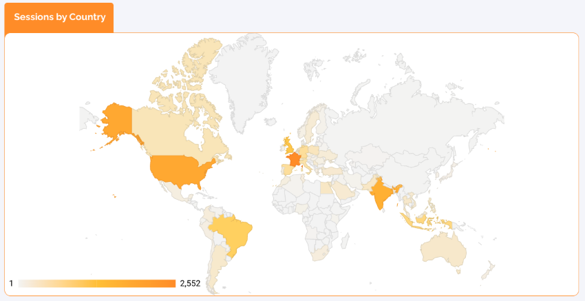
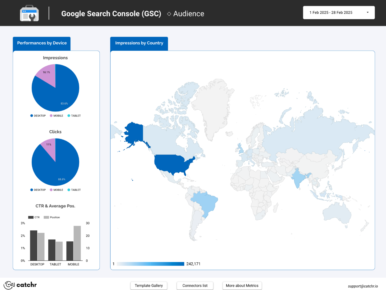
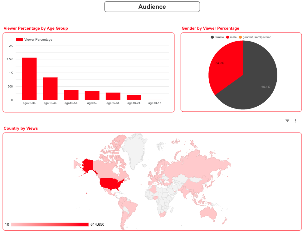
Geo Maps
Geo maps are perfect for visualizing where your strongest audiences come from.
High-performing countries appear in darker tones, helping you identify markets worth investing in and regions where performance drops.
Location strongly influences purchasing power, user intent, behavior patterns, and campaign profitability. These maps help you detect strong regions, weak markets, or opportunities for expansion. For example, a sessions by country map makes the top- preforming markets immediately visible to you.
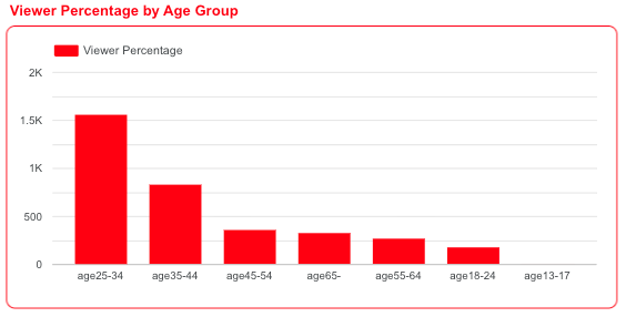
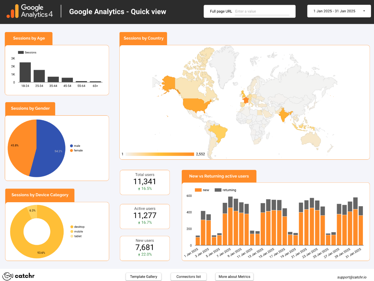
Bar Chart
These charts help you compare performance across demographic audiences and understand who engages and who converts.
They’re especially useful for paid media, UX decisions, and content personalization.
Not all content resonates equally across demographics. These visuals highlight which groups respond best to your messaging or product.
A bar chart showing performance by age group, is ideal for this use case. It clearly highlights that the 25–34 segment dominates, followed by 35–44, while older or younger groups engage far less.
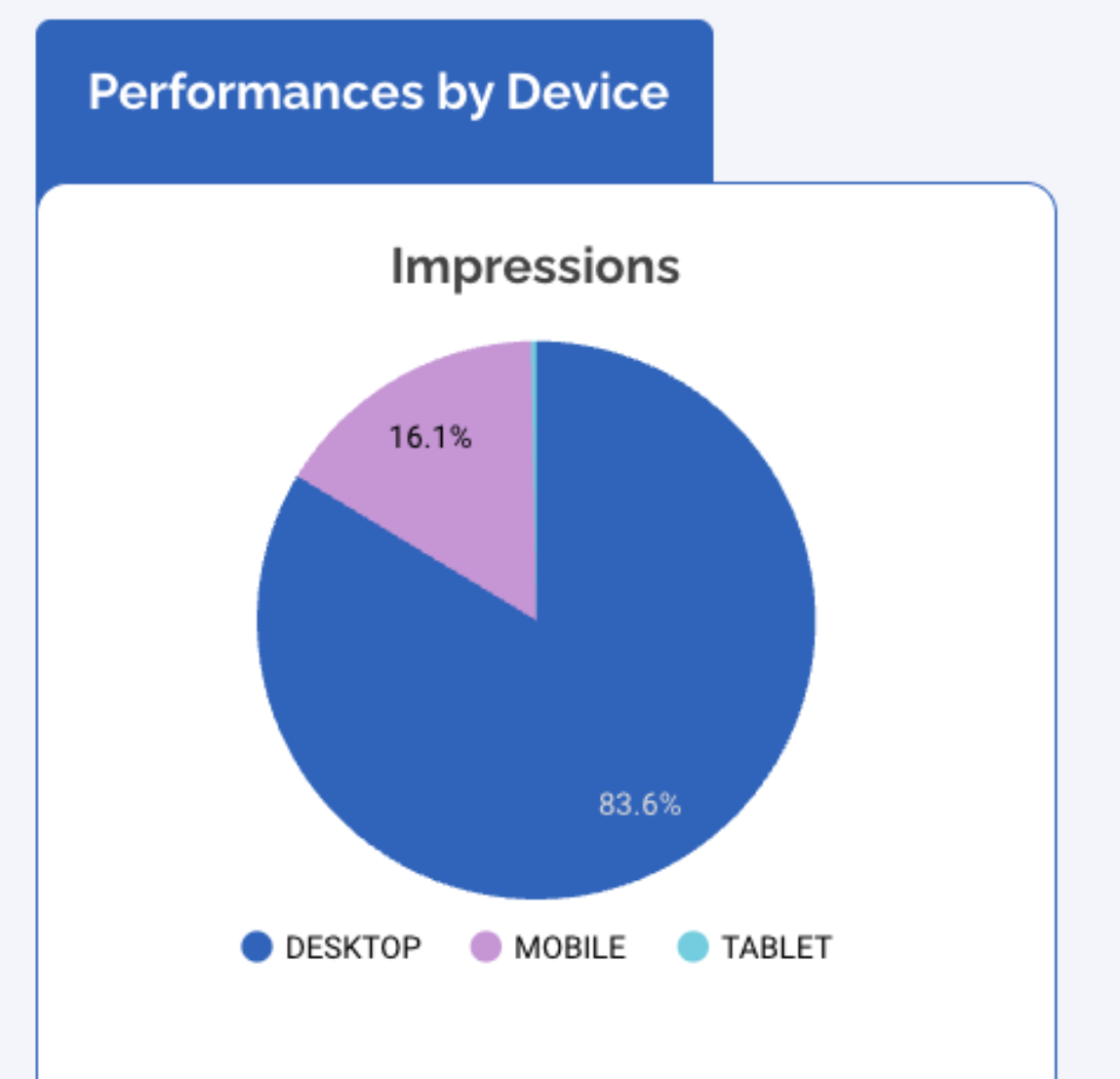
Donut Chart
The donut chart is one of the most effective visuals for audience segmentation because it clearly represents the proportion of 2 to 5 categories at a glance. It’s ideal for showing how your users are distributed across key segments such as Device, Gender, Customer vs Prospect, Age Groups, or any other categorical audience breakdown.
This chart is especially useful when the goal is to understand who your audience is rather than how each group performs. It highlights the share of each segment and helps you instantly see which category dominates.
For example, a donut chart showing Impressions by Device, Desktop at 83.6% and Mobile at 16.1%, instantly reveals which platform your visitors use most.
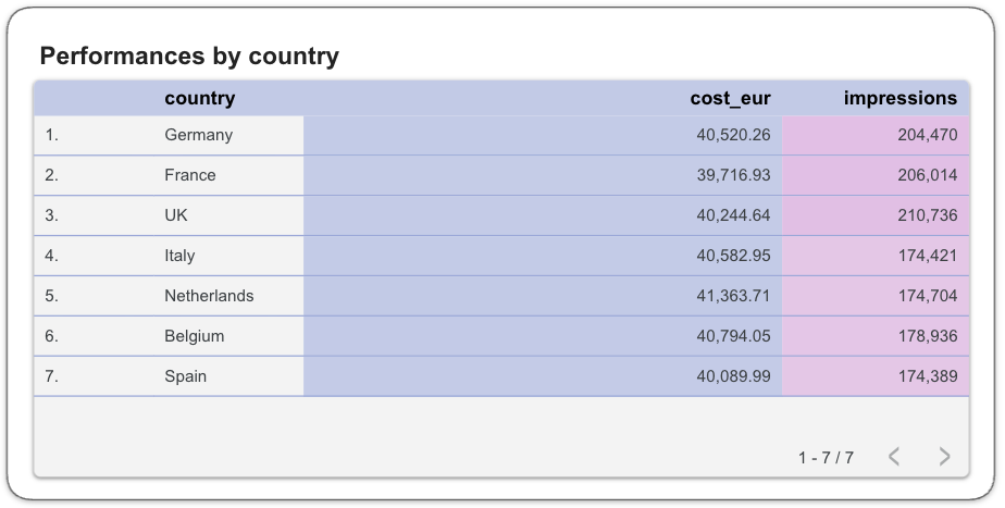
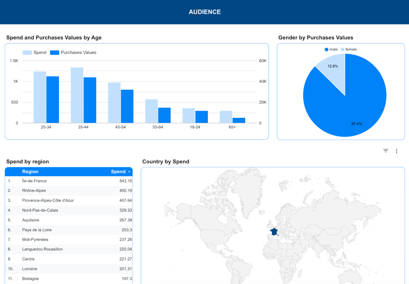
Tables
Tables are essential when you want precise, granular insights for each audience segment.
They allow you to compare performance across countries, devices, genders, interests, customer types, or campaigns with accuracy. Tables reveal information that charts often hide, spend distribution, revenue, conversion value, engagement time, or user quality per segment. They’re ideal when you need to understand both volume and value clearly.
A table like Spend by Region, instantly shows which areas receive the most budget and which ones lag. It helps you spot high-spend regions that underperform, identify strong markets, and quickly see where optimisation is needed.
Controls
Controls make your Segments page flexible and interactive by letting you explore how different audiences behave, without duplicating charts or overcrowding your dashboard. They allow you to focus on the segment you want to analyze while keeping the page clean and easy to read.
Date range control
The Date Range control is essential for seeing how each audience segment evolves over time. It lets you compare behavior before and after campaigns, UX changes, or traffic shifts, making it easier to understand what truly impacts performance.
Filters by specific dimensions
Use dropdown lists or advanced filters to narrow your analysis by country, device, gender, age group, or campaign. This gives you the freedom to isolate a segment instantly and understand how each audience interacts with your content, engages with your pages, or converts.
Best Practices
When building your Segments dashboard, clarity is essential. The goal is to highlight meaningful differences between audiences without overwhelming the reader or duplicating information.
Start with simplicity: each visualization should focus on one clear comparison. Avoid stacking too many KPIs into a single chart, it makes segment behavior harder to read.
Keep a clear visual hierarchy
Start with key KPIs, follow with comparison charts (Geo, Device, Gender), and place detailed tables at the end. This helps readers understand what’s happening before exploring why.
Use consistent colors
Keep the same colors for Mobile, Desktop, Tablet, and for Male/Female/Undefined. A stable palette makes comparisons instant and avoids visual noise.
Rely on filters, not duplicate charts
Geo, Device, and Gender filters let users explore segments without creating multiple versions of the same chart. This keeps the dashboard clean and efficient.
Keep tables focused
Limit table columns to essential KPIs, sort by the most relevant metric, and add only the necessary supporting data. A simple, sharp table is easier to read and far more actionable.
Start with a Looker Studio template
Catchr offers a wide range of ready-to-use Looker Studio templates that help you build acquisition and behavior reports instantly. Instead of starting from a blank page, you can begin with a pre-structured dashboard such as :
After the trial, you can subscribe to continue syncing your data automatically or use the template as a foundation to build your own version with your current data sources. In either case, you will have a solid, well-structured starting point for your reports.
All templates are free to use and include a 14-day trial of Catchr’s connectors. This lets you explore and customize your reports before you subscribe.
