Looker Studio tips: Sparkline in Scorcard

Data visualization plays a crucial role in unlocking insights from raw numbers. Among the tools available in Looker Studio, sparklines offer a compact and powerful way to highlight trends within a scorecard. This guide explains what sparklines are, how to use them in Looker Studio, and why they can improve your dashboards.
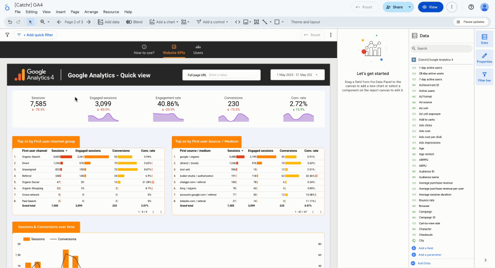
What is Sparkline in Looker Studio?
A sparkline is a small, simple line chart embedded within a data element—often used to show trends over time without distracting from the main message. These mini-charts typically appear without axes or labels, making them ideal for summarizing a time-based metric in a tight space.
In Looker Studio, sparklines can be added to scorecard charts, which are typically used to display a single metric such as revenue, sessions, or conversions. When enabled, the sparkline runs beneath or beside the main metric value, showing a trend over the selected date range.

Sparklines in Looker Studio: Why & How?
Why Sparklines are used in Looker Studio?
Sparklines are small trend lines displayed within scorecards in Looker Studio. They’re used to add context to a KPI by showing how it evolves over time, directly within the metric’s visual.
They are especially useful when:
- You want to enrich a KPI with a visual trend
- You need to keep your dashboard compact and clear
- You want to highlight recent variations or seasonal patterns
By adding sparklines, you can:
- Instantly see the direction of a metric (upward, downward, stable)
- Compare trends across KPIs side by side
- Avoid clutter with a lightweight, integrated visual
How to use Looker Studio Sparkline?
To add a sparkline in Looker Studio:
- Click on the scorecard component in your report.
- In the Setup tab on the right-hand panel, scroll down to the Sparkline section (located just below the metric selection).
- Select a date dimension to define the time axis of the sparkline.
💡 You can customize the sparkline in the Style tab: change its color, choose whether to fill the area, apply a smooth line, and define how missing data is handled.
To conclude, sparklines in Looker Studio are a powerful yet simple feature that enhances your scorecards by providing immediate visual context to your KPIs. By integrating trend lines directly within your metrics, you can quickly identify patterns, monitor performance over time, and make informed decisions without cluttering your dashboard.
More function to use with Looker Studio
Optimize your data analysis
Get free Looker Studio dashboard template among a large collection of +100 stunning template! Elevate your data visualization.
Get free templates!.png)
All your data on Looker Studio
Build Looker Studio dashboard easily with your marketing data from all platforms and track your essential KPIs! No-code integration.
Start free trial now!
Become a Looker Studio expert with Free Video Lessons
Learn all the secrets of data analysis and create beautiful and effective dashboards thanks to our 30-second video courses! Join Catchr's community on YouTube.
Get more video lessons
